Understanding Button Types: A Detailed Guide for UX/UI Professionals
Buttons are a cornerstone of interaction in user interfaces, with different types serving various roles depending on the context and the action required. In this article, we’ll dive deep into the major types of buttons, their use cases, design considerations, and how they contribute to a seamless user experience.
Why Classify Buttons by Type?
Different actions and contexts demand buttons with unique characteristics. Categorizing buttons helps ensure clarity, consistency, and usability in design systems. The primary factors that differentiate button types include:
- Priority: Level of importance relative to other actions.
- Functionality: Specific purpose within a workflow.
- Design Style: Visual elements and interaction states.
Key Button Types
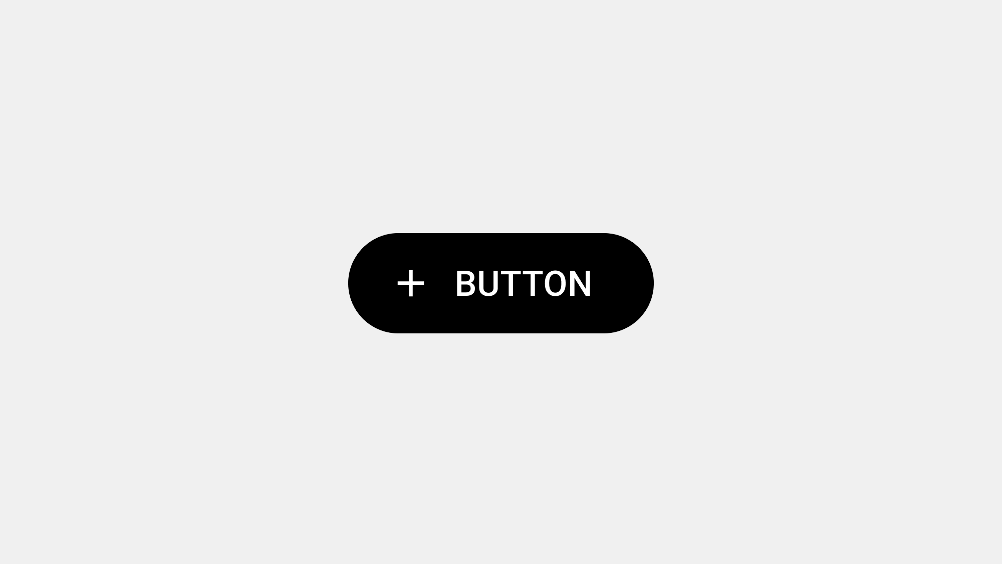
1. Primary Buttons
Definition:
Primary buttons represent the most important action on a screen. They are designed to draw attention and encourage user interaction with the main task.
Use Cases:
- Completing forms (e.g., “Submit”)
- Confirming critical actions (e.g., “Save Changes”)
- Driving user conversions (e.g., “Buy Now”)
Design Considerations:
- Visual Emphasis: Use bold colors, larger size, or unique shapes to stand out.
- One Per Screen: Avoid multiple primary buttons to reduce confusion.
- Action-Oriented Labels: Ensure clear, concise wording that reflects the action, e.g., “Start Free Trial.”
2. Secondary Buttons
Definition:
Secondary buttons support the primary action by offering alternative or less critical options. They are visually less prominent but remain easily accessible.
Use Cases:
- Optional actions alongside primary tasks (e.g., “Learn More”)
- Supporting navigation (e.g., “Back”)
- Providing less urgent actions (e.g., “Preview”)
Design Considerations:
- Styling: Use outlines, muted colors, or less visual weight compared to primary buttons.
- Placement: Position near the primary button without competing for attention.
- Accessibility: Ensure secondary buttons are still easily clickable or tappable.
3. Tertiary Buttons
Definition:
Tertiary buttons are used for minor or supplementary actions. They are typically text-only or minimally styled to avoid drawing too much attention.
Use Cases:
- Navigational links (e.g., “Forgot Password?”)
- Canceling actions (e.g., “Cancel”)
- Opening additional options or menus (e.g., “More Details”)
Design Considerations:
- Minimal Styling: Use text links or very subtle buttons.
- Contextual Placement: Place where users can intuitively find them without cluttering the interface.
4. Icon Buttons
Definition:
Icon buttons are compact, using icons instead of text to represent an action. They save space while maintaining functionality.
Use Cases:
- Common actions with recognizable icons (e.g., “Search,” “Close,” “Delete”)
- Toolbars and action bars (e.g., “Edit” pencil icon)
- Mobile interfaces where space is limited
Design Considerations:
- Clarity: Ensure icons are universally recognizable or provide tooltips/labels for context.
- Touch Targets: Maintain adequate size (minimum 48x48dp for mobile).
- Consistency: Use a consistent style and iconography across the interface.
5. Floating Action Buttons (FABs)
Definition:
A Floating Action Button is a circular button that promotes a primary or standout action, often floating above the content.
Use Cases:
- Mobile interfaces requiring a dominant action (e.g., “Add” in Google Drive)
- Emphasizing a single action in apps with minimal navigation
Design Considerations:
- Positioning: Place in an unobtrusive yet accessible area (typically bottom-right for mobile).
- Use Sparingly: FABs should not compete with other primary buttons on the same screen.
- Animations: Use subtle animations for hover or press feedback.
6. Toggle Buttons
Definition:
Toggle buttons allow users to switch between two states, such as “on” and “off” or “enabled” and “disabled.”
Use Cases:
- Turning features or settings on/off (e.g., “Dark Mode”)
- Selecting preferences (e.g., “Like” or “Dislike”)
- Activating filters in search interfaces
Design Considerations:
- State Indicators: Clearly show the active/inactive state through color changes or icons.
- Accessibility: Ensure screen readers can describe the toggle’s current state.
- Avoid Overuse: Use toggle buttons only when two distinct states are required.
7. Grouped Buttons
Definition:
Grouped buttons are multiple buttons displayed together to provide closely related options.
Use Cases:
- Pagination controls (e.g., “Previous” and “Next”)
- Toolbar options (e.g., “Bold,” “Italic,” “Underline”)
- Multi-choice actions (e.g., “Yes,” “No,” “Maybe”)
Design Considerations:
- Spacing: Maintain sufficient spacing to prevent accidental taps.
- Consistency: Use the same visual style for all buttons in the group.
- Hover States: Ensure hover or active states are distinguishable.
8. Split Buttons
Definition:
Split buttons combine a primary action with a dropdown for additional options.
Use Cases:
- Offering a default action while providing other choices (e.g., “Save” with a dropdown for “Save As…”)
- Contextual actions in complex workflows
Design Considerations:
- Clear Hierarchy: Ensure the primary action is obvious, with secondary actions hidden in the dropdown.
- Ease of Use: Use clear separators between the button and dropdown.
- Visual Cues: Provide arrow icons to indicate the presence of a dropdown.
9. CTA (Call-to-Action) Buttons
Definition:
CTA buttons are designed to drive user engagement and conversions, often used in marketing or e-commerce.
Use Cases:
- Signing up for a service (e.g., “Get Started”)
- Completing purchases (e.g., “Buy Now”)
- Generating leads (e.g., “Download Free E-Book”)
Design Considerations:
- Bold Styling: Use vibrant colors and strong contrast to grab attention.
- Strategic Placement: Position where users are most likely to take action.
- Urgency: Use words that create a sense of urgency, like “Limited Offer.”
10. Ghost Buttons
Definition:
Ghost buttons are outlined buttons with no solid fill, designed for minimal emphasis.
Use Cases:
- Secondary actions on visually heavy screens
- Subtle CTAs (e.g., “Learn More” on a landing page)
- Actions where distraction is a concern
Design Considerations:
- Contrast: Ensure outlines are visible against the background.
- Hierarchy: Use ghost buttons only when a primary button is present to avoid confusion.
11. Dropdown Buttons
Definition:
Dropdown buttons display a menu of options when clicked, offering users multiple choices within a single element.
Use Cases:
- Navigating through categories
- Selecting preferences (e.g., “Sort By”)
- Reducing clutter by hiding less-used options
Design Considerations:
- Menu Design: Ensure dropdown options are easily scannable and categorized.
- Default Action: If possible, include a default action or state.
12. Loading Buttons
Definition:
Loading buttons visually indicate ongoing processes, like submitting data or loading content.
Use Cases:
- Displaying progress after form submission
- Showing a process is in progress (e.g., file upload)
Design Considerations:
- Feedback: Use spinners or progress bars to indicate activity.
- Disable During Load: Prevent users from triggering duplicate actions.
Choosing the Right Button Type
When designing buttons, context is king. Consider the user’s goals, the importance of the action, and the surrounding UI elements. By carefully selecting the right button type, you can guide users effectively and enhance the overall experience.