[카테고리:] UI COMPONENTS

  • Bottom Navigation Bars – 11. Final

    Bottom Navigation Bars – 11. Final

    The Ultimate Guide to Bottom Navigation Bars: A Complete Wrap-Up

    Bottom navigation bars are essential components of mobile app design, offering users a seamless way to navigate primary features. They serve as a cornerstone of usability, ensuring intuitive and efficient navigation. This wrap-up consolidates all aspects of bottom navigation bars—from their definition and roles to their design, development, and QA considerations. Whether you’re a designer, developer, or QA specialist, this guide provides actionable insights to create bottom navigation bars that enhance user experiences.


    1. What Are Bottom Navigation Bars?

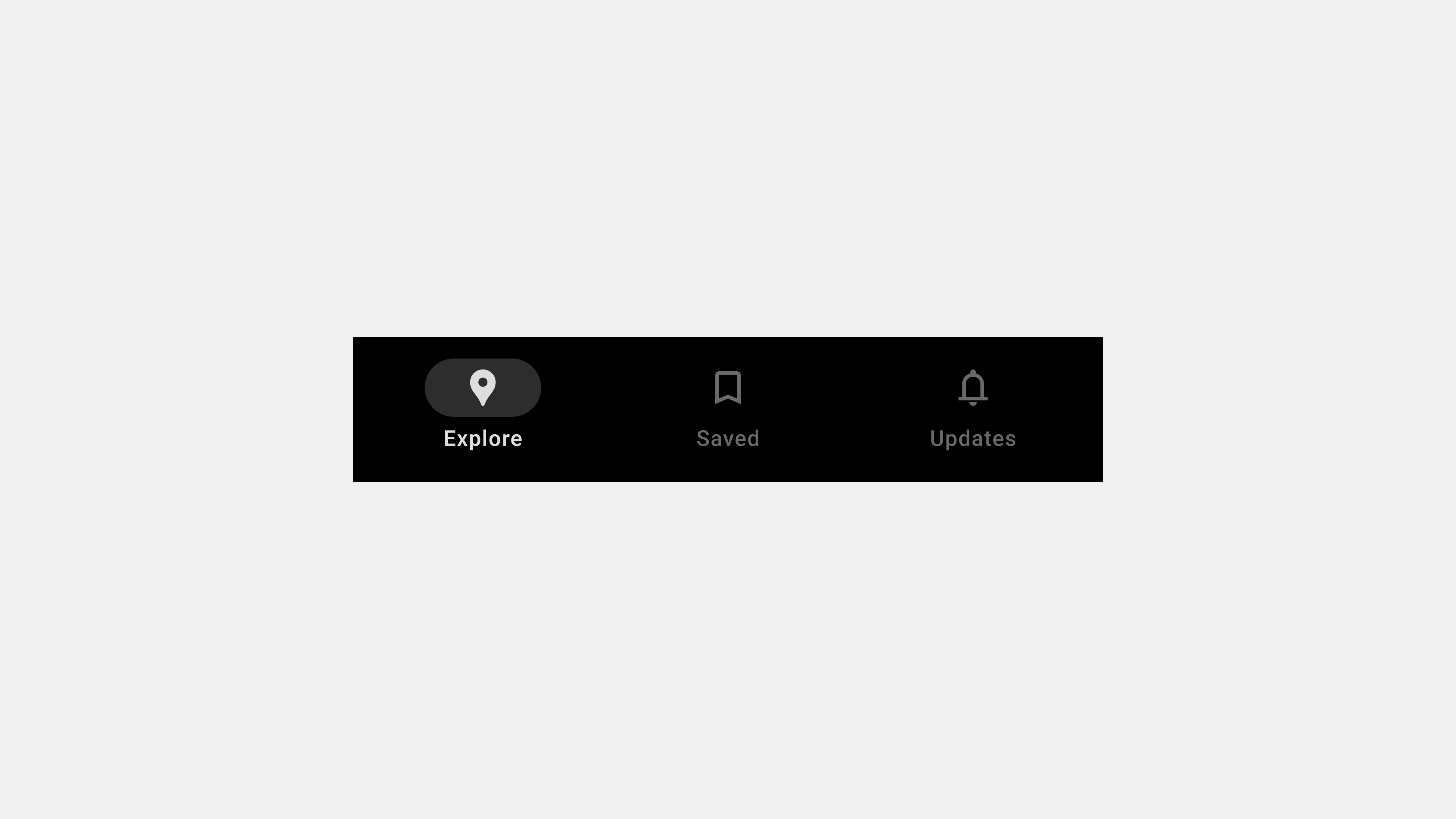
    A bottom navigation bar is a fixed UI component at the bottom of an app screen. Its primary function is to provide quick access to the core sections of an application.

    Key Characteristics

    • Compact Layout: Saves screen space while maintaining accessibility.
    • Icons and Labels: Combines intuitive visuals with descriptive text for clarity.
    • Persistent Placement: Stays visible across screens to ensure consistent navigation.

    Purpose

    Bottom navigation bars simplify navigation by grouping an app’s primary features into easily accessible tabs.


    2. The Role of Bottom Navigation Bars in User Experience

    Bottom navigation bars are integral to creating a seamless and enjoyable user experience.

    Key Functions

    • Organizing Core Features: Groups primary app sections for quick access.
    • Providing Contextual Awareness: Highlights active tabs to show users their current location.
    • Supporting Multitasking: Allows users to switch tasks without losing progress.

    Why It Matters

    By reducing cognitive load and improving task efficiency, bottom navigation bars contribute to overall user satisfaction.


    3. Key Types of Bottom Navigation Bars

    Different apps have varying navigation needs, leading to diverse bottom navigation bar designs.

    A. Standard Navigation Bars

    • Features fixed tabs for primary sections.
    • Ideal for apps with 3-5 core features.

    B. Scrollable Navigation Bars

    • Accommodates more tabs by enabling horizontal scrolling.
    • Suitable for content-heavy apps like streaming platforms.

    C. Floating Navigation Bars

    • Positioned slightly above the screen edge with rounded corners.
    • Adds a modern aesthetic and minimizes visual clutter.

    D. Dynamic Navigation Bars

    • Adjusts content based on user roles or app state.
    • Offers a personalized navigation experience.

    4. UX Writing for Bottom Navigation Bars

    Effective UX writing ensures that tab labels are clear, concise, and aligned with user expectations.

    Best Practices

    • Use Descriptive Labels: Clearly convey the purpose of each tab (e.g., “Home” or “Search”).
    • Combine Icons with Text: Pair icons with labels for better clarity.
    • Keep Labels Short: Avoid truncation by limiting labels to 1-2 words.
    • Align with User Mental Models: Use familiar terms that match user expectations.

    Common Pitfalls

    • Ambiguous labels like “More” or “Stuff.”
    • Overly creative language that confuses users (e.g., “Vibes” for “Music”).
    • Inconsistent terminology across the app.

    5. Designing User-Centered Navigation Bars

    Designing navigation bars with a user-first mindset ensures usability and accessibility.

    Key Design Principles

    • Simplicity: Limit tabs to 3-5 to prevent clutter.
    • Accessibility: Use ARIA roles, high-contrast colors, and touch-friendly targets.
    • Feedback and Indicators: Highlight active tabs and provide smooth transitions.
    • Consistency: Maintain uniform styling and behavior across screens.

    Examples

    • In an e-commerce app, tabs like “Shop,” “Cart,” and “Profile” make navigation straightforward.
    • A travel app highlights the “Bookings” tab with bold text and color changes when selected.

    6. Publishing and Developing Navigation Bars

    Developers play a critical role in implementing bottom navigation bars that are performant and consistent.

    Key Considerations

    • Performance Optimization: Use lazy loading and efficient animations to ensure responsiveness.
    • Cross-Platform Compatibility: Test for consistent functionality across iOS, Android, and web.
    • Dynamic Content Handling: Manage state changes and dynamic tabs efficiently.

    Tools for Development

    • React Native: For cross-platform development.
    • Postman: To test dynamic content and API integrations.

    7. QA Testing Bottom Navigation Bars

    Rigorous QA ensures that bottom navigation bars function reliably across all scenarios.

    Key Testing Areas

    • Functional Testing: Validate that all tabs route users to the correct screens.
    • Accessibility Testing: Use screen readers and keyboard navigation to ensure inclusivity.
    • Performance Testing: Simulate heavy usage and offline scenarios to test resilience.
    • Error Handling: Verify fallback options for failed content or broken links.

    Tools for QA

    • Axe Accessibility Checker: For identifying accessibility issues.
    • BrowserStack: For cross-platform testing.

    8. Future Trends in Bottom Navigation Bars

    As mobile app design evolves, bottom navigation bars continue to adapt to new trends.

    Emerging Trends

    • Gesture-Based Navigation: Complementing or replacing traditional tabs with gestures.
    • AI-Powered Personalization: Dynamic tabs that adjust based on user behavior.
    • Augmented Reality (AR) Integration: Incorporating AR features within navigation systems.

    Conclusion

    Bottom navigation bars are more than just a navigation tool—they are a critical element of user experience design. By focusing on clarity, accessibility, performance, and testing, teams can create navigation bars that meet user expectations and enhance app usability. From design and development to QA, a holistic approach ensures that navigation bars remain intuitive, functional, and future-ready.


  • 바텀 내비게이션 바 – 11. 최종

    바텀 내비게이션 바 – 11. 최종

    바텀 내비게이션 바(Bottom Navigation Bar): 설계부터 QA까지 완벽 가이드

    바텀 내비게이션 바(Bottom Navigation Bar)는 모바일 애플리케이션에서 핵심적인 UI 컴포넌트다. 사용자가 주요 화면과 기능을 탐색하는 데 도움을 주며, 탐색 효율성과 사용자 경험(UX)을 극대화하는 역할을 한다. 하지만 성공적인 바텀 내비게이션 바를 설계하고 구현하려면 사용자 기대를 반영한 디자인부터 개발, 퍼블리싱, QA까지 전 과정을 철저히 검토해야 한다. 이 글에서는 바텀 내비게이션 바에 대한 모든 내용을 종합적으로 정리하며, 사용자 중심의 UI/UX를 구현하기 위한 실질적인 가이드를 제공한다.


    1. 바텀 내비게이션 바란 무엇인가?

    바텀 내비게이션 바는 모바일 화면 하단에 고정된 탐색 UI 컴포넌트로, 사용자가 주요 화면 간에 빠르게 전환할 수 있도록 돕는다.

    • 위치: 항상 화면 하단에 고정.
    • 구성 요소: 아이콘, 텍스트 라벨, 활성화 상태 표시.
    • 주요 특징: 탐색 단순화, 현재 위치 표시, 사용성 강화.

    2. 성공적인 바텀 내비게이션 바 설계를 위한 기본 원칙

    1) 사용자 중심의 정보 구조 설계

    • 핵심 메뉴만 포함: 사용 빈도가 높은 3~5개의 주요 기능을 배치.
    • 논리적 순서: 사용자 행동 패턴에 맞는 직관적인 메뉴 배열.
    • 명확한 텍스트: “내 정보” 대신 “프로필”처럼 간결하고 직관적인 용어 사용.

    2) 디자인 일관성과 브랜드 표현

    • 브랜드 색상과 스타일 반영: 내비게이션 바에 브랜드 아이덴티티를 반영해 신뢰도 강화.
    • 통일된 아이콘과 텍스트 디자인: 일관된 스타일로 가독성과 심미성 확보.

    3) 접근성 강화

    • 색상 대비와 터치 영역: WCAG 기준에 따라 색상 대비를 유지하고, 터치 영역을 충분히 확보.
    • 스크린 리더 지원: ARIA 속성으로 메뉴와 상태 정보를 제공.

    3. UX 라이팅: 명료한 용어로 사용자와 소통

    바텀 내비게이션 바의 각 메뉴는 짧고 직관적인 텍스트로 사용자가 기능을 즉시 이해할 수 있어야 한다.

    • 일상 언어 사용: 사용자가 이해하기 쉬운 단어를 선택.
      • 예: “설정 메뉴” → “설정”.
    • 결과를 예측 가능하게 작성: “저장” → “파일 저장”.
    • 일관된 표현 유지: “내 계정”과 “마이페이지”처럼 혼용하지 않음.

    4. 퍼블리싱과 개발 시 유의사항

    1) 반응형 설계

    • 다양한 화면 크기에 대응: 모바일, 태블릿, 데스크탑 환경에서도 UI가 깨지지 않도록 조정.
    • 가로모드 지원: 화면 회전 시에도 내비게이션 바가 적절히 표시되도록 구현.

    2) 성능 최적화

    • 지연 로딩 적용: 필요한 데이터만 로드해 초기 로딩 시간을 단축.
    • GPU 기반 애니메이션 사용: CSS 애니메이션에서 GPU를 활용해 부드러운 전환 제공.

    3) 재사용성 높은 코드 작성

    • 컴포넌트 기반 설계: React, Vue와 같은 프레임워크를 활용해 모듈화된 컴포넌트 작성.
    • CSS BEM 방법론 사용: 명확한 클래스 이름으로 유지보수성을 강화.

    5. QA 진행 시 주요 테스트 항목

    1) 기능 검증

    • 각 탭이 올바른 화면으로 연결되는지 확인.
    • 빠른 연속 클릭 시 중복 요청이 발생하지 않는지 점검.

    2) 반응형 테스트

    • 다양한 디바이스와 화면 크기에서 UI가 정상적으로 표시되는지 확인.
    • 터치 영역이 충분히 확보되어 있는지 점검.

    3) 접근성 테스트

    • 스크린 리더와 키보드 탐색을 통해 모든 사용자가 접근 가능하도록 설계.
    • 색상 대비가 충분한지 확인.

    4) 성능 테스트

    • 탭 전환 속도와 애니메이션 부드러움을 점검.
    • CPU 및 메모리 사용량을 최소화.

    5) 오류 처리

    • 잘못된 URL, 네트워크 지연 등 다양한 엣지 케이스에서도 정상적으로 작동하는지 확인.

    6. 성공적인 바텀 내비게이션 바를 위한 체크리스트

    1. 탐색 효율성: 사용자가 주요 메뉴에 쉽게 접근할 수 있는가?
    2. 디자인 일관성: 브랜드 이미지와 조화를 이루는 UI인가?
    3. 접근성 강화: 모든 사용자에게 포괄적인 경험을 제공하는가?
    4. 성능 최적화: 빠르고 부드러운 전환 경험을 제공하는가?
    5. 테스트 완료: 다양한 시나리오에서 모든 기능이 예상대로 작동하는가?

    결론

    바텀 내비게이션 바는 모바일 애플리케이션에서 사용자 경험을 좌우하는 중요한 요소다. 성공적인 바텀 내비게이션 바를 구현하려면 정보 구조 설계, 디자인, UX 라이팅, 퍼블리싱, QA까지 모든 단계를 철저히 검토해야 한다. 사용자 중심의 설계와 반복적인 테스트를 통해 완성도 높은 바텀 내비게이션 바를 제공하면, 서비스의 품질과 사용자 만족도를 동시에 향상시킬 수 있다.


  • Bottom Navigation Bars – 10. QA Testing

    Bottom Navigation Bars – 10. QA Testing

    5 Key Considerations for QA Testing Bottom Navigation Bars

    Bottom navigation bars are critical for providing seamless navigation within applications. QA (Quality Assurance) plays a pivotal role in ensuring these navigation components function correctly, deliver a consistent experience, and meet accessibility standards. This article outlines five key areas to focus on during QA testing of bottom navigation bars, ensuring optimal usability and reliability.


    1. Functional Testing

    Why It Matters

    The core purpose of a bottom navigation bar is to enable smooth navigation between key sections of the app. Ensuring that each tab functions as intended is fundamental to the user experience.

    Key Testing Areas

    • Tab Navigation: Verify that each tab redirects users to the correct screen or section.
    • Interactivity: Ensure that all icons and labels are clickable and responsive.
    • Overflow Menus: Test any additional options provided within dropdowns or overflow menus.

    Test Scenarios

    • Switch between tabs in quick succession to ensure no lag or misrouting occurs.
    • Test tab functionality under edge cases, such as multiple rapid taps or simultaneous user interactions.
    • Validate tab interactions on both touch and non-touch devices.

    Tools

    • Selenium or Cypress for automated functional testing.
    • Manual testing for edge cases and real-world scenarios.

    2. Cross-Platform and Device Compatibility

    Why It Matters

    Apps are accessed across a variety of devices and platforms, including iOS, Android, and web browsers. Ensuring that the bottom navigation bar works consistently across all platforms is crucial for a unified user experience.

    Key Testing Areas

    • Device Responsiveness: Test navigation bar behavior on different screen sizes, from small phones to large tablets.
    • Browser Compatibility: Validate functionality on major browsers, including Chrome, Safari, Firefox, and Edge.
    • Platform-Specific Features: Test platform-specific interactions, such as gestures on mobile devices.

    Test Scenarios

    • Check how the navigation bar adapts to various resolutions and orientations (portrait vs. landscape).
    • Validate the tab behavior in responsive layouts on web platforms.
    • Simulate user interactions on real and emulated devices.

    Tools

    • BrowserStack or Sauce Labs for cross-platform and cross-browser testing.
    • Real device testing for mobile and tablet apps.

    3. Accessibility Testing

    Why It Matters

    An accessible bottom navigation bar ensures inclusivity for users with disabilities, enhancing usability and meeting legal requirements.

    Key Testing Areas

    • Screen Reader Support: Verify that all tabs are labeled and announced correctly by screen readers.
    • Keyboard Navigation: Ensure users can navigate and select tabs using only a keyboard.
    • Focus Management: Test visible focus indicators for interactive elements.

    Test Scenarios

    • Navigate tabs using screen readers like VoiceOver or NVDA and check for proper announcements.
    • Use the Tab key to navigate between tabs and validate focus indicators.
    • Check contrast ratios between text, icons, and backgrounds for compliance with WCAG standards.

    Tools

    • Axe Accessibility Checker for automated audits.
    • Lighthouse Accessibility Audit for scoring accessibility performance.

    4. Performance and Load Testing

    Why It Matters

    A navigation bar that lags or fails under heavy usage can frustrate users and degrade the overall app experience. Performance testing ensures responsiveness and reliability.

    Key Testing Areas

    • Loading Speed: Validate that the navigation bar loads instantly and functions without delays.
    • Animation Smoothness: Check for stutter-free transitions between tabs.
    • High-Traffic Scenarios: Simulate heavy usage or poor network conditions to test resilience.

    Test Scenarios

    • Simulate multiple users accessing the app simultaneously to test performance under load.
    • Evaluate navigation bar behavior in offline or low-bandwidth scenarios.
    • Check the impact of animations on low-end devices.

    Tools

    • Apache JMeter for load testing.
    • Chrome DevTools for analyzing performance metrics.

    5. Error Handling and Edge Case Validation

    Why It Matters

    Applications must handle errors gracefully to ensure a seamless user experience. Testing the navigation bar’s response to unexpected scenarios is vital for robust functionality.

    Key Testing Areas

    • Broken Links: Verify that all tabs redirect users to valid destinations.
    • Dynamic Content Failures: Test tabs that load user-specific or real-time data for proper fallback behavior.
    • Offline Scenarios: Ensure the navigation bar remains functional in offline or limited connectivity conditions.

    Test Scenarios

    • Simulate broken links or API failures to ensure appropriate error messages are displayed.
    • Test tab interactions in offline mode, ensuring basic navigation still functions.
    • Validate how the navigation bar behaves when users rapidly switch tabs during a failed content load.

    Tools

    • Postman for API error simulation.
    • Real device testing for simulating offline and edge-case scenarios.

    Conclusion

    Rigorous QA testing ensures that bottom navigation bars function reliably and enhance the user experience. By focusing on functionality, compatibility, accessibility, performance, and error handling, QA teams can identify and resolve potential issues before they impact users. A well-tested navigation bar not only meets user expectations but also strengthens the app’s overall usability and engagement.


  • 바텀 내비게이션 바 – 10. QA

    바텀 내비게이션 바 – 10. QA

    바텀 내비게이션 바 QA 진행 시 유의해야 할 5가지 핵심 요소

    바텀 내비게이션 바(Bottom Navigation Bar)는 사용자 탐색 경험에 큰 영향을 미치는 UI 요소다. QA(품질 보증) 단계에서는 설계와 개발된 기능이 예상대로 작동하며 사용자 경험을 훼손하지 않는지 철저히 점검해야 한다. 이번 글에서는 바텀 내비게이션 바를 QA 진행할 때 반드시 고려해야 할 다섯 가지 중요한 항목과 이를 중심으로 한 테스트 전략을 상세히 설명한다.


    1. 기능 검증: 모든 탭과 연결된 동작 점검

    왜 중요한가?

    바텀 내비게이션 바의 가장 기본적인 역할은 각 탭이 올바른 화면이나 기능으로 연결되도록 보장하는 것이다.

    체크리스트

    1. 탭 클릭 동작 확인
      • 각 탭을 클릭했을 때 올바른 화면으로 이동하는지 확인한다.
      • 잘못된 URL로 연결되지 않는지 점검한다.
    2. 중복 클릭 처리
      • 동일한 탭을 연속 클릭했을 때 중복 요청이 발생하지 않아야 한다.
    3. 탭 상태 유지
      • 사용자가 화면을 전환하더라도 이전 상태가 그대로 유지되어야 한다.

    테스트 방법

    • 수동 테스트로 각 탭의 동작 확인.
    • Selenium 등 자동화 도구를 활용해 링크와 화면 전환 경로 검증.

    2. 반응형 설계 테스트: 다양한 디바이스와 화면 크기 대응 확인

    왜 중요한가?

    모바일 디바이스의 화면 크기와 해상도는 다양하기 때문에, 바텀 내비게이션 바가 모든 환경에서 일관되게 표시되어야 한다.

    체크리스트

    1. 화면 크기별 레이아웃 검증
      • 스마트폰, 태블릿 등 다양한 디바이스에서 UI가 적절히 렌더링되는지 확인.
    2. 가로모드 테스트
      • 가로모드에서 바텀 내비게이션 바가 정상적으로 표시되는지 점검.
    3. 터치 영역 적합성 확인
      • 각 탭의 터치 영역이 충분히 확보되어야 한다(최소 48px).

    테스트 방법

    • Chrome DevTools 디바이스 모드를 활용해 다양한 화면 크기를 시뮬레이션.
    • 실제 디바이스(모바일, 태블릿)에서 반응형 동작 확인.

    3. 접근성 테스트: 모든 사용자에게 접근 가능한 설계 검증

    왜 중요한가?

    접근성은 모든 사용자가 앱을 사용할 수 있도록 보장하는 중요한 기준이다.

    체크리스트

    1. 스크린 리더 호환성
      • 각 탭의 이름과 상태가 스크린 리더에서 정확히 설명되는지 확인.
    2. 색상 대비 확인
      • 텍스트와 배경 간 색상 대비가 WCAG 기준(4.5:1)을 충족하는지 점검.
    3. 키보드 탐색 가능 여부
      • 키보드만으로 바텀 내비게이션 바의 모든 항목을 탐색할 수 있어야 한다.

    테스트 방법

    • NVDA, VoiceOver 같은 스크린 리더를 사용해 접근성을 확인.
    • 키보드로 탭 이동 및 탐색 동작을 수동 테스트.
    • 색상 대비 검사 도구(Contrast Checker) 활용.

    4. 성능 테스트: 로딩 속도와 애니메이션 품질 확인

    왜 중요한가?

    탭 전환 속도와 애니메이션 품질은 사용자의 탐색 경험에 직접적인 영향을 미친다.

    체크리스트

    1. 탭 전환 속도 확인
      • 각 탭을 선택했을 때 화면 전환이 빠르고 부드럽게 이루어지는지 점검.
    2. 애니메이션 성능 점검
      • 전환 애니메이션이 끊기거나 지연되지 않아야 한다.
    3. 리소스 최적화 상태 확인
      • 탭 전환 시 CPU 및 메모리 사용량이 과도하지 않은지 점검.

    테스트 방법

    • Chrome DevTools Performance 탭으로 성능 분석.
    • 실제 디바이스에서 탭 전환과 애니메이션 부드러움 테스트.

    5. 오류 처리 및 엣지 케이스 검증

    왜 중요한가?

    바텀 내비게이션 바는 다양한 사용자 시나리오에서 예상치 못한 오류가 발생할 수 있다. 이러한 상황에 적절히 대처하는 것은 신뢰성 있는 서비스를 제공하는 데 필수적이다.

    체크리스트

    1. 잘못된 URL 처리
      • 잘못된 링크로 연결될 경우, 사용자에게 적절한 오류 메시지를 제공.
    2. 네트워크 오류 대응
      • 네트워크 연결이 끊기거나 느린 환경에서도 내비게이션 바가 정상 작동해야 한다.
    3. 빠른 연속 클릭 테스트
      • 사용자가 탭을 빠르게 연속 클릭했을 때 오류가 발생하지 않아야 한다.

    테스트 방법

    • Postman으로 API 응답 지연 및 오류 상황을 시뮬레이션.
    • 네트워크 상태를 조작해 오프라인 및 저속 환경에서 테스트.

    결론

    바텀 내비게이션 바는 모바일 애플리케이션에서 사용자 경험을 좌우하는 중요한 요소다. 기능 검증, 반응형 설계, 접근성, 성능 최적화, 오류 처리 등 QA 단계에서 철저히 점검하면 사용자와 서비스 모두가 만족할 수 있는 고품질 UI를 구현할 수 있다.


  • Bottom Navigation Bars – 9. Dev.

    Bottom Navigation Bars – 9. Dev.

    Key Considerations for Publishing and Developing Bottom Navigation Bars

    Bottom navigation bars are critical for app usability and user satisfaction, providing an intuitive way to navigate primary features. However, their effectiveness hinges on proper implementation during publishing and development. This article outlines five key considerations to ensure your bottom navigation bar is functional, efficient, and user-friendly.


    1. Prioritize Performance Optimization

    Why It Matters

    A laggy or unresponsive navigation bar can frustrate users and negatively impact their experience. Performance optimization ensures smooth interactions, even in resource-intensive apps.

    Key Actions

    • Lightweight Animations: Use hardware-accelerated CSS or JavaScript for smooth transitions.
    • Lazy Loading: Load content for inactive tabs only when accessed to reduce initial load times.
    • Minimize Dependencies: Avoid bloated frameworks that can slow down navigation.

    Implementation Tips

    • Use requestAnimationFrame for fluid animations.
    • Optimize image and API calls to prevent unnecessary delays.
    • Preload assets for commonly accessed tabs to enhance speed.

    Testing Tools

    • Lighthouse: For performance audits.
    • WebPageTest: To identify performance bottlenecks.

    2. Ensure Cross-Platform Consistency

    Why It Matters

    Users expect a seamless experience across devices and platforms. Consistency in behavior and design fosters trust and familiarity.

    Key Actions

    • Responsive Design: Ensure tabs adapt to varying screen sizes and resolutions.
    • Uniform Behavior: Tabs should function consistently on iOS, Android, and web platforms.
    • Platform-Specific Adjustments: Incorporate platform conventions, like gesture support on mobile.

    Implementation Tips

    • Test designs on devices with different screen sizes, including tablets.
    • Use frameworks like React Native or Flutter for cross-platform development.
    • Maintain uniformity in iconography, typography, and color schemes.

    Testing Tools

    • BrowserStack: For testing on multiple devices and operating systems.
    • Appium: For cross-platform automated testing.

    3. Accessibility Compliance

    Why It Matters

    Accessible navigation ensures inclusivity and compliance with legal standards, allowing all users to navigate your app effectively.

    Key Actions

    • Semantic Markup: Use <nav> tags and ARIA roles to make the navigation bar accessible to screen readers.
    • Keyboard Navigation: Ensure users can navigate tabs using only a keyboard.
    • Color Contrast: Verify sufficient contrast between text/icons and background colors.

    Implementation Tips

    • Label each tab with descriptive ARIA attributes (e.g., aria-label="Home Tab").
    • Use focus indicators for keyboard navigation.
    • Test for compliance with WCAG standards.

    Testing Tools

    • Axe Accessibility Checker: For identifying accessibility issues.
    • VoiceOver/TalkBack: To test screen reader compatibility.

    4. Optimize for Dynamic Content and State Management

    Why It Matters

    Dynamic content and state management ensure tabs remain functional and intuitive, even in complex apps with personalized or role-based navigation.

    Key Actions

    • State Retention: Preserve user progress or data when switching between tabs.
    • Dynamic Tabs: Adjust tabs based on user roles, permissions, or preferences.
    • Error Handling: Implement fallback options for failed content loads.

    Implementation Tips

    • Use state management libraries like Redux or Context API.
    • Display loading indicators for tabs fetching dynamic content.
    • Test for edge cases, such as slow networks or offline scenarios.

    Testing Tools

    • Postman: For API testing.
    • Redux DevTools: To monitor state changes in dynamic applications.

    5. Responsive and Touch-Friendly Design

    Why It Matters

    A poorly designed navigation bar can lead to accidental taps and frustration, especially on mobile devices. Ensuring responsiveness and touch-friendliness is critical for usability.

    Key Actions

    • Touch Targets: Design large tap areas to accommodate different finger sizes.
    • Spacing and Alignment: Maintain adequate spacing between tabs to prevent accidental clicks.
    • Device Orientation: Test navigation bar usability in both portrait and landscape modes.

    Implementation Tips

    • Follow Apple’s Human Interface Guidelines or Google’s Material Design for touch target sizes.
    • Use media queries to adapt layouts for various screen orientations.
    • Test with real users to identify and address usability issues.

    Testing Tools

    • Chrome DevTools: For responsive testing.
    • Real Device Testing: To evaluate touch interaction on actual devices.

    Conclusion

    Developing and publishing bottom navigation bars requires a focus on performance, consistency, accessibility, dynamic content handling, and touch-friendly design. By addressing these five critical areas, you can ensure that your navigation bar enhances user satisfaction and aligns with best practices. Thorough testing and iteration during development further ensure a robust and seamless user experience.


  • 바텀 내비게이션 바 – 9. 퍼블/개발

    바텀 내비게이션 바 – 9. 퍼블/개발

    바텀 내비게이션 바 퍼블리싱 및 개발 시 유의해야 할 5가지 핵심 요소

    바텀 내비게이션 바(Bottom Navigation Bar)는 모바일 애플리케이션과 웹 애플리케이션에서 사용자 경험(UX)을 개선하는 중요한 UI 컴포넌트다. 디자인과 설계가 잘 되어도, 퍼블리싱과 개발 단계에서 문제가 생기면 사용성에 큰 영향을 미칠 수 있다. 이 글에서는 바텀 내비게이션 바를 퍼블리싱 및 개발할 때 반드시 고려해야 할 다섯 가지 핵심 사항을 중심으로 설명한다.


    1. 반응형 설계와 디바이스 호환성

    왜 중요한가?

    바텀 내비게이션 바는 다양한 디바이스와 화면 크기에서 일관된 경험을 제공해야 한다.

    고려 사항

    1. 미디어 쿼리 활용
      • CSS 미디어 쿼리를 사용해 다양한 화면 크기에서 적합한 레이아웃 제공.
      • 예: @media (min-width: 768px) 조건으로 태블릿과 모바일 환경 구분.
    2. 터치 영역 최적화
      • 버튼의 크기는 최소 48px로 설정해 사용자의 터치 정확도 개선.
    3. 가로모드 지원
      • 디바이스가 회전했을 때 UI가 깨지지 않도록 설계.

    유의해야 할 점

    • 화면 크기에 따라 텍스트가 잘리거나 아이콘이 겹치지 않도록 한다.
    • 터치 스크린 친화적인 레이아웃을 유지해야 한다.

    2. 접근성과 사용자 경험 강화

    왜 중요한가?

    접근성은 다양한 사용자(장애인 포함)가 서비스에 쉽게 접근할 수 있도록 보장하며, 법적 요구 사항을 충족하기 위해서도 중요하다.

    고려 사항

    1. 스크린 리더 지원
      • ARIA 속성을 추가해 각 탭의 이름과 상태를 스크린 리더로 읽을 수 있도록 설정.
      • 예: <nav aria-label="주요 탐색">.
    2. 색상 대비 강화
      • 텍스트와 배경의 색상 대비를 WCAG 가이드라인 기준(4.5:1) 이상으로 유지.
    3. 키보드 내비게이션 지원
      • 키보드 탭(Tab) 키로 모든 항목을 탐색 가능하도록 설정.

    유의해야 할 점

    • 색상 대비가 낮으면 저시력 사용자가 메뉴를 식별하기 어렵다.
    • 스크린 리더 테스트를 통해 내비게이션 바가 정확히 작동하는지 확인해야 한다.

    3. 성능 최적화

    왜 중요한가?

    바텀 내비게이션 바는 자주 사용되는 UI 컴포넌트로, 성능이 저하되면 전체 앱의 속도와 사용자 만족도에 영향을 미친다.

    고려 사항

    1. 지연 로딩 적용
      • 탭 전환 시 필요한 데이터만 로드해 초기 로딩 시간을 단축.
    2. GPU 기반 애니메이션 사용
      • CSS 애니메이션에서 GPU를 활용해 부드러운 화면 전환 제공.
      • 예: transform: translateX(); 속성 사용.
    3. 최소 DOM 조작
      • DOM 업데이트는 필요한 경우에만 수행하여 리소스를 절약.

    유의해야 할 점

    • 탭 전환 속도가 느리면 사용자 불만이 증가한다.
    • 무거운 애니메이션은 렌더링 성능을 저하시킬 수 있다.

    4. 유지보수성과 재사용성

    왜 중요한가?

    유지보수성은 긴 서비스 수명 동안 발생하는 업데이트와 오류 수정에 필요한 시간을 줄이는 데 필수적이다.

    고려 사항

    1. 컴포넌트 기반 설계
      • React, Vue 등 프레임워크를 사용해 독립적인 UI 컴포넌트로 설계.
      • 예: <BottomNavigationBar />.
    2. CSS BEM 방법론 적용
      • 클래스 이름을 블록(Block), 요소(Element), 수정자(Modifier)로 나누어 가독성과 유지보수성을 높임.
      • 예: .bottom-nav__item--active.
    3. 코드의 재사용성 강화
      • 스타일과 기능을 모듈화해 다른 프로젝트에서도 활용 가능.

    유의해야 할 점

    • 코드가 복잡하면 유지보수가 어려워지고 버그 발생 가능성이 증가한다.
    • 불필요한 중복 코드를 제거해 재사용성을 높여야 한다.

    5. QA와 테스트의 철저함

    왜 중요한가?

    바텀 내비게이션 바는 사용자와의 접점이 많은 요소로, 오류 발생 시 서비스 신뢰도에 직접적인 영향을 미친다.

    고려 사항

    1. UI 테스트
      • 다양한 화면 크기와 브라우저에서 내비게이션 바가 올바르게 렌더링되는지 확인.
    2. 기능 테스트
      • 각 탭이 올바른 화면으로 연결되는지, 클릭 시 중복 요청이 발생하지 않는지 점검.
    3. 접근성 테스트
      • 키보드와 스크린 리더를 사용해 접근성을 검증.
    4. 성능 테스트
      • Lighthouse, Chrome DevTools 등을 활용해 성능 최적화 상태 점검.

    유의해야 할 점

    • 네트워크 지연이나 오프라인 환경에서도 정상적으로 작동해야 한다.
    • 실제 디바이스에서 다양한 시나리오를 기반으로 테스트를 반복해야 한다.

    결론

    바텀 내비게이션 바는 사용자가 앱의 주요 기능에 접근하는 데 핵심적인 역할을 한다. 반응형 설계, 접근성 강화, 성능 최적화, 유지보수성 확보, 철저한 QA 과정을 통해 완성도 높은 내비게이션 바를 구현할 수 있다. 이러한 요소를 충족하면 사용자 만족도를 높이고, 서비스의 성공에 기여할 수 있다.


  • Bottom Navigation Bars – UX Writing

    Bottom Navigation Bars – UX Writing

    UX Writing for Bottom Navigation Bars: Crafting Clear and User-Friendly Labels

    Bottom navigation bars are integral to user experience, providing quick access to core features. While the design of the navigation bar is important, its usability heavily relies on the clarity of the labels used. UX writing plays a pivotal role in ensuring that users understand the purpose of each tab at a glance. This article explores how to craft intuitive and effective labels for bottom navigation bars, focusing on best practices, common pitfalls, and real-world examples.


    1. Why UX Writing Matters in Bottom Navigation Bars

    The words used in a bottom navigation bar significantly impact user comprehension and navigation efficiency. Poorly written labels can confuse users, leading to frustration and task abandonment.

    Key Principles of Effective UX Writing

    • Clarity: Use clear and straightforward terms that convey the tab’s function.
    • Conciseness: Labels should be short enough to avoid truncation and fit comfortably within the tab.
    • Consistency: Maintain consistent terminology across the app to avoid confusion.
    • Familiarity: Use terms that align with user expectations and mental models.

    2. Best Practices for Writing Tab Labels

    A. Use Descriptive Labels

    Labels should clearly describe the tab’s purpose, leaving no room for ambiguity.

    Examples:

    • Use “Home” instead of “Main” to represent the starting page.
    • Use “Search” instead of “Discover” if the feature is focused on finding specific items.

    Why It Works

    Descriptive labels help users quickly understand the function of each tab, reducing cognitive load.


    B. Combine Icons with Text

    While icons are visually appealing, they should always be accompanied by text to provide context.

    Examples:

    • A magnifying glass icon with the label “Search” makes its purpose unmistakable.
    • A shopping cart icon with “Cart” is more intuitive than the icon alone.

    Why It Works

    Text clarifies the icon’s meaning, especially for users unfamiliar with certain visual metaphors.


    C. Align Labels with User Mental Models

    Labels should match the language and expectations of your target audience.

    Examples:

    • In a social media app, use “Notifications” rather than “Alerts” to align with common terminology.
    • In an e-commerce app, use “Orders” instead of “Transactions.”

    Why It Works

    Using familiar terms improves usability by matching user expectations, reducing the learning curve.


    D. Keep Labels Short and Scannable

    Users should be able to read and understand tab labels at a glance.

    Examples:

    • “Profile” instead of “My Personal Profile.”
    • “Messages” instead of “Your Inbox Messages.”

    Why It Works

    Short labels are easier to scan, especially on small screens, and prevent truncation.


    E. Prioritize Action-Oriented Terms

    Labels should indicate what users can do within a section, focusing on actionable language.

    Examples:

    • Use “Track Order” instead of “Orders” to highlight the feature’s primary function.
    • Use “Start Workout” instead of “Fitness” to make the tab’s purpose more engaging.

    Why It Works

    Action-oriented terms provide clarity and align with user goals, enhancing engagement.


    3. Common Pitfalls in UX Writing for Navigation Bars

    A. Ambiguous Labels

    Using vague terms like “More” or “Stuff” can confuse users about the tab’s purpose.

    How to Fix It

    • Replace “More” with a specific label like “Settings” or “Menu.”
    • Clearly define the contents of overflow tabs to avoid ambiguity.

    B. Overly Creative or Jargon-Filled Language

    Overly creative labels may look unique but often confuse users.

    Examples of What to Avoid:

    • “Vibes” instead of “Music.”
    • “Hub” instead of “Dashboard.”

    Why It Fails

    Users prefer familiar language over clever or abstract terms, as it helps them navigate with confidence.


    C. Inconsistent Terminology

    Using different terms for the same feature across an app creates confusion.

    How to Fix It

    • Standardize terms across all app elements.
    • Conduct a terminology audit to ensure consistency.

    4. Real-World Examples of Excellent UX Writing for Bottom Navigation Bars

    A. Instagram

    • Tabs: Home, Search, Reels, Shop, Profile.
    • Why It Works: Labels are short, descriptive, and align with user expectations.

    B. Netflix

    • Tabs: Home, Search, Coming Soon, Downloads, More.
    • Why It Works: Action-oriented labels like “Downloads” clearly indicate functionality.

    C. Slack (Mobile App)

    • Tabs: Home, Mentions, DMs, You.
    • Why It Works: Combines concise language with a user-focused tone.

    5. Testing and Iteration for UX Writing

    A. Conduct User Testing

    Test different label options with real users to identify the most intuitive terms.

    Example:

    Compare “Search” vs. “Explore” to see which label resonates more with users.


    B. Use A/B Testing

    Deploy multiple versions of tab labels and track user interactions to determine which set performs better.

    Example:

    Test “Orders” vs. “Track Order” to assess engagement differences.


    C. Analyze Navigation Metrics

    Monitor which tabs users interact with most and identify potential confusion points.

    Example:

    If the “More” tab has high traffic, consider breaking its contents into dedicated tabs for clarity.


    6. Future-Proofing Tab Labels

    As apps evolve, the functions within tabs may expand. Plan labels that can accommodate additional features without losing clarity.

    How to Do It

    • Use broad yet descriptive labels (e.g., “Settings” instead of “Account Settings”).
    • Ensure overflow menus are clearly labeled and intuitive.

    Conclusion

    UX writing for bottom navigation bars is about crafting labels that are clear, concise, and aligned with user expectations. By focusing on familiar language, action-oriented terms, and consistency, designers can create navigation systems that enhance usability and satisfaction. Continuous testing and iteration ensure that labels remain effective as the app evolves, helping users achieve their goals effortlessly.


  • 바텀 내비게이션 바 – 8. UX 라이팅

    바텀 내비게이션 바 – 8. UX 라이팅

    바텀 내비게이션 바: UX 라이팅 관점에서 명료한 한국어 용어 선택 가이드

    바텀 내비게이션 바(Bottom Navigation Bar)는 모바일 애플리케이션에서 사용자가 주요 기능에 접근하고 탐색할 수 있도록 돕는 중요한 UI 요소다. 하지만 디자인과 기능이 훌륭하더라도, 탭 이름이나 라벨이 명확하지 않다면 사용자는 혼란을 느낄 수 있다. UX 라이팅은 바텀 내비게이션 바에서 사용자와의 소통을 강화하고, 탐색 효율성을 높이는 중요한 수단이다. 이번 글에서는 UX 라이팅 관점에서 바텀 내비게이션 바의 명료한 한국어 용어 선택 방법을 다룬다.


    1. UX 라이팅의 중요성

    사용자가 기대하는 요소

    • 간결함: 짧고 간단한 단어로 기능을 명확히 표현해야 한다.
    • 직관성: 단어만 보고도 해당 기능이 무엇인지 바로 이해할 수 있어야 한다.
    • 일관성: 앱 내 다른 UI 요소와 동일한 용어와 톤을 유지해야 한다.

    UX 라이팅의 역할

    1. 탐색 가이드 제공
      • 각 메뉴의 목적과 기능을 한눈에 전달.
    2. 사용자 경험 강화
      • 명확한 텍스트로 탐색 시간을 줄이고 사용 편의성을 높임.
    3. 브랜드 이미지 통일
      • 서비스 전반에서 일관된 용어와 스타일로 브랜드 신뢰도를 향상.

    2. UX 라이팅 원칙: 명료한 한국어 용어 작성

    1) 사용자 친화적 용어 사용

    • 일상 언어 활용: 전문 용어보다 사용자가 익숙한 단어를 선택.
      • 예: “업로드” → “올리기”.
    • 문맥에 맞는 표현: 탭의 기능에 정확히 부합하는 단어 사용.
      • 예: “메시지 관리” → “메시지”.

    2) 간결하고 직관적인 텍스트

    • 최소한의 단어로 의미 전달
      • 2~3글자로 구성된 단어가 가장 효과적.
      • 예: “내 정보 보기” → “프로필”.
    • 중복 표현 제거
      • 예: “설정 메뉴” → “설정”.

    3) 동작 중심의 표현

    • 행동을 유도하는 단어 사용
      • 예: “문의” → “문의하기”.
    • 결과 예측 가능성 제공
      • 예: “저장” → “파일 저장”.

    4) 일관성 유지

    • 서비스 전반에서 동일한 용어 사용
      • 예: “내 계정”과 “마이페이지”를 혼용하지 않음.
    • 브랜드 톤앤매너 반영
      • 친근함, 신뢰감, 전문성을 강조하는 용어 선택.

    3. 바텀 내비게이션 바 항목별 UX 라이팅 예시

    1) 홈

    • 목적: 사용자가 앱의 주요 콘텐츠나 기능으로 돌아올 수 있는 화면.
    • 추천 표현: “홈”, “메인”.
    • 지양 표현: “대시보드”, “시작 페이지”.

    2) 검색

    • 목적: 사용자가 원하는 정보를 탐색할 수 있는 기능.
    • 추천 표현: “검색”, “찾기”.
    • 지양 표현: “쿼리”, “탐색”.

    3) 알림

    • 목적: 새로운 소식, 메시지, 업데이트를 사용자에게 전달.
    • 추천 표현: “알림”, “새 소식”.
    • 지양 표현: “공지사항”, “업데이트”.

    4) 설정

    • 목적: 사용자 환경을 개인화하고 앱의 다양한 기능을 조정.
    • 추천 표현: “설정”, “환경설정”.
    • 지양 표현: “옵션”, “설정 관리”.

    5) 프로필

    • 목적: 사용자 계정 정보와 개인화된 기능을 제공.
    • 추천 표현: “프로필”, “내 계정”.
    • 지양 표현: “사용자 정보”, “마이페이지”.

    4. UX 라이팅 테스트와 개선 방법

    1) A/B 테스트

    • 같은 탭에 대해 두 가지 표현을 사용해 클릭률 비교.
      • 예: “내 파일” vs. “파일함”.

    2) 사용자 피드백 수집

    • 사용자 인터뷰나 설문조사를 통해 용어의 직관성을 확인.

    3) 클릭 데이터 분석

    • 각 탭의 클릭 데이터를 분석해 사용자가 가장 많이 선택하는 용어를 확인.

    4) 경쟁사 벤치마킹

    • 유사 서비스에서 사용하는 용어와 사용자 반응을 참고.

    5. 성공적인 UX 라이팅 사례

    1) 카카오톡

    • 간결함: “친구”, “채팅”, “더보기” 등 짧고 직관적인 표현.
    • 일관성: 앱 전반에서 동일한 톤과 단어 사용.

    2) 네이버

    • 사용자 친화적 언어: “쇼핑”, “카페”, “지식인” 등 친숙한 단어 선택.
    • 명확성: 용어만 보고도 기능을 쉽게 이해 가능.

    3) 쿠팡

    • 브랜드 강화: “마이 쿠팡”, “로켓배송” 등 브랜드를 강조하는 단어 활용.
    • 행동 중심: “구매하기”, “장바구니 담기”와 같은 결과를 예측 가능한 표현 사용.

    6. UX 라이팅 체크리스트

    1. 간결성: 탭의 텍스트가 짧고 명확한가?
    2. 직관성: 용어만 보고도 기능을 이해할 수 있는가?
    3. 일관성: 서비스 전반에서 동일한 용어를 사용하고 있는가?
    4. 사용자 테스트: 용어가 실제 사용 환경에서 직관적으로 이해되고 있는가?
    5. 브랜드 반영: 텍스트가 서비스의 브랜드 이미지를 강화하고 있는가?

    결론

    UX 라이팅은 바텀 내비게이션 바 설계에서 사용자 경험을 결정짓는 중요한 요소다. 간결하고 직관적인 텍스트는 사용자가 각 기능을 빠르게 이해하고, 탐색 과정을 간소화한다. 브랜드 정체성을 반영한 일관된 용어 선택과 반복적인 사용자 테스트를 통해 UX 라이팅을 최적화하면, 사용자 만족도와 서비스의 가치를 동시에 높일 수 있다.


  • Bottom Navigation Bar – Design

    Bottom Navigation Bar – Design

    5 Key Considerations for User-Centric Bottom Navigation Bar Design

    Bottom navigation bars are vital for seamless navigation in mobile apps. When designed with a user-centered approach, they enhance usability, improve user satisfaction, and ensure accessibility. This article outlines five critical aspects to focus on when designing bottom navigation bars from a UX/UI perspective, ensuring that they meet user expectations and align with best practices.


    1. Simplify Navigation with Clarity and Focus

    Why It Matters

    Bottom navigation bars must simplify navigation by clearly organizing the app’s core features. Users expect to locate what they need without effort, and overloading the navigation bar with too many tabs can create confusion.

    Key Principles

    • Limit the Number of Tabs: Stick to 3-5 core tabs to prevent overcrowding.
    • Use Clear Labels: Pair icons with concise, descriptive labels to enhance understanding.
    • Prioritize Core Features: Include only the most important features and move secondary functions to an overflow menu.

    Design Tips

    • Conduct user research to identify the most accessed features.
    • Use A/B testing to refine icon and label combinations.
    • Ensure labels are concise and avoid ambiguity (e.g., use “Cart” instead of “Shop Bag”).

    Example

    In an e-commerce app, tabs like “Shop,” “Cart,” “Wishlist,” and “Profile” are clear and focused, ensuring ease of navigation.


    2. Ensure Accessibility and Inclusivity

    Why It Matters

    A user-centered design must cater to everyone, including users with disabilities. Accessibility ensures compliance with legal standards and broadens your app’s reach to a diverse audience.

    Key Principles

    • Screen Reader Compatibility: Add ARIA labels and roles to make tabs readable by assistive technologies.
    • Keyboard Navigation: Ensure users can navigate tabs using only a keyboard.
    • Touch-Friendly Design: Design tap areas that are large enough for accurate selection.

    Design Tips

    • Use high-contrast colors to ensure text and icons are legible.
    • Test designs with assistive technologies like VoiceOver or TalkBack.
    • Include focus indicators for desktop and web applications.

    Example

    In a banking app, the “Accounts” tab announces its label and active state through a screen reader, ensuring visually impaired users can navigate effectively.


    3. Optimize for Ergonomics and Thumb Reach

    Why It Matters

    Most users interact with mobile apps using their thumbs, especially on larger devices. Ergonomic design improves comfort and usability, particularly for one-handed operation.

    Key Principles

    • Placement: Position the navigation bar at the bottom of the screen.
    • Thumb-Friendly Targets: Ensure tap areas are large and well-spaced to minimize misclicks.
    • Responsive Design: Adapt the layout for different screen sizes and orientations.

    Design Tips

    • Use heatmaps to analyze user interaction patterns and optimize button placement.
    • Maintain consistent spacing between tabs for easy navigation.
    • Test usability across devices with varying screen sizes.

    Example

    A fitness app ensures that all tabs, such as “Dashboard,” “Workouts,” and “Progress,” are within thumb reach, enabling effortless interaction on large screens.


    4. Provide Visual Feedback and Contextual Awareness

    Why It Matters

    Users rely on feedback to understand their current location within the app. Without clear indicators, users may feel lost, leading to frustration.

    Key Principles

    • Active Tab Highlighting: Use distinct visual indicators like color changes, bold text, or underlines to highlight the active tab.
    • Feedback for Interactions: Include animations or transitions when switching tabs to enhance responsiveness.
    • Context-Specific Feedback: Dynamically update the navigation bar based on the user’s location or action.

    Design Tips

    • Add subtle animations to make tab transitions feel natural.
    • Use visual hierarchy to make the active tab stand out.
    • Ensure that feedback is immediate and not delayed by performance issues.

    Example

    In a travel app, the “Bookings” tab highlights with a bold icon and color change when selected, providing clear feedback to the user.


    5. Maintain Consistency and Scalability

    Why It Matters

    A consistent design ensures that users can predict how the navigation bar behaves, building familiarity and trust. Scalability allows the navigation bar to accommodate future app updates or expansions.

    Key Principles

    • Design Consistency: Maintain uniform styling, spacing, and functionality across all screens.
    • Future-Proof Layouts: Design flexible navigation systems that can adapt to new features without overwhelming users.
    • Cross-Platform Uniformity: Ensure the navigation bar works seamlessly across mobile, tablet, and web platforms.

    Design Tips

    • Use a design system to standardize elements and interactions.
    • Plan for overflow menus or collapsible tabs to handle additional features.
    • Test the navigation bar on multiple platforms to ensure consistent behavior.

    Example

    A project management app uses a consistent bottom navigation bar for “Tasks,” “Calendar,” and “Messages” across its mobile and web versions, providing a seamless user experience.


    Conclusion

    Designing user-centric bottom navigation bars requires a careful balance of simplicity, accessibility, ergonomics, feedback, and consistency. By focusing on these five key areas, designers can create navigation systems that meet user expectations and enhance the overall app experience. A well-designed navigation bar not only improves usability but also ensures long-term adaptability as the app evolves.


  • 바텀 내비게이션 바 – 7. 디자인

    바텀 내비게이션 바 – 7. 디자인

    바텀 내비게이션 바 디자인: 사용자 중심 UI/UX를 위한 주의사항 5가지

    바텀 내비게이션 바(Bottom Navigation Bar)는 모바일 애플리케이션에서 사용자 경험(UX)을 크게 좌우하는 핵심 UI 요소다. 사용자 중심의 설계를 통해 직관적인 탐색 경험과 높은 만족도를 제공하려면 디자인 단계에서 특별히 주의해야 할 요소들이 있다. 이번 글에서는 사용자 중심 UI/UX를 고려하여 바텀 내비게이션 바를 설계할 때 반드시 주의해야 할 다섯 가지를 상세히 설명한다.


    1. 정보 구조의 명확성: 사용자 기대를 충족하는 메뉴 구성

    왜 중요한가?

    바텀 내비게이션 바는 사용자가 주요 화면을 탐색하는 출발점이다. 메뉴 구성이 혼란스럽거나 불필요한 요소가 많다면 사용자 경험이 크게 저하될 수 있다.

    고려 사항

    1. 핵심 기능만 포함
      • 사용 빈도가 높은 3~5개의 메뉴만 포함.
      • 예: 홈, 검색, 알림, 프로필.
    2. 논리적 순서로 배치
      • 사용자의 예상 흐름에 따라 메뉴를 배열.
      • 예: 홈 → 검색 → 알림 → 설정.
    3. 명확한 메뉴 이름 사용
      • 간결하고 직관적인 용어로 라벨을 설정.
      • 예: “내 정보” 대신 “프로필”.

    주의해야 할 점

    • 너무 많은 메뉴를 포함하면 사용자 혼란이 가중될 수 있다.
    • 메뉴 이름이 직관적이지 않으면 사용자는 올바른 선택을 할 수 없다.

    개선 방안

    • 사용자 행동 데이터를 분석해 주요 기능을 파악.
    • 반복 테스트를 통해 메뉴 구성의 직관성을 검증.

    2. 디자인 일관성: 브랜드 정체성과 시각적 통일성 유지

    왜 중요한가?

    디자인의 일관성은 서비스 신뢰도와 사용성을 높이는 데 필수적이다. 바텀 내비게이션 바는 브랜드의 첫인상을 형성하는 주요 요소 중 하나다.

    고려 사항

    1. 브랜드 색상과 스타일 반영
      • 서비스의 주요 색상과 폰트를 내비게이션 바에 적용.
      • 예: 브랜드의 주요 색상을 활성화된 탭 강조 색으로 사용.
    2. 아이콘과 텍스트 스타일 통일
      • 모든 아이콘의 크기와 스타일, 텍스트의 폰트와 크기를 동일하게 설정.
    3. 전반적인 UI 디자인과의 조화
      • 앱의 다른 UI 요소와 통일된 톤앤매너를 유지.

    주의해야 할 점

    • 브랜드를 강조하려다 과도한 디자인 요소를 포함하지 않도록 주의.
    • 시각적 요소가 사용성을 저해하지 않도록 균형을 유지.

    개선 방안

    • 브랜드 가이드라인을 참고하여 디자인을 일관되게 적용.
    • 디자인 일관성 테스트를 통해 불일치를 발견하고 수정.

    3. 접근성 강화: 누구나 쉽게 사용할 수 있는 설계

    왜 중요한가?

    접근성은 모든 사용자가 서비스에 쉽게 접근할 수 있도록 보장하며, 포괄적인 사용자 경험을 제공한다.

    고려 사항

    1. 충분한 색상 대비 제공
      • 텍스트와 배경 간 색상 대비를 강화하여 시각적 인식력을 높인다.
    2. 터치 영역 확대
      • 각 버튼의 터치 영역은 최소 48px로 설정해 실수 클릭을 방지.
    3. 스크린 리더 지원
      • ARIA 속성을 추가해 스크린 리더가 각 메뉴를 명확히 설명할 수 있도록 한다.

    주의해야 할 점

    • 색상 대비가 낮아 시각 장애 사용자가 메뉴를 식별하기 어려운 경우가 발생할 수 있다.
    • 터치 영역이 작으면 사용성이 떨어지고 실수로 클릭할 가능성이 증가한다.

    개선 방안

    • WCAG(Web Content Accessibility Guidelines) 준수를 목표로 설계.
    • 실제 사용 사례를 기반으로 접근성 테스트를 반복.

    4. 피드백과 인터랙션: 사용자 행동에 즉각적으로 반응

    왜 중요한가?

    사용자는 자신의 행동이 즉각적으로 반영되는 피드백을 기대하며, 이를 통해 서비스에 대한 신뢰를 형성한다.

    고려 사항

    1. 활성화된 탭 강조
      • 선택된 탭은 색상, 밑줄, 아이콘 변화 등으로 시각적으로 구분.
    2. 애니메이션 효과 추가
      • 화면 전환 시 부드럽고 자연스러운 애니메이션을 제공.
    3. 즉각적인 반응 속도 보장
      • 클릭 또는 터치 후 지연 없이 반응.

    주의해야 할 점

    • 과도한 애니메이션은 성능 저하를 유발할 수 있다.
    • 피드백이 불명확하면 사용자가 혼란을 느낄 수 있다.

    개선 방안

    • GPU 기반 애니메이션으로 부드럽고 빠른 반응을 제공.
    • 활성화 상태와 비활성화 상태를 명확히 구분.

    5. 반응형 설계: 다양한 디바이스 환경에 최적화

    왜 중요한가?

    모바일 디바이스마다 화면 크기와 해상도가 다르므로, 바텀 내비게이션 바가 다양한 환경에서 일관된 경험을 제공해야 한다.

    고려 사항

    1. 디바이스 크기별 레이아웃 최적화
      • 화면 크기와 해상도에 따라 내비게이션 바 크기와 요소 간 간격을 조정.
    2. 가로모드 지원
      • 사용자가 가로모드로 전환해도 UI가 깨지지 않도록 설계.
    3. 터치 스크린 친화성 강화
      • 화면 크기가 작은 디바이스에서도 사용성을 유지.

    주의해야 할 점

    • 특정 디바이스에서 UI 요소가 겹치거나 잘리는 문제가 발생할 수 있다.
    • 터치 영역이 화면 크기에 따라 축소되면 사용성이 저하된다.

    개선 방안

    • CSS 미디어 쿼리를 사용해 다양한 화면 크기에 대응.
    • 실제 디바이스에서 반응형 테스트를 반복적으로 실행.

    결론

    바텀 내비게이션 바는 단순한 탐색 도구를 넘어 사용자 경험과 브랜드 이미지를 형성하는 중요한 UI 요소다. 정보 구조의 명확성, 디자인 일관성, 접근성 강화, 사용자 피드백 제공, 반응형 설계를 모두 충족해야 사용자 중심의 UI/UX를 구현할 수 있다. 이러한 요소를 철저히 고려하여 설계된 바텀 내비게이션 바는 사용자의 탐색 경험을 크게 개선하고 서비스의 가치를 높일 수 있다.