[카테고리:] UI COMPONENTS

  • Bottom Navigation Bars – 1. Overview

    Bottom Navigation Bars – 1. Overview

    Comprehensive Guide to Bottom Navigation Bars

    Bottom navigation bars are integral components of modern app design, providing a simple and intuitive way for users to navigate between key features. Commonly seen in mobile apps, they are positioned at the bottom of the screen for easy thumb access. This guide explores the purpose, design principles, benefits, and best practices of bottom navigation bars, helping you create effective and user-friendly interfaces.


    1. What Is a Bottom Navigation Bar?

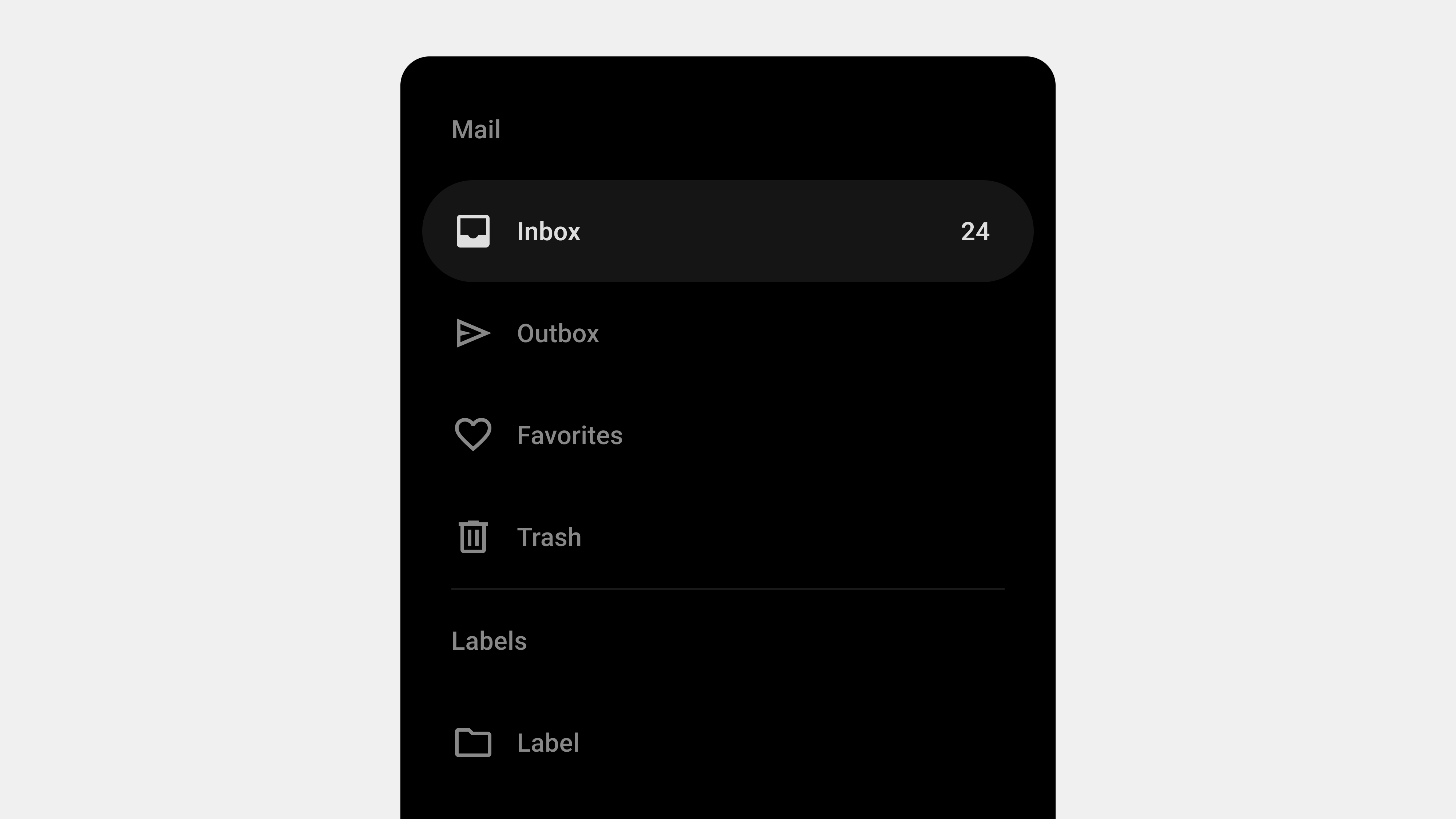
    A bottom navigation bar is a fixed UI element that sits at the bottom of the screen and provides quick access to an app’s core sections. It typically contains three to five items, each representing a primary app feature.

    Key Characteristics

    • Placement: Always visible at the bottom of the screen.
    • Icons and Labels: Combines visual icons with descriptive text for clarity.
    • Active State Indicators: Highlights the currently selected tab with color or style changes.

    Purpose

    • Simplifies navigation by offering direct access to primary features.
    • Enhances usability by keeping navigation within easy reach.
    • Reduces cognitive load by providing a consistent and predictable interface.

    2. Why Use Bottom Navigation Bars?

    Bottom navigation bars are especially effective for mobile apps because they align with natural thumb movement and ergonomic principles.

    Benefits

    • Accessibility: Positioned within thumb reach for one-handed use.
    • Consistency: Offers a uniform navigation structure across screens.
    • Discoverability: Ensures critical features are easy to find.
    • Task Switching: Allows users to switch between tasks without losing context.

    3. Key Components of a Bottom Navigation Bar

    A. Icons

    Icons visually represent each feature or section.

    • Use universally recognized symbols for clarity (e.g., a home icon for the homepage).
    • Ensure icons are visually distinct to avoid confusion.

    B. Labels

    Labels provide textual context for icons.

    • Keep labels concise, ideally one to two words.
    • Use familiar terms aligned with user expectations.

    C. Active State Indicators

    • Highlight the selected tab with bold text, color changes, or underlines.
    • Provide subtle animations for transitions between tabs.

    4. Best Practices for Designing Bottom Navigation Bars

    A. Keep It Simple

    • Limit tabs to three to five items.
    • Avoid overcrowding the navigation bar with too many options.

    B. Prioritize Core Features

    • Include only the most important app sections.
    • Move secondary features to an overflow menu if necessary.

    C. Use Intuitive Icons and Labels

    • Pair icons with descriptive labels for better clarity.
    • Test labels with users to ensure they align with expectations.

    D. Optimize for Accessibility

    • Use ARIA roles and labels for screen reader compatibility.
    • Ensure sufficient contrast between text/icons and the background.

    E. Provide Visual Feedback

    • Highlight the active tab to indicate the user’s current location.
    • Use animations to create smooth transitions between tabs.

    5. Common Types of Bottom Navigation Bars

    A. Standard Bottom Navigation Bar

    • Features fixed tabs for primary app sections.
    • Ideal for apps with up to five core features.

    B. Scrollable Bottom Navigation Bar

    • Allows users to scroll horizontally to access additional tabs.
    • Useful for apps with multiple content categories.

    C. Dynamic Bottom Navigation Bar

    • Adjusts its content based on user roles, preferences, or app states.
    • Enhances personalization and context awareness.

    D. Floating Bottom Navigation Bar

    • Positioned slightly above the bottom edge with rounded corners.
    • Adds a modern aesthetic and reduces visual clutter.

    6. Examples of Effective Bottom Navigation Bars

    A. Instagram

    • Tabs: Home, Search, Reels, Shop, Profile.
    • Why It Works: Combines clear icons, concise labels, and a visually appealing design.

    B. YouTube

    • Tabs: Home, Explore, Subscriptions, Library.
    • Why It Works: Organizes features effectively with clear active state indicators.

    C. Spotify

    • Tabs: Home, Search, Library.
    • Why It Works: Keeps navigation minimal and focused on core features.

    7. Challenges in Designing Bottom Navigation Bars

    A. Overcrowding

    • Including too many tabs can overwhelm users.
    • Solution: Prioritize essential features and group secondary ones into an overflow menu.

    B. Ambiguous Icons or Labels

    • Poorly designed icons or unclear labels can confuse users.
    • Solution: Use familiar icons and test labels with real users.

    C. Poor Accessibility

    • Lack of accessibility features excludes users with disabilities.
    • Solution: Follow WCAG guidelines and test with assistive technologies.

    8. Tools for Designing and Developing Bottom Navigation Bars

    Design Tools

    • Figma: For prototyping and designing interactive navigation bars.
    • Adobe XD: For creating and testing animations and transitions.

    Development Tools

    • React Native: For cross-platform implementation.
    • Flutter: For creating dynamic, responsive navigation bars.

    Testing Tools

    • BrowserStack: For cross-device and cross-browser compatibility testing.
    • Axe Accessibility Checker: For accessibility audits.

    Conclusion

    Bottom navigation bars are essential for creating intuitive and efficient navigation in mobile apps. By focusing on simplicity, accessibility, and user-centered design, you can ensure your navigation bar enhances usability and meets user expectations. Whether it’s a standard navigation bar or a dynamic, personalized one, a well-designed bottom navigation bar is a cornerstone of successful app design.


  • 바텀 내비게이션 바 – 1. 개요

    바텀 내비게이션 바 – 1. 개요

    바텀 내비게이션 바(Bottom Navigation Bar): 사용성과 설계 가이드

    바텀 내비게이션 바(Bottom Navigation Bar)는 모바일 애플리케이션 설계에서 핵심적인 UI 컴포넌트로, 사용자가 주요 화면과 기능에 쉽게 접근할 수 있도록 돕는다. 특히 손쉬운 탐색과 화면 공간의 효율적 활용이 중요한 모바일 환경에서 바텀 내비게이션 바는 필수적인 요소로 자리 잡았다. 이번 글에서는 바텀 내비게이션 바의 정의, 역할, 설계 원칙, 그리고 구현 시 고려해야 할 점을 1500단어 이상으로 상세히 설명한다.


    1. 바텀 내비게이션 바란 무엇인가?

    정의

    바텀 내비게이션 바는 화면 하단에 고정된 탐색 UI 컴포넌트로, 사용자가 주요 화면 간을 빠르게 전환할 수 있도록 돕는다.

    • 위치: 항상 화면 하단에 고정.
    • 구성 요소: 아이콘, 텍스트 라벨, 활성화 상태 표시.
    • 주요 특징: 화면 전환의 직관성, 모바일 터치 최적화.

    역할

    1. 주요 기능 접근: 사용자가 서비스의 핵심 화면에 빠르게 접근할 수 있도록 설계.
    2. 현재 위치 표시: 사용자가 현재 탐색 중인 화면을 명확히 알 수 있도록 시각적 피드백 제공.
    3. 탐색 간소화: 복잡한 메뉴 구조 없이, 최소한의 터치로 주요 화면 전환 가능.

    2. 바텀 내비게이션 바 설계 원칙

    1) 사용자 중심의 정보 구조 설계

    • 핵심 기능만 포함: 자주 사용하는 3~5개의 메뉴를 탭으로 배치.
    • 순서의 논리성: 사용자의 탐색 흐름에 따라 메뉴를 배치.
    • 예: 홈 → 검색 → 알림 → 프로필.

    2) 직관적이고 간결한 디자인

    • 명확한 아이콘과 텍스트 라벨: 아이콘은 의미를 직관적으로 전달하고, 텍스트는 이를 보완.
    • 활성화 상태 표시: 선택된 탭은 색상, 밑줄, 아이콘 변화 등을 통해 강조.
    • 심플한 레이아웃: 불필요한 장식은 배제하고 간결하게 설계.

    3) 반응형 설계

    • 다양한 화면 크기에 대응: 모바일 디바이스마다 다른 해상도와 비율을 고려해 레이아웃 최적화.
    • 터치 스크린 친화적 설계: 터치 영역을 48px 이상으로 설정해 실수 클릭 방지.

    4) 접근성 강화

    • 스크린 리더 지원: ARIA 속성을 사용해 스크린 리더가 메뉴와 상태를 설명할 수 있도록 설정.
    • 색상 대비: 텍스트와 배경 간 충분한 대비를 제공해 시각적 접근성 강화.

    3. 바텀 내비게이션 바의 주요 구성 요소

    1) 아이콘

    • 역할: 메뉴의 기능을 시각적으로 나타냄.
    • 설계 팁: 직관적인 벡터 아이콘을 사용하며, 크기는 24px로 설정.

    2) 텍스트 라벨

    • 역할: 아이콘의 의미를 보완하며, 특히 직관성이 떨어질 수 있는 아이콘을 설명.
    • 설계 팁: 간결한 텍스트(2~3글자)를 사용하며, 글자 크기는 12~14px로 설정.

    3) 활성화 상태 표시

    • 역할: 현재 선택된 메뉴를 강조해 사용자에게 명확한 피드백 제공.
    • 설계 팁: 색상 변화, 아이콘 채우기, 밑줄 등으로 활성화된 탭을 강조.

    4) 애니메이션

    • 역할: 메뉴 전환 시 부드럽고 자연스러운 화면 전환 제공.
    • 설계 팁: 전환 애니메이션은 0.3~0.5초로 설정해 자연스러운 경험 제공.

    4. 바텀 내비게이션 바 설계 시 고려 사항

    1) 화면 전환 간소화

    • 각 탭을 선택했을 때 즉시 화면이 전환되도록 설계.
    • 전환 속도를 빠르게 유지해 사용자 경험 저하 방지.

    2) 터치 및 클릭 테스트

    • 터치 영역이 충분히 확보되었는지 확인.
    • 탭 전환 시 중복 클릭으로 인해 오류가 발생하지 않도록 설계.

    3) 성능 최적화

    • CSS 애니메이션은 GPU를 활용해 성능 저하를 방지.
    • 지연 로딩을 적용해 초기 로딩 시간을 단축.

    4) 브랜드 정체성 반영

    • 서비스의 브랜드 색상, 아이콘 스타일, 폰트 등을 탭 바 디자인에 반영.
    • 브랜드 톤앤매너와 일치하는 심플한 디자인 유지.

    5) 다양한 언어와 텍스트 길이 대응

    • 다국어 지원 시 텍스트 길이가 길어질 가능성을 고려해 레이아웃 조정.
    • 한국어, 영어, 일본어 등 주요 언어에 대해 텍스트 크기를 미리 테스트.

    5. 바텀 내비게이션 바 QA 체크리스트

    1) 기능 테스트

    • 모든 탭이 올바른 화면으로 연결되는지 확인.
    • 활성화 상태가 제대로 표시되는지 점검.

    2) 반응형 테스트

    • 다양한 화면 크기와 해상도에서 탭 바가 정상적으로 표시되는지 확인.
    • 가로모드 및 회전 시에도 UI가 깨지지 않는지 검증.

    3) 접근성 테스트

    • 스크린 리더를 사용해 모든 메뉴와 상태를 명확히 설명하는지 점검.
    • 키보드 탐색이 가능한지 확인.

    4) 성능 테스트

    • 탭 전환 시 속도가 느리지 않고, 애니메이션이 부드럽게 작동하는지 확인.

    5) 오류 처리 테스트

    • 잘못된 URL로 연결되거나 네트워크가 느린 환경에서도 탭 바가 정상 작동하는지 확인.

    6. 성공적인 바텀 내비게이션 바 사례

    1) 인스타그램

    • 특징: 하단 고정형 바텀 내비게이션 바로 홈, 검색, 알림, 프로필 등을 포함.
    • 장점: 간결하고 직관적인 디자인으로 사용자 경험 강화.

    2) 유튜브

    • 특징: 하단 바를 통해 홈, Shorts, 구독 등 주요 메뉴에 빠르게 접근 가능.
    • 장점: 아이콘과 텍스트 라벨의 조화로운 설계.

    3) 페이스북

    • 특징: 홈, 그룹, 알림, 설정 등을 포함한 하단 내비게이션 바 제공.
    • 장점: 활성화 상태 표시와 일관된 디자인 유지.

    결론

    바텀 내비게이션 바는 모바일 애플리케이션에서 사용자 경험을 개선하는 핵심 UI 컴포넌트다. 주요 기능 접근성, 탐색 간소화, 브랜드 정체성을 강화하기 위해 설계 단계에서부터 사용성을 철저히 고려해야 한다. 명확한 정보 구조, 반응형 설계, 접근성 강화, 그리고 세심한 QA 과정을 거치면, 모든 사용자가 만족할 수 있는 바텀 내비게이션 바를 구현할 수 있다.


  • Navigation Drawers – 11. Final

    Navigation Drawers – 11. Final

    The Complete Guide to Navigation Drawers: Wrap-Up

    Navigation drawers are a critical component of modern digital interfaces, offering a clean and efficient way to organize menus and navigation elements. Over the course of our exploration, we have delved into various aspects of navigation drawers, including their definition, roles, key types, UX writing best practices, design considerations, development essentials, and QA testing. This comprehensive guide summarizes all the important points to create a cohesive understanding of navigation drawers, their design, implementation, and testing.


    1. What Is a Navigation Drawer?

    Navigation drawers are collapsible side panels used in digital interfaces to organize and provide access to navigation elements. They are particularly popular in mobile and web applications due to their ability to save space while maintaining functionality.

    Key Features

    • Expandable and Collapsible: Hidden by default and activated via gestures or buttons.
    • Space Efficient: Keeps the interface clean by storing secondary options.
    • Scalable: Handles large or hierarchical navigation structures effectively.

    Primary Role

    Navigation drawers serve as a tool for organizing content, enabling users to navigate complex interfaces with ease.


    2. Designing Navigation Drawers: User-Centered Best Practices

    Creating an effective navigation drawer begins with a focus on the user. The design must prioritize simplicity, accessibility, and responsiveness.

    Key Considerations

    1. Clarity and Simplicity: Use clear, concise labels and group related items logically.
    2. Accessibility: Ensure compatibility with screen readers, keyboard navigation, and focus management.
    3. Responsive Design: Adapt layouts for mobile, tablet, and desktop devices.
    4. Feedback and Cues: Highlight active states, provide visual feedback, and use smooth animations.
    5. Scalability: Design for future growth, accommodating new features seamlessly.

    UX Writing for Navigation Drawers

    Labels play a vital role in user experience. Clear and action-oriented labels such as “Profile” or “Track Order” align with user expectations, improving navigation efficiency.


    3. Types of Navigation Drawers

    Navigation drawers come in various forms, each tailored to specific use cases.

    Primary Types

    1. Standard (Temporary): Hidden by default and overlays the main content. Ideal for mobile apps.
    2. Persistent: Always visible alongside the content, suitable for larger screens.
    3. Mini Variant: Collapsible design showing only icons when closed.
    4. Bottom Drawer: Slides up from the bottom, optimized for mobile ergonomics.
    5. Modal Drawer: Focused interaction with a dimmed background for emphasis.

    Each type addresses different user needs, balancing space efficiency and usability.


    4. Developing and Publishing Navigation Drawers

    Key Development Considerations

    1. Performance Optimization: Use lazy loading, CSS transitions, and minimize JavaScript dependencies.
    2. Dynamic Content Handling: Fetch content dynamically and handle errors gracefully.
    3. Responsiveness: Implement layouts that adapt seamlessly to various screen sizes and devices.
    4. Cross-Platform Compatibility: Test the drawer on all major browsers and devices to ensure consistent performance.
    5. Accessibility Compliance: Incorporate ARIA roles, focus management, and keyboard navigation.

    Tips for Developers

    • Use semantic HTML for better screen reader support.
    • Test gestures and interactions on both mobile and desktop devices.

    5. QA Testing for Navigation Drawers

    Quality assurance ensures that navigation drawers function reliably across all scenarios.

    Focus Areas

    1. Functional Testing: Validate all links, buttons, and dropdowns.
    2. Performance Testing: Measure response times for opening, closing, and loading dynamic content.
    3. Accessibility Testing: Ensure compatibility with assistive technologies like screen readers.
    4. Error Handling: Test fallback behaviors for broken links or failed API requests.
    5. Cross-Browser and Device Testing: Verify consistency across devices, orientations, and browsers.

    Tools for QA

    • Lighthouse: For performance and accessibility audits.
    • BrowserStack: For cross-browser and device testing.
    • Axe Accessibility Checker: For in-depth accessibility testing.

    6. Combining Design, Development, and QA

    The success of a navigation drawer relies on the collaboration between designers, developers, and QA teams. Each role contributes to the process:

    • Designers focus on creating intuitive layouts and labels.
    • Developers implement responsive, scalable, and accessible code.
    • QA Teams ensure functionality, usability, and reliability through rigorous testing.

    By aligning efforts across these teams, you can create navigation drawers that not only meet user expectations but also drive engagement and satisfaction.


    Conclusion

    Navigation drawers are more than just a functional component—they are a strategic tool for organizing content and enhancing user experiences. From their design and development to rigorous QA testing, each step in the process requires attention to detail and user-centric thinking. By following the principles and best practices outlined in this guide, you can create navigation drawers that are intuitive, accessible, and scalable, ensuring long-term success for your applications.


  • 내비게이션 드로어 – 11. 종합

    내비게이션 드로어 – 11. 종합

    내비게이션 드로어 완벽 가이드: 설계부터 QA까지

    내비게이션 드로어는 사용자 경험(UX) 설계에서 빼놓을 수 없는 핵심 UI 컴포넌트다. 공간을 효율적으로 활용하면서 사용자가 서비스의 주요 기능과 콘텐츠에 빠르게 접근할 수 있도록 돕는다. 이번 글에서는 내비게이션 드로어 설계, 퍼블리싱/개발, QA, 그리고 UX 라이팅까지 다방면에서 작성했던 내용을 종합적으로 정리하고, 성공적인 내비게이션 드로어 구현을 위한 포괄적인 가이드를 제공한다.


    1. 내비게이션 드로어란 무엇인가?

    정의

    내비게이션 드로어(Navigation Drawer)는 화면의 한쪽에서 슬라이드로 나타나는 탐색 UI다. 사용자가 메뉴 아이콘 클릭, 스와이프 등의 동작을 통해 열고 닫으며, 주요 메뉴, 설정, 사용자 프로필 등 다양한 기능을 제공한다.

    역할

    1. 공간 절약: 작은 화면에서도 탐색 경험을 효율적으로 제공.
    2. 정보 구조화: 계층적 메뉴 구성을 통해 복잡한 정보도 간단히 정리.
    3. 브랜드 강화: 드로어를 통해 서비스의 브랜드 정체성을 표현.

    2. 설계 시 고려해야 할 핵심 요소

    1) 정보 구조와 계층 설계

    • 메뉴는 사용자 우선순위에 따라 상단부터 배치하고, 불필요한 항목은 최소화한다.
    • 관련 항목은 그룹화하고, 하위 메뉴는 확장형으로 제공해 혼란을 줄인다.

    2) 반응형 설계와 디바이스 적응성

    • 모바일에서는 햄버거 메뉴와 슬라이드 방식, 데스크탑에서는 고정형 드로어를 사용한다.
    • 모든 디바이스에서 일관된 경험을 제공하기 위해 브레이크포인트를 와이어프레임에 포함시킨다.

    3) 접근성과 사용성 강화

    • 키보드 탐색, 스크린 리더 지원, 색상 대비 강화 등을 통해 WCAG 기준을 충족한다.
    • 드로어 열림/닫힘 시 포커스 이동을 명확히 설정한다.

    3. UX 라이팅: 명료한 용어 선택

    1) 사용자 중심의 표현

    • 기술 용어 대신 사용자에게 익숙한 단어를 사용(예: ‘리소스’ → ‘자료실’).
    • 동사를 활용해 행동을 유도하는 메뉴 이름 작성(예: ‘문의’ → ‘문의하기’).

    2) 간결한 텍스트

    • 메뉴 이름은 3~4글자로 간결하게 작성하고, 의미를 명확히 전달한다(예: ‘설정 메뉴’ → ‘설정’).

    3) 테스트 기반 개선

    • A/B 테스트와 클릭 데이터를 통해 메뉴 용어의 효과를 검증하고 개선한다.

    4. 퍼블리싱/개발 시 주의점

    1) 반응형 설계와 크로스 브라우저 호환성

    • CSS 미디어 쿼리를 사용해 디바이스별로 적합한 드로어 크기와 레이아웃을 제공한다.
    • 주요 브라우저 간 스타일 차이를 제거하기 위해 CSS Reset과 최신 레이아웃 기술을 활용한다.

    2) 성능 최적화

    • 드로어 애니메이션을 GPU 가속으로 구현하고, 리소스는 지연 로딩하여 로딩 속도를 단축한다.

    3) 유지보수 가능한 코드 작성

    • React, Vue와 같은 컴포넌트 기반 프레임워크를 활용해 재사용성을 높인다.
    • CSS는 BEM(Block Element Modifier) 방법론을 사용해 가독성과 유지보수성을 강화한다.

    5. QA에서의 철저한 검증

    1) 기능 테스트

    • 모든 메뉴 항목과 링크가 예상대로 작동하며, 깨진 링크가 없는지 확인한다.

    2) 반응형 설계와 디바이스 테스트

    • 다양한 화면 크기와 브라우저에서 드로어의 레이아웃과 동작을 검증한다.

    3) 접근성 테스트

    • NVDA, VoiceOver 같은 스크린 리더를 사용해 드로어의 접근성을 검증한다.
    • WAVE 도구로 색상 대비와 키보드 탐색 문제를 점검한다.

    6. 성공적인 내비게이션 드로어 사례

    1) 구글 드라이브

    • 좌측 오버레이 드로어를 사용해 계층적 폴더 구조와 파일 탐색을 지원.

    2) 네이버

    • 모바일에서 햄버거 메뉴를 통해 주요 서비스(카페, 블로그 등)로의 탐색을 제공.

    3) 쿠팡

    • 드로어를 통해 개인화된 추천 상품, 주문 내역 등 사용자 맞춤 경험 제공.

    7. 드로어 설계와 운영을 위한 체크리스트

    1. 정보 구조가 명확한가?
    2. 모든 디바이스에서 반응형으로 동작하는가?
    3. 접근성이 충분히 고려되었는가?
    4. UX 라이팅이 사용자 관점에서 명확한가?
    5. 성능과 유지보수성을 확보했는가?

    결론

    내비게이션 드로어는 서비스의 탐색 효율성과 사용자 경험을 결정짓는 중요한 UI 컴포넌트다. 성공적인 드로어 구현을 위해 설계, 퍼블리싱, QA, UX 라이팅을 모두 철저히 고려해야 한다. 명확한 정보 구조, 접근성 강화, 반응형 설계, 그리고 사용자 관점에서의 용어 선택은 드로어의 완성도를 높이고, 사용자가 더 나은 경험을 할 수 있도록 돕는다.


  • Navigation Drawers – 9. QA

    Navigation Drawers – 9. QA

    5 Key Considerations for QA Testing Navigation Drawers

    Navigation drawers are critical components of modern user interfaces, helping users navigate seamlessly through content and features. Given their importance, rigorous quality assurance (QA) testing is essential to ensure functionality, usability, and accessibility. This article outlines the five most important areas to focus on during QA for navigation drawers, providing practical insights and actionable tips for QA teams.


    1. Functional Testing

    Why It Matters

    The primary purpose of a navigation drawer is to enable users to access content and features efficiently. Broken links, unresponsive buttons, or improper animations can lead to user frustration and abandonment.

    Key Considerations

    • Link Validation: Ensure all links navigate to the correct destinations.
    • Interactive Elements: Verify that buttons, icons, and touch gestures work as expected.
    • Dropdowns and Submenus: Test nested menus for smooth opening and closing.

    Testing Checklist

    • Open and close the drawer using gestures, buttons, and keyboard shortcuts.
    • Verify that all menu items are clickable and functional.
    • Test dynamic elements like dropdowns or expandable sections.

    Example

    In a food delivery app, ensure that tapping “My Orders” navigates to the order history page, and submenus like “Past Orders” expand correctly.

    Tools

    • Selenium or Cypress for automated testing.
    • Browser DevTools for manual interaction testing.

    2. Cross-Platform and Cross-Browser Compatibility

    Why It Matters

    Users access navigation drawers on a variety of devices and browsers. Ensuring compatibility across platforms is crucial for a consistent experience.

    Key Considerations

    • Browser Testing: Verify functionality in major browsers like Chrome, Firefox, Safari, and Edge.
    • Device Testing: Test responsiveness on different devices, including mobile, tablet, and desktop.
    • Orientation Changes: Ensure the drawer behaves properly when switching between portrait and landscape modes.

    Testing Checklist

    • Check for consistent rendering across browsers and devices.
    • Test swipe gestures on mobile and click functionality on desktop.
    • Verify that the drawer adapts to screen orientation changes.

    Example

    In a streaming app, ensure the drawer is fully functional when accessed on Chrome (desktop), Safari (iPhone), and Firefox (Android).

    Tools

    • BrowserStack or Sauce Labs for cross-browser testing.
    • Real-device testing for accurate results.

    3. Accessibility Testing

    Why It Matters

    Navigation drawers must be accessible to all users, including those with disabilities. Ignoring accessibility can lead to usability issues and potential legal implications.

    Key Considerations

    • Keyboard Navigation: Test if users can open, close, and navigate the drawer using only a keyboard.
    • Screen Reader Compatibility: Ensure all elements are readable and labeled correctly for screen readers.
    • Focus Management: Verify that focus shifts to the drawer when it opens and returns to the toggle button when it closes.

    Testing Checklist

    • Navigate through the drawer using the Tab and Shift+Tab keys.
    • Test with screen readers like NVDA, VoiceOver, or JAWS.
    • Check focus indicators for visibility and functionality.

    Example

    In a banking app, confirm that pressing Tab moves through each menu item in the correct order and announces labels like “Accounts” and “Transfers.”

    Tools

    • Axe Accessibility Checker.
    • Lighthouse Accessibility Audit.

    4. Performance Testing

    Why It Matters

    Navigation drawers are often used on every page, making their performance critical to the overall user experience. Slow loading or laggy animations can frustrate users and lead to disengagement.

    Key Considerations

    • Load Speed: Measure how quickly the drawer opens and closes.
    • Dynamic Content: Test the performance of dynamically loaded sections.
    • Heavy Traffic: Simulate multiple users interacting with the drawer simultaneously.

    Testing Checklist

    • Measure response times for interactions like opening, closing, and navigating.
    • Test the drawer under slow network conditions.
    • Analyze performance during high traffic or peak usage scenarios.

    Example

    In a retail app, ensure the drawer loads personalized recommendations within 2 seconds, even on slow networks.

    Tools

    • Apache JMeter for load testing.
    • Lighthouse Performance Audit.

    5. Error Handling and Edge Case Testing

    Why It Matters

    Navigation drawers must handle unexpected inputs, errors, or failures gracefully to ensure a robust user experience.

    Key Considerations

    • Broken Links: Verify that the drawer responds appropriately to missing or incorrect links.
    • Dynamic Content Errors: Test how the drawer handles failures when fetching dynamic content.
    • Offline Mode: Ensure the drawer remains functional with offline or limited connectivity.

    Testing Checklist

    • Simulate 404 errors for missing pages linked in the drawer.
    • Test how the drawer behaves when API calls for dynamic content fail.
    • Check for proper error messages or fallback options in offline scenarios.

    Example

    In a project management app, ensure the drawer shows a clear error message if “Project Files” fails to load due to a server issue.

    Tools

    • Postman for API testing.
    • Chrome DevTools for offline simulation.

    Conclusion

    Quality assurance for navigation drawers is a multi-faceted process that involves testing functionality, compatibility, accessibility, performance, and error handling. By addressing these five critical areas, QA teams can ensure that navigation drawers are reliable, user-friendly, and inclusive. A well-tested navigation drawer enhances the overall user experience, building trust and satisfaction among users.


  • 내비게이션 드로어 – 10. QA

    내비게이션 드로어 – 10. QA

    내비게이션 드로어 QA 진행 시 유의해야 할 5가지 핵심 요소

    내비게이션 드로어는 사용자의 탐색 경험에 직접적으로 영향을 미치는 UI 컴포넌트다. 따라서 QA 단계에서 철저한 검증 과정을 거쳐야만 오류 없이 안정적으로 동작하는 드로어를 제공할 수 있다. 이번 글에서는 내비게이션 드로어 QA 진행 시 반드시 점검해야 할 다섯 가지 주요 요소를 상세히 다룬다.


    1. 기능 테스트: 모든 메뉴와 링크 검증

    중요성

    내비게이션 드로어의 핵심 역할은 메뉴를 통해 사용자가 원하는 페이지로 이동하도록 돕는 것이다. 모든 링크와 메뉴가 정상적으로 작동하지 않으면 사용자 경험이 크게 저하될 수 있다.

    검증 항목

    1. 메뉴 클릭 동작
      • 드로어의 모든 메뉴 항목이 클릭 가능한 상태인지 확인한다.
    2. 링크 유효성
      • 모든 메뉴 항목이 올바른 페이지로 연결되는지 점검한다.
      • 깨진 링크(404 오류) 여부를 확인한다.
    3. 드롭다운/하위 메뉴 작동
      • 확장형 메뉴가 올바르게 열리고 닫히는지 확인한다.

    검증 방법

    • 메뉴 하나하나를 클릭하며 작동 여부를 수동으로 테스트한다.
    • 자동화 테스트 도구(예: Selenium)로 링크 유효성을 검증한다.

    주의사항

    • 다국어 서비스를 제공하는 경우 각 언어별 메뉴 연결 상태를 확인한다.
    • 외부 링크는 페이지가 예상대로 열리는지 검증한다.

    2. 반응형 설계 및 디바이스 호환성 테스트

    중요성

    내비게이션 드로어는 다양한 화면 크기와 디바이스에서 일관된 사용자 경험을 제공해야 한다.

    검증 항목

    1. 화면 크기별 테스트
      • 모바일, 태블릿, 데스크탑 등 모든 디바이스에서 드로어가 정상적으로 작동하는지 확인.
    2. 브라우저 호환성
      • Chrome, Safari, Firefox, Edge 등 주요 브라우저에서 드로어가 동일하게 작동하는지 점검.
    3. 슬라이드 애니메이션
      • 드로어 열림/닫힘 애니메이션이 모든 화면 크기에서 부드럽게 작동하는지 확인.

    검증 방법

    • Chrome DevTools의 디바이스 시뮬레이터를 사용해 다양한 화면 크기를 테스트한다.
    • BrowserStack을 활용해 여러 브라우저 환경에서 테스트한다.

    주의사항

    • 모바일 환경에서 드로어 터치 영역이 충분히 넓은지 확인한다.
    • 데스크탑에서는 햄버거 메뉴 클릭과 마우스 오버가 제대로 작동하는지 검증한다.

    3. 접근성(A11Y) 테스트

    중요성

    접근성은 모든 사용자, 특히 장애를 가진 사용자에게 서비스를 제공하는 데 필수적인 요소다.

    검증 항목

    1. 스크린 리더 호환성
      • 드로어 열림/닫힘 상태를 스크린 리더가 올바르게 읽을 수 있는지 확인.
    2. 키보드 탐색 가능 여부
      • 키보드만으로 드로어의 모든 메뉴를 탐색할 수 있어야 한다.
    3. 색상 대비 및 텍스트 가독성
      • 메뉴 텍스트와 배경 간 충분한 색상 대비를 제공하는지 점검.

    검증 방법

    • NVDA, VoiceOver 등 스크린 리더를 사용해 드로어의 접근성을 테스트한다.
    • WAVE 도구로 색상 대비와 접근성 문제를 자동으로 분석한다.

    주의사항

    • 드로어가 열리면 포커스가 자동으로 첫 번째 메뉴 항목으로 이동하는지 확인한다.
    • 닫힐 때 포커스가 원래 위치로 돌아가는지 검증한다.

    4. 성능 테스트

    중요성

    내비게이션 드로어는 페이지 탐색에서 자주 호출되는 UI 컴포넌트이므로 성능 최적화가 중요하다.

    검증 항목

    1. 로드 시간
      • 드로어가 열릴 때와 닫힐 때의 반응 속도를 측정.
    2. 애니메이션 성능
      • 드로어 열림/닫힘 애니메이션이 끊김 없이 작동하는지 확인.
    3. 리소스 사용량
      • 드로어가 과도한 CPU/GPU 리소스를 사용하지 않는지 점검.

    검증 방법

    • Chrome DevTools의 성능 분석 기능을 활용해 애니메이션과 로드 시간을 측정한다.
    • Lighthouse로 전체 성능 점수를 확인한다.

    주의사항

    • 저속 네트워크 환경(3G)에서도 드로어가 원활히 작동하는지 확인한다.
    • 과도한 애니메이션 효과가 성능에 영향을 미치지 않도록 주의한다.

    5. 사용자 시나리오 기반 테스트

    중요성

    내비게이션 드로어는 사용자 여정에서 중요한 역할을 하므로, 실제 사용 시나리오를 기반으로 테스트해야 한다.

    검증 항목

    • 사용자 여정 테스트
    • 드로어를 통해 사용자가 주요 기능(예: 검색, 설정, 프로필 접근)을 수행할 수 있는지 점검.
    1. 에러 처리
      • 잘못된 메뉴나 링크 클릭 시 적절한 오류 메시지가 표시되는지 확인.
    2. 다국어 지원
      • 다국어 환경에서 메뉴 텍스트가 올바르게 표시되고, 레이아웃이 깨지지 않는지 확인.

    검증 방법

    • 사용자 여정을 따라가며 모든 메뉴와 기능을 수동으로 테스트한다.
    • 다국어 서비스를 제공하는 경우 각 언어 설정별로 테스트한다.

    주의사항

    • 비정상적인 상황(예: 서버 연결 실패)에서도 드로어가 정상적으로 작동하도록 검증.
    • 다국어 메뉴에서 글자 수 차이로 인해 레이아웃이 깨지지 않도록 확인.

    결론

    내비게이션 드로어는 사용자의 탐색 경험을 좌우하는 중요한 UI 컴포넌트로, QA 단계에서 기능, 반응형 설계, 접근성, 성능, 사용자 시나리오를 철저히 검증해야 한다. 이러한 요소를 충실히 점검하고 개선한다면, 내비게이션 드로어는 안정성과 신뢰성을 갖춘 완벽한 탐색 도구가 될 것이다.


  • Navigation Drawers – 9. Dev

    Navigation Drawers – 9. Dev

    5 Key Considerations for Publishing and Developing Navigation Drawers

    Navigation drawers are an essential part of modern UI design, providing a compact and efficient way to organize menus and navigation elements. While their design plays a vital role, successful implementation through publishing and development is equally critical. Poor execution can lead to usability issues, performance lags, or even accessibility barriers. This article outlines the top five considerations for publishing and developing navigation drawers, offering practical insights for developers and publishers to ensure optimal functionality and user experience.


    1. Performance Optimization

    Why It Matters

    Navigation drawers are used across multiple screens in an app or website. Poorly optimized drawers can slow down load times, negatively impacting the overall user experience.

    Key Considerations

    • Lazy Loading: Load secondary or less-used content only when the drawer is opened.
    • Minimize JavaScript: Avoid unnecessary JavaScript dependencies for animations or dynamic content.
    • Efficient CSS: Use clean and efficient CSS for styling to reduce rendering time.

    Implementation Tips

    • Use CSS transitions for animations instead of JavaScript for better performance.
    • Preload critical assets for smooth interaction.
    • Combine multiple API calls for dynamic content into a single request.

    Tools

    • Lighthouse for performance auditing.
    • Webpack or Rollup to bundle and minify assets.

    2. Responsiveness and Device Compatibility

    Why It Matters

    Navigation drawers must work seamlessly across a wide range of devices, from small-screen smartphones to large desktop monitors. Ensuring responsiveness is critical to maintaining a consistent user experience.

    Key Considerations

    • Responsive Breakpoints: Use media queries to define specific layouts for different screen sizes.
    • Mobile Optimization: Ensure touch targets are large enough for mobile interactions.
    • Cross-Browser Compatibility: Test the drawer’s functionality on all major browsers, including Chrome, Safari, Firefox, and Edge.

    Implementation Tips

    • Use a mobile-first approach when defining breakpoints.
    • Implement swipe gestures for mobile drawers while maintaining click/tap functionality.
    • Design persistent drawers for desktop applications where appropriate.

    Tools

    • BrowserStack for testing across devices and browsers.
    • Chrome DevTools for simulating various screen sizes.

    3. Accessibility Compliance

    Why It Matters

    Accessibility ensures that navigation drawers are usable for all users, including those with disabilities. Ignoring accessibility can alienate users and lead to legal consequences.

    Key Considerations

    • Keyboard Navigation: Users should be able to navigate the drawer using only a keyboard.
    • Screen Reader Support: Implement ARIA roles and labels to make the drawer content accessible via screen readers.
    • Focus Management: Automatically move focus to the drawer when it opens and return it to the toggle button when it closes.

    Implementation Tips

    • Use semantic HTML for the drawer’s structure (e.g., <nav> tags).
    • Highlight focusable elements and ensure focus indicators are visible.
    • Test the drawer with assistive technologies like NVDA or VoiceOver.

    Tools

    • Axe Accessibility Checker.
    • Lighthouse Accessibility Audit.

    4. Dynamic Content Handling

    Why It Matters

    Many modern applications rely on navigation drawers to display dynamic or personalized content. If not handled correctly, this can lead to performance issues or broken functionality.

    Key Considerations

    • Dynamic Loading: Fetch content only when required, rather than preloading everything.
    • Error Handling: Provide fallback options or error messages if dynamic content fails to load.
    • Caching: Cache frequently accessed content to improve load times.

    Implementation Tips

    • Use loading indicators for sections that fetch content dynamically.
    • Implement retry mechanisms for failed network requests.
    • Test how the drawer behaves in offline or low-connectivity scenarios.

    Example

    For a messaging app, load recent chats dynamically when the drawer opens, but show a placeholder if the content fails to load.


    5. Testing and Quality Assurance (QA)

    Why It Matters

    Even a well-designed navigation drawer can fail to meet user expectations without rigorous testing. QA ensures the drawer performs consistently across devices, browsers, and scenarios.

    Key Considerations

    • Functional Testing: Verify that all links, buttons, and dynamic content work correctly.
    • Performance Testing: Test the drawer’s performance under high traffic or slow network conditions.
    • Stress Testing: Ensure the drawer can handle large amounts of content without breaking.

    Implementation Tips

    • Create automated tests for common user actions, such as opening, closing, and navigating through the drawer.
    • Simulate various user behaviors, such as rapid opening/closing or switching devices mid-session.
    • Test accessibility features with real users or accessibility experts.

    Tools

    • Selenium or Cypress for automated testing.
    • Apache JMeter for load and stress testing.

    Conclusion

    Publishing and developing navigation drawers require a balance of performance optimization, responsiveness, accessibility, dynamic content handling, and rigorous testing. By addressing these five areas, developers and publishers can create navigation systems that meet user expectations and perform reliably across devices and scenarios. Proper implementation ensures not only a smoother user experience but also long-term scalability and maintainability.


  • 내비게이션 드로어 – 9. 퍼블/개발

    내비게이션 드로어 – 9. 퍼블/개발

    내비게이션 드로어 퍼블리싱/개발 시 유의해야 할 5가지 핵심 요소

    내비게이션 드로어는 사용자가 애플리케이션이나 웹사이트에서 주요 기능과 콘텐츠를 탐색할 수 있도록 돕는 UI 컴포넌트다. 이를 퍼블리싱하거나 개발할 때는 디자인과 UX 설계를 충실히 구현하는 동시에 기술적인 요구를 충족시켜야 한다. 이번 글에서는 내비게이션 드로어를 퍼블리싱/개발할 때 반드시 유의해야 할 다섯 가지 핵심 요소를 상세히 다룬다.


    1. 반응형 설계와 크로스 브라우저 호환성

    중요성

    드로어는 다양한 화면 크기와 브라우저에서 일관되게 작동해야 하므로 반응형 설계와 호환성을 철저히 고려해야 한다.

    구현 방법

    1. 반응형 레이아웃
      • 미디어 쿼리를 사용해 드로어의 크기와 위치를 조정한다.
      • 모바일에서는 슬라이드 방식, 데스크탑에서는 고정형 드로어를 기본값으로 적용한다.
    2. 크로스 브라우저 호환성
      • CSS Reset을 통해 브라우저 간 기본 스타일 차이를 제거한다.
      • 최신 CSS 레이아웃 기술(Flexbox, Grid)을 활용하되, 레거시 브라우저를 고려한 대안을 준비한다.
    3. 테스트 도구 활용
      • BrowserStack과 같은 크로스 브라우저 테스트 도구를 활용해 주요 브라우저에서의 작동 상태를 검증한다.

    주의사항

    • 다양한 화면 크기에서 드로어가 콘텐츠와 겹치거나 잘리는 일이 없도록 확인.
    • 터치 스크린 디바이스에서 슬라이드 기능이 매끄럽게 작동하는지 테스트.

    2. 접근성(A11Y) 준수

    중요성

    모든 사용자가 불편 없이 내비게이션 드로어를 탐색할 수 있도록 접근성을 강화해야 한다.

    구현 방법

    1. ARIA 속성 적용
      • 드로어에 aria-hidden, aria-expanded, role="navigation" 등을 추가해 스크린 리더가 상태를 인식할 수 있도록 한다.
    2. 키보드 탐색 지원
      • tabindex를 설정해 키보드로 드로어의 모든 메뉴를 탐색할 수 있도록 한다.
    3. 색상 대비
      • 텍스트와 배경의 색상 대비를 WCAG 기준(4.5:1 이상)에 맞춘다.

    테스트 도구

    • WAVE(Web Accessibility Evaluation Tool)와 같은 접근성 테스트 도구로 자동 검증.
    • 실제 스크린 리더(NVDA, VoiceOver 등)를 사용해 접근성을 점검.

    주의사항

    • 드로어가 열리고 닫힐 때 포커스가 적절히 이동하는지 확인.
    • 장애 사용자의 피드백을 반영해 문제점을 지속적으로 개선.

    3. 성능 최적화

    중요성

    드로어는 페이지 로딩 시 가장 자주 호출되는 UI 컴포넌트 중 하나로, 성능 최적화가 필수다.

    구현 방법

    1. CSS와 JavaScript 최적화
      • CSS는 필요한 스타일만 포함하고, JavaScript는 동적 호출로 성능을 최적화한다.
      • 애니메이션은 GPU를 활용해 렌더링 속도를 높인다(예: transform, opacity 사용).
    2. 지연 로딩
      • 드로어가 열릴 때만 필요한 리소스를 로드하여 초기 로딩 시간을 단축한다.
    3. 캐싱 활용
      • 자주 사용되는 드로어 리소스를 캐싱해 재로딩 시간을 줄인다.

    테스트 방법

    • Lighthouse나 WebPageTest를 사용해 로딩 시간과 애니메이션 성능을 점검.

    주의사항

    • 애니메이션 효과가 과도해 CPU/GPU 성능을 저하시키지 않도록 주의.
    • 불필요한 API 호출을 줄여 네트워크 부하를 최소화.

    4. 유지보수 가능한 코드 구조

    중요성

    드로어는 서비스 전반에서 반복적으로 사용되므로, 코드의 재사용성과 유지보수성을 높이는 것이 중요하다.

    구현 방법

    1. 컴포넌트 기반 설계
      • React, Vue와 같은 프레임워크를 활용해 드로어를 독립적인 컴포넌트로 설계한다.
    2. BEM 방법론 사용
      • CSS 클래스 이름을 Block, Element, Modifier 구조로 명명해 가독성과 유지보수를 강화한다.
      • 예: .drawer__item--active
    3. 모듈화된 JavaScript
      • 각 기능(예: 드로어 열림, 닫힘, 애니메이션)을 독립적인 모듈로 작성한다.

    주의사항

    • 코드 리뷰를 통해 일관된 스타일을 유지.
    • Lint 도구(ESLint, Stylelint 등)를 사용해 코드 품질을 검증.

    5. 사용자 시나리오 기반 테스트

    중요성

    드로어는 사용자 여정의 중심에 있는 컴포넌트로, 다양한 시나리오에서 정상 작동해야 한다.

    구현 방법

    1. UI 테스트
      • 다양한 화면 크기와 브라우저에서 드로어의 레이아웃이 깨지지 않도록 검증.
    2. 기능 테스트
      • 드로어의 모든 메뉴가 올바른 페이지로 연결되는지 확인.
    3. 접근성 테스트
      • 키보드 탐색과 스크린 리더 사용 시 문제가 없는지 점검.
    4. 성능 테스트
      • 드로어 열림/닫힘 동작이 지연 없이 부드럽게 작동하는지 확인.

    테스트 도구

    • Chrome DevTools: 실시간 디버깅 및 성능 분석.
    • BrowserStack: 다양한 디바이스와 브라우저에서 테스트.

    주의사항

    • 네트워크가 느린 환경에서도 드로어가 정상 작동하도록 검증.
    • 오류 상황(예: 서버 연결 문제)에서도 사용자 경험이 유지되는지 확인.

    결론

    내비게이션 드로어는 사용자 경험과 탐색 효율성을 높이는 핵심 UI 컴포넌트다. 이를 퍼블리싱하고 개발할 때는 반응형 설계, 접근성 강화, 성능 최적화, 유지보수 가능한 코드 구조, 그리고 철저한 테스트가 필요하다. 이러한 요소를 충실히 반영하면, 내비게이션 드로어는 사용자와 서비스 간의 원활한 연결 고리가 될 것이다.


  • Navigation Drawers – 8. UX Writing

    Navigation Drawers – 8. UX Writing

    UX Writing for Navigation Drawers: Crafting Clear and User-Friendly Labels

    Navigation drawers are a versatile tool in modern UI design, offering a clean way to organize complex menus while optimizing space. However, the success of a navigation drawer depends not only on its structure but also on the clarity and intuitiveness of its labels. UX writing plays a crucial role in ensuring users can easily understand and navigate the drawer’s options. This article focuses on how to craft clear, concise, and user-centric labels for navigation drawers, providing practical examples and best practices.


    1. The Role of UX Writing in Navigation Drawers

    UX writing is about creating text that guides users through an interface effortlessly. For navigation drawers, it ensures that users can quickly locate features and understand their purpose without confusion or guesswork.

    Why It Matters

    • Efficiency: Clear labels reduce the time users spend searching for features.
    • Usability: Intuitive text enhances the overall experience.
    • Consistency: Uniform language builds trust and familiarity.

    Example

    Instead of using vague terms like “Options” or “Things to Do,” opt for descriptive labels like “Settings” or “Task Manager.”


    2. Principles of Effective UX Writing for Navigation Drawers

    A. Clarity Over Creativity

    Users value clarity more than creative or quirky language. Avoid jargon, idioms, or ambiguous terms that could confuse users.

    Good Examples:

    • Use “Profile” instead of “My Corner.”
    • Use “Cart” instead of “Bag of Goods.”

    Why It Works:

    Clear, familiar terms help users understand options at a glance.


    B. Use Action-Oriented Labels

    Action-oriented labels help users understand what they can do within a section.

    Good Examples:

    • Use “Start Order” instead of “Ordering.”
    • Use “Track Shipment” instead of “Shipping Info.”

    Why It Works:

    Action-oriented labels align with user intent, guiding them toward their goals.


    C. Prioritize the User’s Mental Model

    Align labels with how users think about tasks and features. Conduct user research to understand their expectations and terminology.

    Good Examples:

    • “Watchlist” for saved media in a streaming app.
    • “Favorites” for saved items in an e-commerce app.

    Why It Works:

    Matching users’ mental models makes navigation intuitive.


    D. Keep It Short and Scannable

    Navigation drawer labels should be concise and scannable. Long phrases increase cognitive load and make navigation slower.

    Good Examples:

    • “Home” instead of “Return to Home Page.”
    • “Orders” instead of “Order History and Details.”

    Why It Works:

    Short labels are easier to read, especially on mobile devices.


    E. Consistency Across the Interface

    Use consistent terminology throughout the app or platform to avoid confusion.

    Good Examples:

    • If the main navigation says “Cart,” don’t call it “Basket” elsewhere.
    • If you use “Notifications” in one place, avoid “Alerts” or “Updates” elsewhere.

    Why It Works:

    Consistency reinforces user understanding and trust.


    3. Common Navigation Drawer Categories and Their Optimal Labels

    A. Home and General Navigation

    • Optimal Labels: Home, Dashboard, Explore.
    • Why It Works: These terms are widely recognized and intuitive.

    B. User Actions and Profiles

    • Optimal Labels: Profile, Settings, Log Out.
    • Why It Works: They clearly indicate user-specific functions.

    C. E-Commerce

    • Optimal Labels: Shop, Cart, Wishlist, Orders.
    • Why It Works: These terms directly reflect typical e-commerce actions.

    D. Content Platforms

    • Optimal Labels: Library, Favorites, Categories, Recommendations.
    • Why It Works: These terms align with how users organize and discover content.

    4. Testing and Refining Navigation Drawer Labels

    UX writing is an iterative process. Testing ensures that your labels resonate with users and align with their expectations.

    A. Conduct Usability Testing

    • Use A/B testing to evaluate different label options.
    • Ask users to locate specific features and observe their behavior.

    B. Analyze Metrics

    • Monitor click-through rates and time spent navigating.
    • Identify labels that cause confusion or low engagement.

    C. Gather Feedback

    • Collect user feedback through surveys or interviews.
    • Incorporate their suggestions into your next iteration.

    5. Examples of Excellent UX Writing for Navigation Drawers

    A. Google Drive

    • Labels: My Drive, Shared with Me, Recent, Trash.
    • Why It Works: Combines simplicity with functionality, using terms users easily understand.

    B. Netflix

    • Labels: Home, New & Popular, My List, Settings.
    • Why It Works: Prioritizes commonly used actions and personalized options.

    C. Shopify

    • Labels: Dashboard, Orders, Products, Marketing, Analytics.
    • Why It Works: Uses direct, action-oriented language suited for business owners.

    6. Common Pitfalls to Avoid

    A. Ambiguous Labels

    • Issue: Users can’t predict what the label means.
    • Fix: Use descriptive terms, e.g., replace “Stuff” with “Documents.”

    B. Overloading with Options

    • Issue: Too many items overwhelm users.
    • Fix: Group items into categories or collapsible menus.

    C. Ignoring Localization

    • Issue: Terms don’t translate well for international users.
    • Fix: Use universally understood terms or localize effectively.

    Conclusion

    Crafting clear and user-friendly labels for navigation drawers is a critical part of UX writing. By focusing on clarity, action-oriented language, and user mental models, you can create a navigation system that enhances usability and meets user expectations. Consistent testing and iteration ensure that your labels remain relevant and effective over time. A well-written navigation drawer not only improves navigation but also strengthens the overall user experience.


  • 내비게이션 드로어 – 8. UX 라이팅

    내비게이션 드로어 – 8. UX 라이팅

    내비게이션 드로어 UX 라이팅: 명확하고 사용자 중심의 용어 사용하기

    내비게이션 드로어(Navigation Drawer)는 사용자와 서비스 간의 탐색 경험을 연결하는 중요한 UI 컴포넌트다. 그러나 드로어의 디자인과 기능이 완벽하더라도 메뉴 항목의 텍스트(UX 라이팅)가 명확하지 않으면 사용자는 혼란을 느낄 수 있다. UX 라이팅은 사용자가 내비게이션 드로어를 직관적으로 이해하고 효율적으로 사용할 수 있도록 돕는 핵심 요소다. 이번 글에서는 내비게이션 드로어 UX 라이팅의 중요성과, 한국어 환경에서 가장 명료한 용어를 선택하는 방법을 다룬다.


    1. UX 라이팅에서 명료성이 중요한 이유

    사용자 기대

    사용자는 내비게이션 드로어를 통해 원하는 정보를 쉽게 찾고, 탐색 과정에서 혼란을 느끼지 않기를 기대한다.

    • 즉각적인 이해: 메뉴 이름만 보고도 해당 항목의 기능이나 목적을 예측할 수 있어야 한다.
    • 일관성 유지: 전체 서비스에서 동일한 의미를 가진 단어가 일관되게 사용되어야 한다.

    UX 라이팅이 미치는 영향

    • 사용자는 명확한 용어를 통해 탐색 시간을 단축하고, 더 나은 경험을 누릴 수 있다.
    • 혼란스러운 용어 사용은 사용자 만족도를 낮추고, 이탈률을 높일 수 있다.

    2. 한국어 UX 라이팅의 원칙

    1) 사용자 관점의 표현

    • 기술 용어 지양: 사용자가 익숙하지 않은 전문 용어나 복잡한 표현은 피한다.
    • 예: ‘리소스 관리’ 대신 ‘자료실’
    • 일상적인 단어 사용: 한국어 사용자가 자주 접하는 표현을 선택한다.
    • 예: ‘대시보드’ 대신 ‘메인 화면’

    2) 행동을 유도하는 동사 사용

    • 동사 기반 표현: 메뉴 이름에 동사를 사용해 사용자의 행동을 유도한다.
    • 예: ‘문의’ 대신 ‘문의하기’, ‘파일’ 대신 ‘파일 업로드’
    • 명확한 동작 지시: 사용자가 클릭했을 때 무엇이 발생하는지 예측 가능해야 한다.
    • 예: ‘저장’ → ‘파일 저장하기’, ‘공유’ → ‘링크 공유하기’

    3) 간결하고 짧은 텍스트

    • 3~4글자 원칙: 한국어 메뉴 항목은 3~4글자를 넘지 않는 것이 가독성에 유리하다.
    • 예: ‘설정 메뉴 옵션 보기’ → ‘설정’
    • 핵심 정보만 포함: 불필요한 단어를 제거하여 간결하게 작성.

    3. 메뉴 유형별 UX 라이팅 예시

    1) 주요 메뉴

    • 홈 화면: ‘홈’, ‘메인 화면’ 등 직관적인 표현 사용.
    • 설정: ‘설정’, ‘계정 설정’, ‘앱 설정’과 같이 구체적인 항목 명시.
    • 알림: ‘알림함’, ‘알림 보기’ 등 동작을 설명하는 이름 사용.

    2) 기능 메뉴

    • 검색 기능: ‘검색’, ‘찾기’처럼 간결한 표현을 사용.
    • 다운로드: ‘파일 다운로드’, ‘자료 받기’ 등 사용자 행동을 유도.
    • 즐겨찾기: ‘즐겨찾기’, ‘저장 목록’ 등 사용자 관점을 반영한 표현 선택.

    3) 부가 메뉴

    • 로그인/로그아웃: ‘로그인하기’, ‘로그아웃하기’처럼 동작을 명확히 표현.
    • 고객 지원: ‘문의하기’, ‘도움말 보기’ 등 사용자의 행동을 예상한 텍스트 작성.

    4. UX 라이팅 설계와 테스트 방법

    1) 사용자 테스트

    • A/B 테스트: 같은 메뉴에 대해 두 가지 다른 용어를 사용해 클릭률을 비교한다.
    • 예: ‘자료실’ vs. ‘리소스 센터’
    • 사용자 인터뷰: 특정 메뉴명이 직관적인지 사용자의 피드백을 받는다.

    2) 사용자 여정 맵핑

    • 메뉴 항목이 사용자 여정의 각 단계에서 의미 있는 도움을 제공하는지 평가한다.
    • 각 메뉴가 사용자 목표 달성을 지원하도록 텍스트를 조정.

    3) 클릭 데이터 분석

    • 클릭 데이터를 기반으로 메뉴 용어가 사용자의 기대에 부합하는지 확인한다.
    • 클릭률이 낮은 메뉴는 더 직관적인 용어로 변경한다.

    5. 한국어 UX 라이팅에서 주의할 점

    1) 중의적 표현 피하기

    • 단어의 의미가 혼동될 가능성이 있다면, 더 구체적인 용어를 사용한다.
    • 예: ‘파일’ → ‘문서 파일 업로드’

    2) 사용자의 문화적 배경 고려

    • 한국어 사용자에게 친숙한 표현을 사용하며, 불필요한 외래어나 번역체를 피한다.
    • 예: ‘Home’ 대신 ‘홈 화면’, ‘Dashboard’ 대신 ‘대시보드’.

    3) 일관성 유지

    • 같은 개념에는 항상 동일한 용어를 사용해 혼란을 방지한다.
    • 예: ‘장바구니’와 ‘쇼핑백’을 혼용하지 않는다.

    6. 성공적인 UX 라이팅 사례

    1) 쿠팡

    • 간결하고 직관적인 메뉴명으로 탐색 시간을 단축.
    • ‘마이 쿠팡’과 같은 사용자 중심의 표현 사용.

    2) 네이버

    • ‘지식인’, ‘카페’와 같은 한국 사용자에게 익숙한 용어를 통해 높은 직관성 제공.

    3) 카카오톡

    • ‘채팅’, ‘친구’, ‘더보기’ 등 간결하고 행동 중심의 표현으로 사용자 경험 강화.

    7. UX 라이팅 개선을 위한 체크리스트

    1. 명확성: 메뉴 이름이 사용자에게 즉각적으로 이해되는가?
    2. 행동 유도: 사용자가 메뉴를 클릭했을 때 결과를 쉽게 예측할 수 있는가?
    3. 간결성: 텍스트가 짧고, 불필요한 단어가 없는가?
    4. 일관성: 서비스 전반에서 동일한 용어를 사용하고 있는가?
    5. 테스트 결과 반영: 클릭률, 사용자 피드백 등 데이터를 기반으로 용어를 최적화했는가?

    결론

    내비게이션 드로어 UX 라이팅은 사용자에게 명확하고 직관적인 탐색 경험을 제공하는 데 중요한 역할을 한다. 한국어 환경에서는 사용자 관점을 반영한 표현, 간결하고 행동 중심의 텍스트, 테스트를 통한 데이터 기반 개선이 필요하다. 올바른 UX 라이팅을 통해 내비게이션 드로어는 단순한 메뉴를 넘어 사용자 경험을 향상시키는 도구로 발전할 수 있다.