[카테고리:] UI COMPONENTS

  • Navigation Drawers – 2. Definition

    Navigation Drawers – 2. Definition

    Understanding Navigation Drawers: Definition and Role

    Navigation drawers, also known as side menus or hamburger menus, are one of the most widely used UI patterns in digital design. They provide a streamlined and efficient way to organize navigation, especially for applications with numerous features or complex hierarchies. While they are often seen as secondary to the primary navigation, their design and functionality can significantly impact the overall user experience. This article delves into the definition and role of navigation drawers, providing a comprehensive understanding of their importance in modern UI/UX design.


    1. What Is a Navigation Drawer?

    A navigation drawer is a collapsible side panel that allows users to access secondary or supplementary navigation elements. It typically remains hidden by default and can be opened via a toggle button, swipe gesture, or similar interaction.

    Key Characteristics

    • Hidden by Default: It stays out of sight, providing a clean interface until needed.
    • Expandable: Opens with a smooth transition to reveal navigation options.
    • Hierarchical Navigation: Supports multiple levels of navigation in a compact form.
    • Context-Aware: Can be personalized or contextualized based on user behavior.

    Common Use Cases

    • Mobile apps where screen space is limited.
    • Web applications with complex functionality.
    • Multi-platform tools that require consistent navigation patterns.

    2. The Role of Navigation Drawers in UX/UI Design

    Navigation drawers play a crucial role in enhancing usability, accessibility, and design efficiency. Let’s explore their key functions.

    A. Organizing Content and Features

    One of the primary roles of a navigation drawer is to organize content and features into a structured, easily navigable format.

    Benefits

    • Reduces clutter on the main screen by hiding secondary items.
    • Groups related features, making them easier to find.
    • Enables quick access to key sections without overwhelming the user.

    Example

    An e-commerce app might use a navigation drawer to house sections like “Shop by Category,” “Order History,” and “Account Settings,” while keeping the main interface focused on product discovery.


    B. Improving Space Efficiency

    Navigation drawers are particularly valuable in mobile and responsive designs, where screen space is at a premium.

    Benefits

    • Maximizes space for primary content by hiding the navigation panel.
    • Ensures users can focus on tasks without distraction.
    • Adapts seamlessly to different screen sizes and orientations.

    Example

    In a productivity app like Google Drive, the drawer stays hidden until the user needs to switch folders or access settings.


    C. Supporting Hierarchical Navigation

    For applications with multiple layers of content, navigation drawers simplify hierarchical navigation.

    Benefits

    • Allows users to drill down into submenus without losing context.
    • Keeps the navigation structure clear and logical.
    • Accommodates large datasets or extensive features.

    Example

    A learning platform like Coursera might use a drawer to navigate between courses, modules, and lessons.


    D. Enhancing Personalization

    Navigation drawers can be tailored to individual users, offering shortcuts or content based on their preferences and behavior.

    Benefits

    • Boosts engagement by showing personalized options.
    • Speeds up navigation for frequently accessed features.
    • Encourages user retention through customized experiences.

    Example

    A streaming app like Netflix uses the drawer to highlight the user’s profile, watchlist, and recommendations.


    E. Ensuring Consistency Across Platforms

    Navigation drawers provide a consistent navigation experience across mobile, web, and desktop applications.

    Benefits

    • Reduces learning curves for users switching between platforms.
    • Standardizes the UI design for better brand consistency.
    • Simplifies maintenance and updates for development teams.

    Example

    Slack’s navigation drawer maintains a consistent structure whether accessed on mobile or desktop, ensuring familiarity for users.


    3. Advantages of Navigation Drawers

    A. Scalability

    Navigation drawers can handle a wide range of content without becoming cluttered.

    B. Flexibility

    They adapt to different contexts, user needs, and platform constraints.

    C. Minimal Disruption

    The hidden design minimizes disruption to the main content, allowing users to focus on their tasks.

    D. Improved Aesthetics

    By hiding secondary navigation elements, drawers contribute to a cleaner, more modern interface.


    4. Challenges in Implementing Navigation Drawers

    While navigation drawers offer many benefits, they also present certain challenges.

    A. Discoverability

    Since drawers are hidden by default, some users may overlook their presence.

    Solution

    • Use onboarding or visual hints to introduce the drawer.
    • Make the toggle icon prominent and universally recognizable (e.g., the hamburger icon).

    B. Overcrowding

    Adding too many items to the drawer can overwhelm users and reduce usability.

    Solution

    • Prioritize key items and move less important ones to submenus.
    • Regularly audit and streamline the navigation structure.

    C. Accessibility Issues

    Improper implementation can exclude users with disabilities.

    Solution

    • Follow accessibility standards like WCAG.
    • Use ARIA roles and keyboard navigation support.

    5. Best Practices for Navigation Drawers

    A. Keep It Simple

    • Limit the number of menu items to avoid clutter.
    • Use clear and concise labels for navigation links.

    B. Highlight Key Features

    • Place frequently used features at the top of the drawer.
    • Use separators or headings to group related items.

    C. Optimize for Gestures

    • Enable swipe gestures for opening and closing the drawer on mobile devices.
    • Ensure gestures don’t interfere with other interactions.

    D. Test Responsiveness

    • Adapt the drawer design for various screen sizes.
    • Use persistent drawers for larger screens where appropriate.

    6. Examples of Effective Navigation Drawer Designs

    A. Gmail

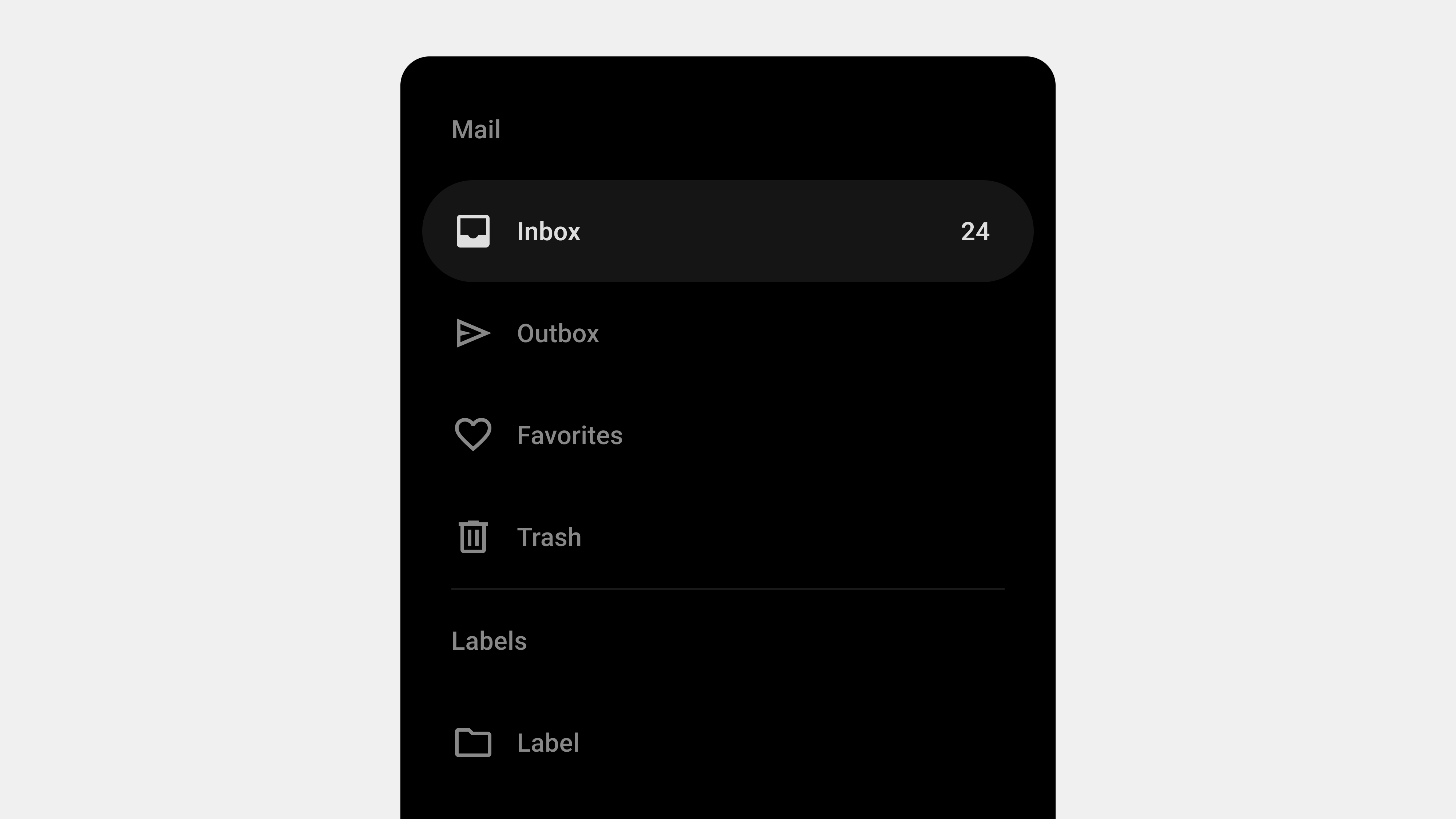
    • Features: Displays user account info, primary folders, and additional labels.
    • Why It Works: Combines personalization with hierarchical navigation.

    B. Spotify

    • Features: Provides quick access to playlists, search, and user library.
    • Why It Works: Keeps the focus on music discovery while organizing secondary features.

    C. Trello

    • Features: Allows users to switch between boards and manage account settings.
    • Why It Works: Maintains a clean interface by hiding less frequently used options.

    7. Future Trends in Navigation Drawers

    A. AI-Powered Personalization

    Future drawers will use AI to dynamically adjust content based on user behavior and preferences.

    B. Voice Integration

    As voice interfaces grow, navigation drawers may incorporate voice commands for opening and navigating menus.

    C. Gesture-Based Interactions

    Gestures will become more intuitive and integrated with other touch interactions.


    Conclusion

    Navigation drawers are more than just a design trend—they are a functional, space-efficient solution for organizing complex menus and enhancing user experiences. By understanding their definition and role, designers and developers can harness their potential to create intuitive, user-friendly interfaces. While challenges like discoverability and accessibility require careful attention, the benefits of navigation drawers make them an indispensable tool in modern UI/UX design.
  • 내비게이션 드로어 – 2. 정의

    내비게이션 드로어 – 2. 정의

    내비게이션 드로어(Navigation Drawer)의 정의와 역할

    내비게이션 드로어(Navigation Drawer)는 화면의 한쪽에서 슬라이드로 나타나는 UI 컴포넌트로, 애플리케이션이나 웹사이트 내 주요 탐색 항목을 제공한다. 최근 모바일 중심의 사용자 경험(UX) 설계에서 널리 사용되며, 공간 절약과 탐색 효율성을 높이는 데 기여한다. 이번 글에서는 내비게이션 드로어의 정의와 역할을 심도 있게 탐구하고, 이를 설계 및 구현할 때 고려해야 할 요소를 살펴본다.


    내비게이션 드로어의 정의

    1. 내비게이션 드로어란 무엇인가?

    내비게이션 드로어는 화면의 좌측 또는 우측에서 슬라이드 방식으로 나타나는 메뉴 UI다. 일반적으로 아이콘 클릭, 제스처(스와이프) 등의 사용자 입력에 의해 활성화되며, 주요 메뉴, 설정, 사용자 프로필, 알림 등 다양한 기능을 포함할 수 있다.

    2. 내비게이션 드로어의 구성 요소

    • 햄버거 메뉴 아이콘: 드로어를 열기 위한 트리거 역할을 함.
    • 슬라이드 패널: 드로어 자체로, 탐색 메뉴와 부가적인 정보를 표시.
    • 메뉴 항목: 주요 페이지 링크, 설정, 프로필 등 사용자의 행동을 유도하는 항목들.
    • 닫기 인터페이스: 드로어를 닫는 버튼 또는 제스처 영역.

    내비게이션 드로어의 역할

    1. 공간 절약

    드로어는 화면에 항상 고정된 내비게이션 바와 달리, 필요한 경우에만 나타나기 때문에 화면 공간을 절약할 수 있다.

    • 효율적 레이아웃: 작은 화면(모바일)에서도 콘텐츠 중심의 UI를 유지.
    • 복잡한 정보 구조 처리: 많은 메뉴 항목을 숨겨 사용자 인터페이스를 간결하게 유지.

    2. 다단계 메뉴 제공

    드로어는 계층적 정보 구조를 표현하기에 적합하다.

    • 하위 메뉴: 여러 단계를 포함한 복잡한 메뉴 구조를 깔끔하게 정리 가능.
    • 카테고리화: 관련 메뉴를 그룹화하여 사용자가 쉽게 탐색하도록 유도.

    3. 사용자 행동 유도

    드로어는 단순한 메뉴 제공을 넘어, 사용자 행동을 유도하는 역할을 한다.

    • CTA(Call to Action): 특정 행동(예: 설정 변경, 프로필 확인)을 유도하는 버튼 포함.
    • 개인화 메뉴: 사용자 데이터(예: 최근 검색, 즐겨찾기)에 기반한 맞춤형 탐색 제공.

    4. 브랜드 아이덴티티 표현

    드로어는 서비스의 브랜드 아이덴티티를 시각적으로 강화하는 역할도 한다.

    • 브랜드 로고 및 컬러 사용: 브랜드의 정체성을 반영한 시각적 요소 배치.
    • 일관성 유지: 애플리케이션 또는 웹사이트 전반에서 동일한 디자인 언어 적용.

    내비게이션 드로어 설계 시 고려사항

    1. 정보 계층 구조

    • 우선순위 설정: 사용자 행동 데이터를 기반으로 가장 중요한 메뉴 항목을 상단에 배치.
    • 하위 메뉴 표시: 드롭다운 또는 확장 가능한 메뉴로 계층 구조를 명확히 표현.
    • 사용자 피드백 반영: 자주 사용되는 항목과 그렇지 않은 항목을 지속적으로 최적화.

    2. 시각적 디자인

    • 명확한 구분: 드로어와 메인 콘텐츠를 시각적으로 분리하여 혼란을 방지.
    • 일관된 스타일: 브랜드 색상, 아이콘 스타일, 텍스트 폰트를 통일.
    • 가독성: 텍스트 크기와 색상 대비를 조정하여 사용자 경험을 개선.

    3. 반응형 설계

    • 모바일 최적화: 터치 친화적인 인터페이스로 설계.
    • 데스크탑 적응: 화면 크기에 따라 드로어를 고정형(핀)으로 표시하거나, 슬라이드 방식으로 표시.

    4. 접근성(A11Y)

    • 스크린 리더 지원: 드로어 열림 및 닫힘 상태를 스크린 리더가 명확히 읽을 수 있도록 ARIA 속성 사용.
    • 키보드 탐색: 키보드만으로도 모든 메뉴를 탐색할 수 있도록 설정.
    • 색상 대비: 색맹 및 시각 장애 사용자를 위한 충분한 대비 제공.

    5. 성능 최적화

    • 애니메이션 성능: 드로어 열림/닫힘 애니메이션이 부드럽게 작동하도록 GPU 가속 활용.
    • 리소스 로드 최적화: 드로어가 열릴 때만 필요한 리소스를 로드하여 초기 로딩 속도 개선.

    성공적인 내비게이션 드로어 활용 사례

    1. 구글 드라이브

    • 특징: 좌측 드로어에 계정 정보, 폴더 구조, 즐겨찾기 항목 포함.
    • 장점: 단순하면서도 강력한 탐색 경험 제공.

    2. 페이스북

    • 특징: 모바일에서는 햄버거 메뉴로 드로어를 제공.
    • 장점: 핵심 기능은 하단 바, 부가 기능은 드로어에 배치하여 효율적인 탐색 제공.

    3. 아마존

    • 특징: 방대한 카테고리를 드로어로 정리.
    • 장점: 검색 필터와 결합해 효율적인 상품 탐색 제공.

    내비게이션 드로어의 한계와 개선 방향

    1. 가시성 부족

    드로어는 기본적으로 숨겨져 있어 사용자가 메뉴를 찾기 어려울 수 있다.

    • 개선 방향: 중요 항목은 내비게이션 바에 배치하고, 부가 항목만 드로어에 포함.

    2. 복잡성 증가

    과도하게 많은 항목을 포함하면 사용자가 혼란을 느낄 수 있다.

    • 개선 방향: 메뉴 수를 제한하고, 검색 기능 추가.

    3. 접근성 문제

    드로어가 스크린 리더나 키보드 탐색을 지원하지 않으면 특정 사용자에게 불편을 줄 수 있다.

    • 개선 방향: 접근성 표준(WCAG)을 준수하고, 사용자 테스트를 통해 문제점을 식별.

    결론

    내비게이션 드로어는 공간 절약, 정보 구조화, 사용자 행동 유도 등 다양한 역할을 수행하는 강력한 UI 컴포넌트다. 이를 성공적으로 설계하기 위해서는 사용자 중심의 정보 구조, 일관된 디자인, 접근성 강화, 성능 최적화가 필수적이다. 잘 설계된 드로어는 사용자 경험을 크게 향상시키며, 복잡한 정보 구조를 간단하고 효율적으로 제공할 수 있다.


  • Navigation Drawer – 1. Overview

    Navigation Drawer – 1. Overview

    Navigation Drawer: A Comprehensive Guide

    The navigation drawer is a UI component widely used in modern applications, especially mobile apps, to organize and access features efficiently. It provides a hidden menu that users can open by tapping a button or swiping from the side of the screen. This design pattern has become a go-to solution for developers and designers seeking to balance functionality with a clean interface. In this article, we’ll dive deep into the definition, use cases, design principles, best practices, and challenges of navigation drawers.


    1. What Is a Navigation Drawer?

    A navigation drawer, also known as a side drawer or hamburger menu, is a collapsible panel that slides in from the side of the screen. It houses secondary or less frequently used navigation items, allowing the primary interface to remain uncluttered.

    Key Features

    • Expandable and Collapsible: Opens and closes with a user gesture or interaction.
    • Accessible from Any Screen: Typically available across all app pages for consistent navigation.
    • Supports Hierarchical Navigation: Allows grouping of related menu items.

    2. Benefits of Using a Navigation Drawer

    A. Space Efficiency

    By hiding the navigation menu, navigation drawers maximize screen space for primary content. This makes them particularly useful for smaller devices like smartphones.

    B. Organizational Clarity

    They allow grouping and categorizing menu items, helping users navigate complex apps or websites more easily.

    C. Customization

    Navigation drawers can be personalized to display user-specific content, such as profiles, shortcuts, or recommended actions.

    D. Consistent Accessibility

    The drawer remains available from any screen, ensuring users can always return to key sections without confusion.


    3. Use Cases for Navigation Drawers

    A. Mobile Applications

    • Social Media: Facebook, Instagram, and Twitter use drawers for secondary features like settings and saved items.
    • Productivity Apps: Google Drive and Evernote use drawers for folder navigation and account switching.

    B. Complex Web Applications

    Web platforms like project management tools or SaaS products use navigation drawers for multi-level menus and quick access to various modules.

    C. Cross-Platform Apps

    For apps designed to run on both mobile and desktop, navigation drawers provide a unified navigation experience.


    4. Design Principles for Navigation Drawers

    A. Prioritize Simplicity

    • Display only essential items to avoid overwhelming the user.
    • Use clear and concise labels for menu items.

    B. Maintain Visual Hierarchy

    • Use grouping and separators to organize related items.
    • Place frequently accessed items at the top of the list.

    C. Provide Visual Feedback

    • Highlight the active or selected item.
    • Use animations to show transitions between opened and closed states.

    D. Support Gestures

    • Allow users to swipe to open and close the drawer.
    • Ensure gestures don’t interfere with other UI elements.

    E. Ensure Accessibility

    • Use semantic HTML and ARIA roles for screen reader compatibility.
    • Include a keyboard-accessible toggle for opening and closing the drawer.

    5. Best Practices for Navigation Drawers

    A. Use a Clear Toggle Icon

    • The hamburger icon (three horizontal lines) is a universal standard for toggling drawers.
    • Ensure the icon is prominently placed, usually at the top left of the screen.

    B. Keep It Minimal

    • Avoid overcrowding the drawer with too many menu items.
    • Use collapsible sections for submenus to maintain clarity.

    C. Provide Contextual Information

    • Display the user’s profile, notifications, or shortcuts at the top of the drawer.
    • For example, Google apps often show the logged-in user’s name and avatar.

    D. Test Responsiveness

    • Adapt the drawer for different devices and screen sizes.
    • On larger screens, consider using a persistent drawer that remains visible.

    E. Ensure Smooth Animations

    • Avoid abrupt transitions when opening and closing the drawer.
    • Use subtle animations to enhance the user experience.

    6. Challenges and Solutions in Navigation Drawer Design

    A. Hidden Navigation Problem

    Challenge: Users may overlook the drawer if it’s not obvious.
    Solution: Use onboarding or visual hints (e.g., pulsing animations around the toggle icon) to guide new users.

    B. Overloading with Items

    Challenge: An overcrowded drawer can confuse users.
    Solution: Prioritize key items and move less-used options to secondary menus.

    C. Accessibility Issues

    Challenge: Improper implementation can make drawers unusable for assistive technology users.
    Solution: Follow WCAG guidelines, ensuring compatibility with screen readers and keyboard navigation.

    D. Performance Concerns

    Challenge: Animations and dynamic content in drawers can impact app performance.
    Solution: Optimize assets and preload content to ensure smooth performance.


    7. Examples of Excellent Navigation Drawer Implementation

    A. Google Drive

    • Features: Includes quick access to “My Drive,” “Shared with Me,” and “Recent.”
    • Why It Works: Clear hierarchy and collapsible sections keep it clean and functional.

    B. Facebook

    • Features: Uses a navigation drawer for less critical features like saved posts and events.
    • Why It Works: Prioritizes the feed while keeping secondary features accessible.

    C. Slack (Mobile App)

    • Features: The drawer organizes channels, DMs, and workspaces effectively.
    • Why It Works: Displays essential content without overwhelming the user.

    8. How to QA a Navigation Drawer

    A. Functional Testing

    • Verify that the drawer opens and closes with both gestures and the toggle button.
    • Test all links and menu items for correct functionality.

    B. Responsiveness Testing

    • Check behavior on various devices and screen orientations.
    • Ensure smooth animations across devices.

    C. Accessibility Testing

    • Use screen readers to ensure all elements are accessible.
    • Test keyboard navigation for opening, closing, and interacting with the drawer.

    D. Performance Testing

    • Simulate high traffic to test how the drawer performs under load.
    • Optimize assets and animations to reduce lag.

    9. Future Trends in Navigation Drawers

    A. Dynamic Personalization

    Navigation drawers will increasingly leverage AI to show personalized content and shortcuts based on user behavior.

    B. Voice-Activated Navigation

    With the rise of voice assistants, drawers may integrate voice commands for opening and navigating menu items.

    C. Gesture-First Design

    Gesture-based interactions will continue to evolve, allowing users to interact with drawers more intuitively.


    Conclusion

    The navigation drawer is a versatile tool for organizing complex menus while maintaining a clean and user-friendly interface. By adhering to design principles, implementing best practices, and addressing challenges, you can create navigation drawers that enhance usability and accessibility. Whether you’re designing for mobile apps, web platforms, or cross-platform tools, navigation drawers remain an indispensable UI component for effective navigation.


  • 내비게이션 드로어 – 1. 개괄

    내비게이션 드로어 – 1. 개괄

    내비게이션 드로어(Navigation Drawer): 설계와 활용 가이드

    내비게이션 드로어(Navigation Drawer)는 모바일 및 웹 애플리케이션에서 점점 더 많이 사용되는 탐색 UI 컴포넌트다. 특히 공간을 효율적으로 활용하면서도 복잡한 메뉴 구조를 제공할 수 있다는 점에서 주목받고 있다. 이번 글에서는 내비게이션 드로어의 정의, 장단점, 설계 원칙, 구현 시 주의사항, 그리고 성공적인 사례를 중심으로 1500단어 이상으로 다룬다.


    1. 내비게이션 드로어란 무엇인가?

    정의

    내비게이션 드로어는 화면 측면에서 슬라이드로 나타나는 메뉴 구성 요소다. 사용자가 특정 동작(예: 아이콘 클릭, 스와이프)을 수행했을 때 나타나며, 애플리케이션 내 주요 탐색 항목을 제공한다.

    특징

    • 기본적으로 화면 공간을 차지하지 않으며, 필요한 경우에만 활성화된다.
    • 드로어는 보통 좌측에서 열리며, 오른쪽 또는 상단에서 열리는 경우도 있다.
    • 주요 메뉴뿐만 아니라 프로필, 설정, 알림 등 다양한 항목을 포함할 수 있다.

    2. 내비게이션 드로어의 장단점

    장점

    1. 공간 효율성: 화면 공간을 절약하여 콘텐츠에 집중할 수 있다.
    2. 다양한 정보 제공: 복잡한 메뉴 구조를 깔끔하게 정리할 수 있다.
    3. 사용자 인터랙션: 슬라이드 애니메이션이 추가되어 직관적인 사용자 경험을 제공한다.

    단점

    1. 가시성 부족: 드로어가 열리지 않으면 사용자는 메뉴를 즉시 볼 수 없다.
    2. 탐색 어려움: 특정 메뉴를 찾기 위해 사용자가 드로어를 반복적으로 열어야 할 수 있다.
    3. 복잡성 증가: 과도하게 많은 항목을 포함하면 사용자 혼란을 초래할 수 있다.

    3. 내비게이션 드로어 설계 원칙

    1) 간결하고 직관적인 메뉴 구성

    • 메뉴는 사용자 관점에서 가장 자주 사용하는 항목을 상단에 배치한다.
    • 하위 메뉴는 간단히 정리하거나 드롭다운 형식으로 추가한다.
    • 불필요한 항목은 제거하여 드로어를 깔끔하게 유지한다.

    2) 일관된 디자인 유지

    • 드로어의 스타일은 전체 애플리케이션과 일관성을 유지해야 한다.
      • 컬러 스킴: 브랜드 색상을 사용하되, 텍스트 가독성을 높인다.
      • 아이콘: 모든 항목에 동일한 스타일의 아이콘을 적용.

    3) 반응형 설계

    • 데스크탑과 모바일에서 드로어가 적절히 동작하도록 반응형 디자인을 적용한다.
      • 데스크탑: 고정형 드로어 또는 클릭 시 열리는 드로어.
      • 모바일: 슬라이드 드로어와 햄버거 아이콘 활용.

    4) 사용자 피드백 제공

    • 드로어가 열리거나 닫힐 때 애니메이션 효과를 통해 상태 변화를 명확히 보여준다.
    • 활성화된 메뉴를 시각적으로 강조하여 현재 위치를 알려준다.

    4. 내비게이션 드로어 구현 시 주의사항

    1) 접근성(A11Y) 강화

    • 키보드 탐색이 가능하도록 tabindexaria-label 속성을 사용한다.
    • 스크린 리더가 드로어 열림과 닫힘 상태를 정확히 읽을 수 있도록 설정한다.
    • 색상 대비와 텍스트 크기를 적절히 조정해 모든 사용자가 드로어를 쉽게 사용할 수 있도록 한다.

    2) 성능 최적화

    • 드로어 애니메이션이 과도한 CPU나 GPU 리소스를 소모하지 않도록 최적화한다.
    • 불필요한 리소스를 미리 로드하지 않고 사용자가 드로어를 열 때 로드하도록 설정한다.

    3) 테스트와 디버깅

    • 모바일, 태블릿, 데스크탑 등 다양한 디바이스에서 드로어의 동작을 테스트한다.
    • 다양한 브라우저 환경에서 크로스 브라우저 호환성을 점검한다.

    5. 성공적인 내비게이션 드로어 사례

    1) 구글 드라이브

    • 특징: 좌측 드로어에 계정 정보, 폴더 구조, 설정 메뉴를 포함.
    • 장점: 간단하고 직관적인 탐색 경험 제공.

    2) 페이스북

    • 특징: 모바일에서 햄버거 메뉴를 클릭하면 슬라이드로 드로어가 열림.
    • 장점: 자주 사용되는 항목은 바텀 내비게이션, 부가 항목은 드로어에 배치.

    3) 아마존

    • 특징: 방대한 카테고리를 드로어로 구성해 정보 과부하를 줄임.
    • 장점: 드로어 내 검색 기능을 제공하여 탐색 효율성을 높임.

    6. 내비게이션 드로어와 다른 UI 컴포넌트 비교

    1) 내비게이션 바와의 비교

    • 공간 활용성: 내비게이션 드로어는 공간 절약에 유리하지만, 내비게이션 바는 메뉴 가시성이 뛰어나다.
    • 적합한 상황: 드로어는 많은 메뉴 항목을 포함해야 할 때 적합, 내비게이션 바는 주요 기능을 강조할 때 적합.

    2) 탭 내비게이션과의 비교

    • 사용성: 탭 내비게이션은 한눈에 메뉴를 보여줄 수 있어 단순한 구조에 적합.
    • 적합한 상황: 드로어는 다단계 메뉴를 제공해야 할 때 유리.

    7. 내비게이션 드로어 설계 시 체크리스트

    1. 구조: 메뉴가 논리적이고 직관적으로 정렬되었는가?
    2. 디자인: 드로어의 디자인이 전체 UI와 일관성을 유지하는가?
    3. 애니메이션: 드로어 열림/닫힘 애니메이션이 부드럽게 작동하는가?
    4. 반응형: 모바일과 데스크탑에서 모두 적절히 작동하는가?
    5. 접근성: 키보드와 스크린 리더 지원이 충분한가?

    결론

    내비게이션 드로어는 공간을 효율적으로 사용하고 복잡한 메뉴를 깔끔하게 제공할 수 있는 강력한 UI 컴포넌트다. 그러나 사용자 경험을 최적화하려면 간결한 구성, 일관된 디자인, 접근성과 성능 최적화에 주의를 기울여야 한다. 성공적인 내비게이션 드로어는 사용자와 서비스를 자연스럽게 연결하며, 탐색 효율성을 극대화한다.


  • Navigation Bars – Final

    Navigation Bars – Final

    The Ultimate Guide to Navigation Bars: A Comprehensive Wrap-Up

    Navigation bars are the backbone of user interaction in digital platforms, serving as the gateway to content and functionality. From their design principles to their development, testing, and user experience writing, every aspect contributes to creating a seamless, intuitive, and accessible user journey. This comprehensive guide wraps up key insights about navigation bars, summarizing critical considerations for designers, developers, publishers, and QA teams.


    1. Understanding Navigation Bars: Definition and Role

    A navigation bar is a user interface component that provides structured access to various sections of a website or application. Its primary purpose is to enable users to locate and interact with features efficiently.

    Key Takeaways

    • Definition: A visual roadmap connecting users to content and functionality.
    • Role: Guides users, enhances usability, and improves content discoverability.

    Practical Example

    For an e-commerce platform, a navigation bar might include:

    • Core functions: “Home,” “Shop,” “Categories,” “Cart.”
    • Secondary actions: “Login,” “Help,” “Settings.”

    The role of the navigation bar extends beyond functionality—it establishes brand identity and builds user trust.


    2. Designing User-Centric Navigation Bars

    Designing navigation bars with users in mind ensures better usability and engagement. A well-designed navigation bar is simple, accessible, and consistent across devices and platforms.

    Key Considerations

    1. Clarity and Simplicity: Use familiar terms and organize content logically.
    2. Accessibility: Include ARIA roles, keyboard navigation, and focus indicators.
    3. Responsive Design: Adapt layouts to different screen sizes and devices.
    4. Feedback and Visual Cues: Highlight active states, provide hover effects, and ensure smooth transitions.
    5. Scalability: Prepare for future growth with expandable and flexible designs.

    3. UX Writing for Navigation Bars

    Clear and concise UX writing is essential for navigation bars, as it helps users understand and interact with the platform effortlessly.

    Key Principles

    • Use Familiar Language: Avoid jargon and use terms that resonate with users (e.g., “Cart” instead of “Shopping Basket”).
    • Behavior-Driven Labels: Use action-oriented phrases like “Start Now” or “Learn More.”
    • Consistency: Maintain uniform terminology across pages and components.
    • Global Context: Consider cultural and linguistic differences in international platforms.

    Practical Application

    For a banking app:

    • Use “Accounts” instead of “My Account” to reflect multiple options.
    • Highlight primary tasks like “Send Money” or “View Transactions.”

    4. Development and Publishing Considerations

    Developing and publishing navigation bars requires technical precision to ensure performance, compatibility, and responsiveness.

    Key Areas to Focus On

    1. Performance Optimization: Minimize load times with efficient code and lazy loading.
    2. Cross-Browser Compatibility: Test across major browsers like Chrome, Firefox, and Safari.
    3. Responsive Design: Use CSS media queries for adaptive layouts.
    4. Dynamic Content Handling: Load dropdowns and menus dynamically for better scalability.
    5. Accessibility Compliance: Ensure ARIA roles, keyboard navigation, and screen reader support are in place.

    Practical Example

    /* Responsive Navigation Bar */
    @media (max-width: 768px) {
      nav ul {
        display: none;
      }
      nav .hamburger {
        display: block;
      }
    }
    

    Tools like BrowserStack and Lighthouse can streamline cross-browser testing and performance optimization.


    5. QA Testing for Navigation Bars

    Quality assurance is critical for ensuring navigation bars function as intended across devices and user scenarios.

    Key Testing Areas

    1. Functional Testing: Validate all links, dropdowns, and interactive elements.
    2. Cross-Platform Testing: Ensure compatibility across devices and operating systems.
    3. Accessibility Testing: Verify keyboard navigation, screen reader compatibility, and focus indicators.
    4. Performance and Load Testing: Ensure smooth operation under high traffic and dynamic loading.
    5. Error Handling: Test edge cases like 404 errors, broken links, or failed dynamic content.

    QA Checklist

    • Simulate high traffic with tools like Apache JMeter.
    • Test usability in offline mode and under slow network conditions.
    • Use tools like Axe for accessibility audits.

    6. Holistic Approach to Navigation Bars

    Bringing together design, UX writing, development, and QA ensures a comprehensive approach to navigation bar creation.

    Unified Best Practices

    • Collaborate Across Teams: Designers, developers, writers, and QA must align on user goals and technical requirements.
    • Conduct User Testing: Validate navigation designs with real users to gather actionable feedback.
    • Iterate Continuously: Monitor performance post-launch and update as user needs evolve.

    Final Thoughts

    A navigation bar is not just a functional component—it’s a strategic tool that defines the overall user experience. By focusing on clarity, accessibility, responsiveness, and usability, teams can create navigation systems that meet user needs and drive engagement.


  • 내비게이션 바 – 종합

    내비게이션 바 – 종합

    내비게이션 바에 대한 완벽 가이드: 설계, 개발, QA, UX 라이팅까지

    내비게이션 바는 디지털 서비스에서 사용자와 콘텐츠를 연결하는 가장 중요한 UI 요소 중 하나다. 설계부터 개발, QA, UX 라이팅까지 내비게이션 바를 다룬 모든 내용을 종합적으로 정리하며, 성공적인 내비게이션 바 구현을 위한 핵심 가이드를 제공한다.


    1. 내비게이션 바란 무엇인가?

    내비게이션 바는 사용자가 웹사이트나 애플리케이션의 주요 콘텐츠와 기능을 탐색할 수 있도록 도와주는 UI 컴포넌트다.

    • 주요 역할: 정보 탐색, 현재 위치 안내, 주요 기능 접근성 제공.
    • 사용자 기대: 직관적이고 간단하며 빠르게 반응하는 탐색 경험.

    내비게이션 바는 단순히 디자인 요소를 넘어 사용자 경험(UX)과 비즈니스 목표 달성에 직접적으로 기여한다.


    2. 설계 단계에서 고려해야 할 요소

    1) 정보 구조와 계층화

    • 주요 메뉴와 하위 메뉴를 직관적으로 계층화하여 사용자가 혼란 없이 탐색할 수 있어야 한다.
    • 사용자가 가장 자주 사용하는 메뉴를 우선 배치하고 부가 항목은 숨기거나 보조 메뉴로 처리한다.

    2) 반응형 설계

    • 데스크탑에서는 상단 내비게이션 바, 모바일에서는 햄버거 메뉴 또는 바텀 내비게이션을 활용한다.
    • 다양한 화면 크기에 유연하게 대응할 수 있도록 미디어 쿼리를 활용한다.

    3) 사용자 중심 UI/UX

    • 사용자 행동 데이터를 기반으로 설계하며, 모든 디바이스에서 동일한 경험을 제공해야 한다.
    • 인터랙션(클릭, 호버, 드롭다운)과 피드백(애니메이션, 색상 변화)을 포함해 사용자 경험을 개선한다.

    3. 개발과 퍼블리싱 시 주의사항

    1) 크로스 브라우저와 디바이스 호환성

    • 주요 브라우저와 OS에서 동일하게 작동하도록 CSS Reset과 Flexbox/Grid를 활용.
    • BrowserStack과 같은 도구를 통해 다양한 디바이스에서 테스트.

    2) 코드 구조화와 성능 최적화

    • React나 Vue와 같은 프레임워크를 활용해 내비게이션 바를 컴포넌트화.
    • CSS와 JavaScript를 최소화하여 로딩 시간을 단축하고 불필요한 네트워크 요청을 제거.

    3) 접근성(A11Y)

    • 스크린 리더와 키보드 탐색이 가능하도록 aria-label, role 등 ARIA 속성을 설정.
    • 텍스트와 배경 간 색상 대비를 충분히 제공해 시각적 장애를 가진 사용자도 접근 가능하게 한다.

    4. UX 라이팅 관점에서의 최적화

    1) 직관적이고 명확한 용어 사용

    • ‘이벤트’ 대신 ‘할인 행사’처럼 사용자 관점에서 이해하기 쉬운 단어를 선택한다.
    • 모든 메뉴명은 3~4글자로 간결하게 작성하되, 메뉴의 기능을 예측 가능하도록 한다.

    2) 행동을 유도하는 표현

    • ‘구독’보다는 ‘구독하기’처럼 동사를 활용해 사용자가 다음 행동을 바로 이해하도록 한다.

    3) 일관성과 테스트

    • 메뉴 용어와 스타일은 서비스 전체에서 일관성을 유지해야 하며, A/B 테스트를 통해 클릭률과 사용자 반응을 점검한다.

    5. QA 단계에서의 검증

    1) 기능 테스트

    • 모든 메뉴와 하위 메뉴가 올바르게 작동하며 링크가 404 오류를 일으키지 않도록 검증한다.

    2) 반응형 및 크로스 브라우저 테스트

    • 다양한 화면 크기와 브라우저 환경에서 내비게이션 바가 정상적으로 표시되는지 확인한다.

    3) 접근성 테스트

    • NVDA, VoiceOver 같은 스크린 리더를 활용해 내비게이션 바가 시각적 장애 사용자를 지원하는지 점검한다.

    4) 성능 테스트

    • Lighthouse와 같은 도구를 사용해 내비게이션 바의 로딩 속도를 점검하고, 네트워크 속도가 느린 환경에서도 원활히 작동하는지 확인한다.

    6. 내비게이션 바 설계와 운영의 성공 사례

    성공적인 사례

    • 네이버: ‘지식인’과 같은 직관적이고 익숙한 용어로 사용자 경험 강화.
    • 쿠팡: 모바일에서 바텀 내비게이션을 통해 접근성과 탐색 효율성을 높임.

    개선이 필요한 사례

    • 메뉴명 혼용: ‘장바구니’와 ‘쇼핑백’을 혼용하는 사례는 사용자 혼란을 유발하므로 통일 필요.
    • 긴 메뉴명: ‘정기구독 및 멤버십 관리’를 ‘구독 관리’로 간결화해 가독성 개선.

    7. 내비게이션 바 운영을 위한 체크리스트

    1. 설계 단계: 정보 구조와 계층이 명확하며, 반응형 설계가 적용되었는가?
    2. 개발 단계: 크로스 브라우저 호환성과 성능 최적화가 이루어졌는가?
    3. UX 라이팅: 모든 메뉴명이 명확하고 사용자의 행동을 유도하는가?
    4. QA 단계: 링크, 반응형 레이아웃, 접근성, 성능 테스트가 완료되었는가?
    5. 운영 단계: 사용자 피드백과 데이터 분석을 통해 지속적으로 개선하고 있는가?

    결론

    내비게이션 바는 사용자 경험과 비즈니스 성공을 좌우하는 핵심 UI 요소다. 설계부터 QA까지의 모든 단계에서 세심한 주의와 협업이 필요하다. 정보를 체계적으로 정리하고, 직관적이며 접근 가능한 디자인을 구현하며, 지속적인 테스트와 개선을 통해 내비게이션 바의 품질을 유지해야 한다. 사용자 중심의 내비게이션 바는 단순한 메뉴를 넘어, 서비스와 사용자 간의 원활한 연결 고리가 될 것이다.


  • Navigation Bars – QA

    Navigation Bars – QA

    5 Key Considerations for QA Testing Navigation Bars

    Quality assurance (QA) plays a critical role in ensuring that a navigation bar functions correctly, provides a seamless user experience, and maintains platform stability. As the navigation bar is one of the most visible and frequently used components of a digital product, meticulous testing is essential. This article highlights the five most important areas to focus on when conducting QA for navigation bars, ensuring they are user-friendly, functional, and error-free.


    1. Functional Testing: Ensuring Core Functionality

    Why It Matters

    The primary purpose of a navigation bar is to help users move through the platform seamlessly. Any broken links, incorrect redirections, or missing elements can disrupt the user experience.

    Key Guidelines

    • Link Validation: Test all navigation links to ensure they point to the correct destinations.
    • Dropdown and Submenu Functionality: Verify that dropdown menus and submenus expand, collapse, and link correctly.
    • Button Clickability: Ensure all buttons in the navigation bar are clickable and trigger the intended actions.

    Checklist for QA

    • Test all links across pages and devices.
    • Verify that hover states, clicks, and taps work as expected.
    • Ensure secondary navigation items (e.g., dropdowns) function correctly.

    Tools

    • Browser DevTools for link inspection.
    • Automated testing tools like Selenium or Cypress for repeated functional tests.

    2. Cross-Browser and Cross-Platform Compatibility

    Why It Matters

    Users access websites and applications on a variety of devices and browsers. Ensuring compatibility prevents issues like misaligned elements, broken functionality, or inconsistent behavior.

    Key Guidelines

    • Test Across Major Browsers: Chrome, Firefox, Safari, Edge, and their mobile counterparts.
    • Device Testing: Check functionality on desktops, tablets, and mobile devices.
    • OS Compatibility: Verify behavior across Windows, macOS, iOS, and Android.

    Checklist for QA

    • Test how the navigation bar adapts to different screen sizes.
    • Ensure consistent appearance and functionality in both light and dark modes (if supported).
    • Confirm responsive behavior (e.g., hamburger menus on mobile).

    Tools

    • BrowserStack or Sauce Labs for multi-browser and multi-device testing.
    • Real-device testing for accurate results.

    3. Accessibility Testing: Inclusive Usability for All Users

    Why It Matters

    An accessible navigation bar ensures that users with disabilities can interact with your platform effectively. Accessibility issues can alienate users and may even lead to legal consequences.

    Key Guidelines

    • Screen Reader Compatibility: Ensure ARIA roles, labels, and semantic HTML elements are properly implemented.
    • Keyboard Navigation: Test navigation using only a keyboard (e.g., tab and arrow keys).
    • Focus Indicators: Verify that focus states are visible and intuitive.
    • Color Contrast: Ensure adequate contrast for text and interactive elements.

    Checklist for QA

    • Test with screen readers like NVDA or VoiceOver.
    • Verify the tab order of navigation links.
    • Use contrast-checking tools to ensure WCAG compliance.

    Tools

    • Lighthouse for accessibility audits.
    • Axe Accessibility Checker for in-depth reports.

    4. Performance and Load Testing

    Why It Matters

    The navigation bar is a core component of every page, so its performance affects the overall user experience. Slow load times or unresponsive interactions can frustrate users.

    Key Guidelines

    • Load Speed: Ensure the navigation bar loads quickly on all devices.
    • Dynamic Content: Test how dynamically loaded menus (e.g., dropdowns) perform under various conditions.
    • Heavy Traffic: Simulate high traffic to ensure stability during peak usage.

    Checklist for QA

    • Measure page load times with the navigation bar active.
    • Test dynamic elements like dropdowns under slow network conditions.
    • Simulate multiple users accessing the navigation bar simultaneously.

    Tools

    • Lighthouse or GTmetrix for load speed analysis.
    • Apache JMeter for load and stress testing.

    5. Edge Cases and Error Handling

    Why It Matters

    Navigation bars must handle unexpected inputs, errors, or unusual user behaviors gracefully. Poor error handling can lead to crashes or broken navigation, which can negatively impact the user experience.

    Key Guidelines

    • 404 Errors: Verify how the navigation bar behaves when a linked page is missing or unavailable.
    • Dynamic Menu Failures: Test what happens if dynamically loaded content fails to load.
    • Broken Links: Simulate incorrect or outdated links to ensure error messages are helpful.

    Checklist for QA

    • Ensure fallback behavior for missing or unavailable content.
    • Verify error messages are displayed clearly and guide users on what to do next.
    • Test navigation elements in offline mode or with intermittent network connectivity.

    Tools

    • Postman for API testing in dynamic menus.
    • Chrome DevTools for offline simulation.

    Conclusion

    Quality assurance for navigation bars involves testing for functionality, compatibility, accessibility, performance, and error handling. By focusing on these five areas, QA teams can ensure that navigation systems meet user expectations, perform reliably, and provide an inclusive experience across all platforms. A well-tested navigation bar not only enhances usability but also strengthens the overall credibility of the product.


  • 내비게이션 바 – QA

    내비게이션 바 – QA

    내비게이션 바 QA 시 유의해야 할 5가지 핵심 요소

    내비게이션 바는 사용자의 탐색 경험과 서비스의 성공 여부를 결정짓는 중요한 UI 컴포넌트다. QA(품질 보증) 과정에서 내비게이션 바를 철저히 검증하는 것은 오류 없는 사용자 경험을 보장하는 데 필수적이다. 이번 글에서는 내비게이션 바 QA 시 반드시 점검해야 할 다섯 가지 핵심 요소를 중심으로 구체적인 방법과 팁을 소개한다.


    1. 기능 테스트: 모든 메뉴와 링크 검증

    테스트 목적

    내비게이션 바의 각 메뉴가 올바르게 작동하며, 모든 링크가 정확한 페이지로 이동하는지 확인한다.

    테스트 항목

    • 메뉴 클릭: 각 메뉴 항목을 클릭했을 때 지정된 경로로 이동하는지 확인.
    • 링크 유효성: 링크가 깨지거나 404 오류 페이지로 연결되지 않도록 검증.
    • 하위 메뉴 동작: 드롭다운이나 확장형 메뉴가 제대로 표시되고 닫히는지 확인.

    테스트 방법

    • 모든 메뉴 항목을 하나씩 클릭하며 실제 경로와 요구사항 문서에 명시된 경로를 비교.
    • 링크 크롤러 도구(예: Screaming Frog)를 활용해 링크 유효성을 자동으로 검증.

    주의사항

    • 복잡한 메뉴 구조에서는 사용자 여정을 따라가며 경로를 재점검.
    • 다국어 서비스의 경우 언어별로 링크가 올바른 페이지로 연결되는지 확인.

    2. 반응형 및 크로스 브라우저 테스트

    테스트 목적

    내비게이션 바가 다양한 디바이스와 브라우저에서 일관된 동작을 보이는지 확인한다.

    테스트 항목

    • 화면 크기별 동작: 데스크탑, 태블릿, 모바일 화면에서 내비게이션 바가 적절히 표시되는지 확인.
    • 브라우저 호환성: Chrome, Safari, Firefox, Edge 등 주요 브라우저에서 동일한 동작을 보이는지 확인.
    • 레이아웃 안정성: 브라우저 확대/축소 시 내비게이션 바가 깨지거나 콘텐츠가 겹치지 않는지 점검.

    테스트 방법

    • 디바이스 시뮬레이터: Chrome DevTools를 사용해 다양한 화면 크기를 테스트.
    • 실제 디바이스 테스트: 실제 스마트폰, 태블릿 등을 사용해 모바일 환경을 확인.
    • 브라우저 스택(BrowserStack): 크로스 브라우저와 OS 테스트 도구를 활용.

    주의사항

    • 모바일에서는 햄버거 메뉴와 바텀 내비게이션이 적절히 작동하는지 반드시 확인.
    • OS별 차이를 고려하여 Windows, macOS에서도 테스트 진행.

    3. 접근성 테스트(A11Y)

    테스트 목적

    내비게이션 바가 장애를 가진 사용자를 포함한 모든 사용자에게 접근 가능하도록 설계되었는지 확인한다.

    테스트 항목

    • 스크린 리더 지원: 메뉴 항목이 스크린 리더에서 올바르게 읽히는지 확인.
    • 키보드 탐색: 탭(Tab) 키만으로 모든 메뉴를 탐색할 수 있는지 확인.
    • 색상 대비: 텍스트와 배경 색상 대비가 충분한지 점검(WCAG 기준 4.5:1).

    테스트 방법

    • 스크린 리더 도구: NVDA, VoiceOver 등 스크린 리더를 사용해 테스트.
    • WAVE 도구: 자동화된 접근성 테스트 도구로 주요 문제를 식별.
    • 수동 테스트: 키보드만으로 메뉴 탐색 및 클릭이 가능한지 확인.

    주의사항

    • 드롭다운 메뉴가 키보드로도 열리고 닫힐 수 있는지 검증.
    • 모든 알림이나 상태 변화가 스크린 리더에 즉시 반영되는지 확인.

    4. 성능 테스트: 로딩 속도와 안정성

    테스트 목적

    내비게이션 바가 빠르게 로드되고, 과도한 리소스를 사용하지 않는지 확인한다.

    테스트 항목

    • 로드 시간: 내비게이션 바의 모든 리소스(CSS, JavaScript)가 빠르게 로드되는지 점검.
    • 애니메이션 성능: 드롭다운, 클릭, 호버 효과 등의 애니메이션이 끊김 없이 작동하는지 확인.
    • 네트워크 요청: 불필요한 API 호출이나 리소스가 없는지 점검.

    테스트 방법

    • Lighthouse: 페이지 로딩 시간과 성능 점수를 확인.
    • DevTools 성능 패널: JavaScript 실행 시간과 애니메이션 성능을 분석.
    • 네트워크 속도 제한: 네트워크 속도를 느리게 설정해 로드 속도와 안정성을 테스트.

    주의사항

    • 저속 네트워크 환경(3G 등)에서도 내비게이션 바가 적절히 로드되는지 확인.
    • 애니메이션 사용 시 CPU나 GPU 과부하를 일으키지 않도록 최적화.

    5. 사용자 시나리오 기반 테스트

    테스트 목적

    내비게이션 바가 실제 사용자 시나리오에서 요구사항을 충족하는지 확인한다.

    테스트 항목

    • 사용자 여정 테스트: 사용자가 내비게이션 바를 이용해 주요 기능(예: 로그인, 구매, 검색)을 문제없이 수행할 수 있는지 점검.
    • 오류 처리: 클릭 후 404 오류 페이지로 이동하거나 예상치 못한 동작이 발생하지 않는지 확인.
    • 언어별 동작: 다국어 서비스의 경우 메뉴 항목이 올바르게 번역되고 레이아웃이 깨지지 않는지 점검.

    테스트 방법

    • 사용자 여정을 기반으로 구체적인 테스트 케이스를 작성.
    • 여러 사용자 유형(신규, 기존 사용자)으로 테스트를 진행.

    주의사항

    • 비정상적인 상황(예: 서버 응답 지연, 네트워크 끊김)에서도 내비게이션 바가 정상 작동하는지 확인.
    • 다국어 메뉴에서 글자 수 차이로 인해 레이아웃이 변경되지 않도록 검증.

    결론

    내비게이션 바 QA는 기능, 반응형 설계, 접근성, 성능, 사용자 시나리오를 종합적으로 검토해야 한다. 철저한 검증 과정을 통해 사용자는 편리한 탐색 경험을, 서비스는 안정성과 신뢰를 동시에 확보할 수 있다. QA 팀은 지속적인 테스트와 피드백을 통해 내비게이션 바의 품질을 유지하고 개선해야 한다.


  • Navigation Bars – Publising and Developing

    Navigation Bars – Publising and Developing

    5 Key Considerations for Publishing and Developing Navigation Bars

    Developing and publishing a navigation bar requires meticulous planning and execution, as it serves as the backbone of user interaction within a digital platform. Mistakes in this component can lead to a poor user experience, inefficient functionality, and accessibility issues. This article highlights the five most critical aspects to consider when publishing or developing navigation bars, ensuring usability, performance, and compatibility across platforms.


    1. Accessibility Compliance

    Why It Matters

    Accessibility is crucial for making navigation usable by everyone, including individuals with disabilities. Ignoring accessibility can alienate users and even lead to legal implications in some regions.

    Key Guidelines

    • Keyboard Navigation: Ensure all menu items are accessible via keyboard controls (e.g., tabbing through links).
    • Screen Reader Support: Use semantic HTML and ARIA roles to make navigation clear for screen readers.
    • Color Contrast: Maintain sufficient contrast between text and background for users with visual impairments.
    • Focus Indicators: Include visible focus states for links and buttons.

    Implementation Example

    <nav aria-label="Main Navigation">
      <ul>
        <li><a href="/home" aria-current="page">Home</a></li>
        <li><a href="/about">About</a></li>
        <li><a href="/services">Services</a></li>
        <li><a href="/contact">Contact</a></li>
      </ul>
    </nav>
    

    Testing Tools

    • Lighthouse Accessibility Audit.
    • Axe Accessibility Checker.
    • Manual screen reader testing with tools like NVDA or VoiceOver.

    2. Responsiveness and Mobile Optimization

    Why It Matters

    With a majority of users accessing websites and apps through mobile devices, navigation bars must be responsive and mobile-friendly. A poorly optimized nav bar can disrupt the user experience and increase bounce rates.

    Key Guidelines

    • Responsive Breakpoints: Define CSS breakpoints for various screen sizes (mobile, tablet, desktop).
    • Mobile-Specific Navigation: Implement hamburger menus or bottom navigation for better usability on smaller screens.
    • Touch-Friendly Elements: Ensure buttons and links are large enough for touch interaction.

    Implementation Example

    /* Desktop Navigation */
    nav ul {
      display: flex;
      justify-content: space-around;
    }
    
    /* Mobile Navigation */
    @media (max-width: 768px) {
      nav ul {
        display: none;
      }
      nav .hamburger {
        display: block;
      }
    }
    

    Testing Tools

    • Browser DevTools to simulate different screen sizes.
    • Responsive design tools like BrowserStack.

    3. Performance Optimization

    Why It Matters

    Navigation bars are a core element loaded on every page. Inefficient code can slow down page load times and negatively affect SEO rankings and user experience.

    Key Guidelines

    • Minimize JavaScript: Avoid unnecessary JavaScript dependencies for basic navigation functionality.
    • Lazy Loading: Load secondary or hidden menu items only when required.
    • CSS Optimization: Use efficient CSS selectors and avoid redundant styles.
    • Reduce HTTP Requests: Combine assets like icons and fonts to minimize HTTP requests.

    Implementation Example

    • Use a sprite for menu icons:
    .icon-home {
      background: url('icons-sprite.png') no-repeat -10px -10px;
    }
    
    • Load dropdown content dynamically:
    document.querySelector('.dropdown').addEventListener('click', () => {
      fetch('/menu-items').then(response => response.json()).then(data => {
        // Render dropdown content
      });
    });
    

    Testing Tools

    • Lighthouse Performance Audit.
    • WebPageTest for detailed performance metrics.

    4. Cross-Browser and Cross-Platform Compatibility

    Why It Matters

    Users access websites and applications using various browsers and devices, each with its quirks. Ensuring compatibility prevents broken functionality or inconsistent design across platforms.

    Key Guidelines

    • Test in Major Browsers: Chrome, Firefox, Safari, Edge, and mobile browsers.
    • Use Progressive Enhancement: Ensure basic functionality works even without JavaScript or CSS.
    • Standardized Code: Use modern HTML5, CSS3, and JavaScript standards.

    Implementation Example

    • CSS Reset to normalize styles:
    * {
      margin: 0;
      padding: 0;
      box-sizing: border-box;
    }
    
    • Polyfill for older browser support:
    if (!('fetch' in window)) {
      // Load fetch polyfill
      const script = document.createElement('script');
      script.src = 'https://cdn.polyfill.io/v2/polyfill.min.js';
      document.head.appendChild(script);
    }
    

    Testing Tools

    • BrowserStack or Sauce Labs for multi-browser testing.
    • Virtual Machines for testing older versions of browsers.

    5. Robust QA and Error Handling

    Why It Matters

    Navigation bars are one of the most visible and used components of a website. Errors in this area can lead to user frustration and navigation failure. Thorough QA ensures functionality, usability, and reliability.

    Key Guidelines

    • Link Testing: Verify that all links work correctly and lead to the intended destinations.
    • Error States: Handle edge cases gracefully, such as unavailable pages or network errors.
    • Interaction Testing: Test hover, click, and focus interactions across devices.
    • Load Testing: Ensure the navigation bar performs well under high traffic.

    Implementation Example

    • Graceful error handling:
    document.querySelector('.nav-link').addEventListener('click', (e) => {
      e.preventDefault();
      fetch('/page').catch(() => {
        alert('Page is currently unavailable. Please try again later.');
      });
    });
    

    Testing Tools

    • Selenium for automated interaction testing.
    • Load testing tools like Apache JMeter.

    Conclusion

    Publishing and developing navigation bars require a balance of accessibility, responsiveness, performance, compatibility, and quality assurance. By focusing on these five key areas, developers and publishers can ensure that navigation systems meet user expectations, perform efficiently, and remain accessible across devices and platforms. Thoughtful implementation not only enhances usability but also reinforces the credibility of the entire digital platform.


  • 내비게이션 바 – 퍼블리싱/개발

    내비게이션 바 – 퍼블리싱/개발

    내비게이션 바 퍼블리싱/개발 시 유의해야 할 5가지 핵심 사항

    내비게이션 바는 사용자가 서비스의 콘텐츠와 기능에 접근하는 데 있어 가장 중요한 UI 요소다. 이 컴포넌트를 퍼블리싱하거나 개발할 때에는 디자인과 UX를 구현하는 데 필요한 기술적 요소를 철저히 고려해야 한다. 이번 글에서는 퍼블리셔와 개발자가 내비게이션 바를 구현할 때 반드시 유의해야 할 다섯 가지 핵심 사항을 다룬다.


    1. 반응형 설계와 크로스 브라우저 호환성

    반응형 설계의 중요성

    내비게이션 바는 다양한 디바이스와 화면 크기에서 일관된 사용자 경험을 제공해야 한다.

    • 화면 크기별 레이아웃 변경: 데스크탑에서는 전체 메뉴를, 모바일에서는 햄버거 메뉴를 제공.
    • 손가락 접근성: 모바일 환경에서는 터치 영역이 충분히 커야 한다.

    크로스 브라우저 호환성

    모든 주요 브라우저(Chrome, Safari, Firefox, Edge 등)에서 동일하게 작동해야 한다.

    • CSS Reset 사용: 브라우저 간 기본 스타일 차이를 제거.
    • Flexbox와 Grid 활용: 반응형 설계를 위한 CSS 레이아웃 기술 사용.

    유의사항

    • 미디어 쿼리를 사용해 반응형 디자인 구현.
    • 주요 브라우저와 OS 환경에서 테스트를 진행해 호환성을 확인.

    2. 접근성(A11Y) 고려

    접근성의 기본 원칙

    내비게이션 바는 모든 사용자가 쉽게 탐색할 수 있어야 한다.

    • ARIA 속성 사용: role, aria-label, aria-expanded와 같은 속성을 사용해 스크린 리더 호환성을 높인다.
    • 키보드 탐색 지원: 모든 메뉴를 키보드로 탐색할 수 있어야 한다.
    • 색상 대비: 시각 장애인을 위해 충분한 텍스트와 배경 색상 대비를 제공.

    구현 팁

    • 메뉴에 tabindex 속성을 부여해 키보드 포커스를 설정.
    • WAVE 도구를 사용해 접근성 문제를 자동으로 검사.

    3. 성능 최적화

    성능이 중요한 이유

    내비게이션 바는 서비스 전반에서 가장 자주 사용되는 컴포넌트 중 하나로, 성능 저하는 전체 사용자 경험에 부정적인 영향을 줄 수 있다.

    최적화 방법

    • CSS와 JavaScript 최소화: 코드의 불필요한 공백과 주석 제거.
    • 지연 로딩: 불필요한 메뉴나 데이터는 사용자가 요청할 때 로드.
    • 캐싱 활용: 자주 사용되는 리소스를 캐싱하여 로드 속도를 높인다.
    • GPU 가속: CSS 트랜지션이나 애니메이션에 GPU를 활용해 렌더링 성능을 높인다.

    유의사항

    • Lighthouse 또는 WebPageTest를 사용해 성능 문제를 점검.
    • 복잡한 인터랙션은 과도한 JavaScript 사용을 지양하고 CSS로 구현.

    4. 유지보수 가능한 코드 구조

    코드 가독성과 재사용성

    내비게이션 바는 서비스 전반에서 반복적으로 사용되기 때문에 유지보수와 확장이 용이한 구조로 작성해야 한다.

    • 컴포넌트화: React, Vue와 같은 프레임워크를 사용해 내비게이션 바를 컴포넌트 단위로 분리.
    • BEM 방법론 사용: CSS 작성 시 Block, Element, Modifier 방식으로 명명해 가독성과 유지보수를 강화.
      • 예시: .nav-bar__item--active
    • 모듈화된 스크립트: JavaScript 코드를 모듈화해 각 기능을 분리.

    협업을 위한 코드 스타일

    • Lint 도구 사용: ESlint, Stylelint를 사용해 코드 스타일을 통일.
    • 버전 관리: Git을 활용해 코드 변경 이력을 명확히 관리.

    5. 테스트와 디버깅

    테스트의 중요성

    내비게이션 바는 사용자 경험에 큰 영향을 미치므로 철저한 테스트가 필요하다.

    테스트 종류

    • UI 테스트: 다양한 화면 크기와 디바이스에서 UI가 깨지지 않도록 확인.
    • 기능 테스트: 모든 메뉴가 올바르게 작동하며, 링크가 정확한 페이지로 이동하는지 확인.
    • 접근성 테스트: 스크린 리더와 키보드 탐색 시 문제가 없는지 점검.
    • 성능 테스트: 내비게이션 바의 로딩 시간과 반응 속도 확인.

    디버깅 도구

    • Chrome DevTools: 실시간으로 스타일과 DOM 구조 점검.
    • Lighthouse: 성능, 접근성, SEO 문제를 자동으로 분석.
    • BrowserStack: 다양한 브라우저와 디바이스 환경에서의 호환성 테스트.

    결론

    내비게이션 바는 퍼블리싱과 개발 과정에서 세심한 주의를 요하는 중요한 UI 컴포넌트다. 반응형 설계, 접근성 강화, 성능 최적화, 유지보수 가능한 코드 구조, 철저한 테스트와 디버깅은 성공적인 내비게이션 바 구현을 위한 핵심 요소다. 이러한 사항을 충실히 따르고 협업을 통해 완성도를 높인다면, 사용자는 물론 비즈니스 목표에도 긍정적인 영향을 미칠 수 있다.