블로그

  • 경험 중심 디자인의 부상

    경험 중심 디자인의 부상

    기술 중심에서 경험 중심으로의 전환

    디자인의 패러다임은 기술 중심에서 경험 중심으로 빠르게 전환되고 있다. 과거의 디자인은 주로 제품의 기능과 성능을 극대화하는 데 초점을 맞췄지만, 이제는 사용자가 제품을 사용하는 동안 느끼는 전체적인 경험에 중점을 둔다. 이는 제품의 성공 여부가 사용자 만족과 감정적 연결에 크게 의존한다는 점에서 비롯되었다.

    경험 중심 디자인은 기술이 아닌 사람을 중심으로 한다. 이 접근법은 사용자가 제품과 상호작용하며 느끼는 심리적, 정서적 만족도를 설계의 핵심으로 삼는다. 결과적으로 제품의 기술적 우수성뿐 아니라 감성적 연결과 심미적 만족을 중요하게 고려한다.

    경험 중심 디자인의 핵심 요소

    경험 중심 디자인은 다음과 같은 요소를 기반으로 한다:

    1. 사용자 이해: 제품을 설계하기 전에 사용자의 필요와 목표, 그리고 사용 맥락을 철저히 이해해야 한다. 이는 사용자 조사와 인터뷰를 통해 얻을 수 있다.
    2. 감성적 연결: 단순히 기능을 제공하는 데 그치지 않고, 사용자가 제품을 사용할 때 긍정적인 감정을 느낄 수 있도록 설계한다.
    3. 일관성과 직관성: 사용자가 제품을 쉽게 이해하고 사용할 수 있도록, 인터페이스와 기능을 직관적이고 일관되게 설계한다.

    구글 보이스 액션과 애플 시리: 경험 중심 디자인의 사례

    구글 보이스 액션과 애플 시리는 경험 중심 디자인의 성공적인 사례로 자주 언급된다. 이 두 기술은 사용자가 음성 명령으로 다양한 작업을 수행할 수 있게 해주는 서비스다. 하지만 단순히 음성을 인식하는 기술적 요소를 넘어 사용자와의 상호작용을 풍부하게 만들었다는 점에서 경험 중심 디자인의 모범 사례로 평가받는다.

    구글 보이스 액션

    구글 보이스 액션은 음성 명령을 통해 스마트폰과 상호작용할 수 있는 기능이다. 사용자는 “메시지 보내기” 또는 “알람 설정”과 같은 간단한 명령어로 복잡한 작업을 수행할 수 있다. 이 기능은 사용자의 삶을 단순화하고 효율성을 높이며, 자연어 처리 기술로 사용자와의 상호작용을 더욱 직관적으로 만든다.

    애플 시리

    애플 시리는 음성 기반 인공지능 비서로, 사용자의 질문에 답하고 명령을 실행하는 등 다양한 기능을 제공한다. 특히, 시리는 사용자의 맥락을 이해하고 적절한 응답을 제공하는 데 중점을 둔다. 예를 들어, “오늘 날씨 어때?”라는 질문에 단순히 기온을 전달하는 것이 아니라, 사용자의 현재 위치와 기후 조건을 반영한 답변을 제공한다.

    이 두 사례는 기술적 완성도 이상으로 사용자와의 정서적 연결을 강화하고, 사용자 경험을 개인화하며, 보다 자연스러운 상호작용을 가능하게 했다는 점에서 주목받는다.

    경험 중심 디자인의 필요성

    현대 사회에서 제품과 서비스는 단순한 도구가 아니라 사용자 삶의 일부로 자리 잡았다. 경험 중심 디자인은 단순히 제품을 사용하는 데 그치지 않고, 사용자와의 관계를 강화하며 브랜드 충성도를 높이는 데 중요한 역할을 한다. 특히, 기술이 점점 더 복잡해짐에 따라 사용자 경험을 단순화하고 인간 중심의 접근을 취하는 것이 필수적이다.

    예를 들어, 전통적인 기술 중심 접근은 사용자가 제품의 기능을 학습하고 익히는 데 상당한 노력을 기울여야 했다. 반면, 경험 중심 디자인은 사용자의 자연스러운 행동과 기대를 기반으로 설계되기 때문에, 사용자와 제품 간의 상호작용을 훨씬 더 원활하게 만든다.

    경험 중심 디자인이 기업에 주는 이점

    경험 중심 디자인은 사용자에게 긍정적인 경험을 제공함으로써, 기업에도 다음과 같은 이점을 가져다준다:

    1. 사용자 만족도 증가: 직관적이고 감성적인 디자인은 사용자의 만족도를 크게 높인다.
    2. 브랜드 충성도 강화: 뛰어난 사용자 경험은 브랜드와 사용자 간의 신뢰와 감정을 강화한다.
    3. 경쟁 우위 확보: 경험 중심의 제품은 시장에서 차별화된 가치를 제공한다.

    미래의 경험 중심 디자인

    경험 중심 디자인은 앞으로도 계속 진화할 것이다. 인공지능(AI), 증강현실(AR), 가상현실(VR) 등 신기술의 도입은 사용자 경험을 더욱 개인화하고 몰입감 있게 만들 가능성을 제공한다. 이러한 기술은 사용자와의 상호작용을 더욱 풍부하게 하고, 제품과 서비스의 가치를 한 단계 끌어올릴 것이다.

    특히, AI는 사용자 데이터를 분석해 맞춤형 경험을 제공할 수 있고, AR/VR은 물리적 환경과 디지털 경험을 융합해 사용자에게 새로운 차원의 상호작용을 제시한다. 이는 디자인의 중심이 단순히 제품의 외형이나 기능에서 사용자의 총체적인 경험으로 이동하고 있음을 보여준다.


  • UX 디자인의 정의와 시대적 변화

    UX 디자인의 정의와 시대적 변화

    사용자 경험이란 무엇인가?

    사용자 경험(UX)은 사용자가 제품, 서비스, 또는 시스템과 상호작용하며 느끼는 전반적인 경험을 뜻한다. 단순히 기능이나 성능을 넘어선 전반적인 만족도를 포함하며, 이는 제품의 성공에 있어 핵심적인 요소로 자리 잡았다. UX 디자인은 이러한 사용자 경험을 설계하고 최적화하는 과정으로, 사용자가 제품을 쉽고 즐겁게 사용할 수 있도록 돕는 역할을 한다. UX의 핵심은 사람을 중심에 두는 접근법에 있다.

    UX의 초기 등장과 발전

    UX라는 개념은 1990년대 초 도널드 노먼이 애플에서 ‘사용자 경험 아키텍트’라는 직책을 처음 사용하면서 본격적으로 등장했다. 이후 UX는 단순한 인터페이스 디자인을 넘어 사용자와 제품, 서비스 간의 모든 접점을 다루는 포괄적인 개념으로 발전했다. 초기의 UX는 주로 소프트웨어와 하드웨어 간 상호작용에 초점을 맞췄지만, 디지털 기술이 발전하며 그 범위는 서비스 디자인, 브랜드 경험, 물리적 공간 디자인까지 확장되었다.

    기술 변화와 UX의 진화

    기술의 발전은 UX의 변화와 밀접하게 연결되어 있다. 초기의 UX는 주로 데스크톱 PC 환경에 초점이 맞춰져 있었다. 그러나 스마트폰과 태블릿의 등장으로 UX 디자인의 중심은 모바일 환경으로 빠르게 이동했다. 이 과정에서 사용자는 더욱 직관적이고 간결한 경험을 기대하게 되었고, UX 디자인은 복잡한 기능을 단순화하고 접근성을 높이는 방향으로 진화했다.

    예를 들어, 과거에는 사용자가 복잡한 메뉴를 탐색해야 하는 데스크톱 기반 인터페이스가 주를 이루었다. 반면, 스마트폰 시대에는 손가락 터치와 제스처만으로 기능을 실행할 수 있는 직관적인 디자인이 요구되었다. 이러한 변화는 단순히 화면 크기의 차이를 넘어, 사용자의 행동 패턴과 기대를 반영한 결과다.

    사용자 중심의 디자인 패러다임

    기술 중심에서 사용자 중심으로 전환된 디자인 패러다임은 UX의 가장 중요한 특징 중 하나다. 이는 사용자가 원하는 바를 중심으로 설계를 진행하는 접근 방식으로, 사용자가 제품이나 서비스를 사용하는 맥락을 이해하는 데 중점을 둔다.

    예를 들어, 애플의 Siri와 구글의 보이스 액션은 단순히 음성 명령을 인식하는 기술이 아니라, 사용자의 맥락과 의도를 이해하고 적절한 응답을 제공하는 데 중점을 둔 UX의 좋은 사례다. 이러한 접근은 기술을 단순히 기능으로 보는 것을 넘어, 사용자와의 정서적 연결을 강화한다.

    PC에서 스마트폰으로의 전환과 UX의 변화

    PC 시대의 UX 디자인은 주로 키보드와 마우스를 사용하는 데 초점이 맞춰져 있었다. 사용자 인터페이스는 복잡하고 정보 중심적인 구성이 주를 이루었으며, 생산성을 극대화하는 데 중점을 두었다. 그러나 스마트폰의 등장은 사용자 경험의 새로운 장을 열었다.

    스마트폰 시대에는 사용자가 이동 중에도 쉽게 접근할 수 있는 간단하고 직관적인 인터페이스가 필요했다. 이로 인해 버튼의 크기와 간격, 제스처 기반의 내비게이션, 반응형 디자인 등이 UX 디자인의 핵심 요소로 자리 잡았다.

    이 과정에서 사용자 경험은 물리적, 디지털 경험의 경계를 허물며, 사용자에게 더 직관적이고 자연스러운 상호작용을 제공하는 방향으로 나아갔다. 예를 들어, 스마트폰의 스와이프 동작은 책장을 넘기는 행동을 모방한 것으로, 사용자에게 익숙한 경험을 제공하면서도 디지털 환경에 최적화된 UX를 보여준다.

    앞으로의 UX 디자인 전망

    UX 디자인은 계속해서 진화하고 있다. 인공지능(AI)과 증강현실(AR) 같은 신기술은 UX 디자인의 새로운 기회를 열고 있다. 이러한 기술은 사용자 경험을 더욱 몰입감 있고, 개인화된 방향으로 발전시킬 가능성을 제공한다.

    예를 들어, AI는 사용자의 과거 행동 데이터를 분석해 맞춤형 경험을 제공할 수 있으며, AR은 물리적 환경과 디지털 정보를 융합해 새로운 형태의 인터페이스를 제시한다. 이러한 변화는 UX 디자이너들에게 더 큰 창의성과 기술적 이해를 요구하며, UX 디자인의 중요성을 더욱 강조한다.


  • Navigation Drawers – Functions

    Navigation Drawers – Functions

    Key Functions of Navigation Drawers: A Detailed Exploration

    Navigation drawers are a fundamental component of modern user interfaces, designed to streamline navigation and enhance usability. Their hidden, expandable structure makes them ideal for organizing a large number of features without overwhelming the user. This article explores the primary functions of navigation drawers, emphasizing their role in creating intuitive and efficient digital experiences.


    1. Organizing and Categorizing Content

    One of the core functions of a navigation drawer is to organize and categorize content, providing users with a clear structure to explore features and resources.

    How It Works

    • Grouping Items: Related features are grouped together under headers or sections for better discoverability.
    • Hierarchical Navigation: Supports multi-level menus, enabling users to drill down into subcategories.

    Benefits

    • Reduces clutter on the main interface.
    • Makes complex systems easier to navigate.

    Example

    In an e-commerce app:

    • Categories like “Men,” “Women,” and “Kids” are top-level items.
    • Subcategories like “Clothing” and “Accessories” are nested under them.

    2. Providing Quick Access to Key Features

    Navigation drawers enable users to access essential features or frequently used sections with minimal effort.

    How It Works

    • Shortcut Links: Direct links to critical actions like “Home,” “Search,” or “Profile.”
    • Pinned Features: Important items are pinned at the top of the drawer for easy access.

    Benefits

    • Saves time by reducing the number of clicks or taps needed.
    • Improves overall efficiency for power users.

    Example

    In a productivity app like Trello, quick links to “Boards,” “Notifications,” and “Settings” allow users to switch contexts effortlessly.


    3. Enhancing Personalization

    Navigation drawers can dynamically adapt to user preferences and behavior, offering a personalized experience.

    How It Works

    • Dynamic Menus: Display content based on user activity, such as recently visited sections or saved items.
    • Profile Integration: Includes user-specific details like profile pictures, account names, and shortcuts.

    Benefits

    • Increases engagement by prioritizing relevant content.
    • Provides a sense of ownership and customization.

    Example

    Streaming platforms like Netflix use the drawer to show personalized recommendations and quick links to the user’s watchlist.


    4. Supporting Seamless Cross-Platform Navigation

    Navigation drawers maintain consistency across devices, making them a versatile tool for multi-platform applications.

    How It Works

    • Responsive Design: Adapts the layout to suit different screen sizes and orientations.
    • Consistent Structure: Retains the same menu organization across mobile, tablet, and desktop versions.

    Benefits

    • Reduces the learning curve for users switching between devices.
    • Enhances brand identity through uniform design.

    Example

    Slack’s navigation drawer provides the same structure for channels and direct messages across all devices, ensuring familiarity.


    5. Improving Focus with Contextual Navigation

    Navigation drawers can adjust their content based on the user’s current context, offering options relevant to the task at hand.

    How It Works

    • Context-Aware Menus: Display actions related to the active screen or task.
    • Dynamic Updates: Change the menu items as the user navigates through the application.

    Benefits

    • Reduces cognitive load by limiting options to relevant ones.
    • Enhances task efficiency by aligning navigation with user goals.

    Example

    In a design app like Figma, the drawer might show “Layers” and “Components” when editing a file, but display “Account Settings” when on the home screen.


    6. Enhancing Accessibility and Usability

    Navigation drawers contribute to a more inclusive experience by supporting accessibility features.

    How It Works

    • Screen Reader Compatibility: Uses ARIA roles and semantic HTML for better interaction with assistive technologies.
    • Keyboard Navigation: Allows users to open, close, and navigate through the drawer using only a keyboard.
    • Focus Indicators: Highlights interactive elements to improve visibility for users with visual impairments.

    Benefits

    • Ensures usability for a broader range of users.
    • Complies with accessibility standards like WCAG.

    Example

    A government website with a navigation drawer ensures that all links are screen-reader friendly and accessible via keyboard shortcuts.


    7. Enabling Multi-Level Navigation

    For applications with extensive hierarchies, navigation drawers simplify multi-level navigation without overwhelming the user.

    How It Works

    • Expandable Menus: Submenus appear dynamically when users interact with a parent item.
    • Breadcrumb Integration: Shows the user’s current location within the hierarchy.

    Benefits

    • Keeps the interface clean while offering depth when needed.
    • Reduces the steps required to navigate to specific sections.

    Example

    A content management system (CMS) might use a drawer to navigate between “Pages,” “Posts,” and nested categories like “Drafts” and “Published.”


    8. Supporting Offline Functionality

    Navigation drawers can enhance offline usability by providing cached or locally stored content.

    How It Works

    • Preloaded Content: Displays options that are available offline, like downloaded files or recent activity.
    • Error Messaging: Communicates connectivity issues while guiding users to accessible features.

    Benefits

    • Ensures the app remains functional even without an internet connection.
    • Improves user trust by handling errors gracefully.

    Example

    A cloud storage app like Google Drive shows offline files prominently in the navigation drawer when the user is disconnected.


    9. Facilitating Error Handling and Recovery

    Navigation drawers can help users recover from errors by providing fallback options and clear pathways.

    How It Works

    • Visible Home Links: Always display a “Home” or “Dashboard” link for easy recovery.
    • Error Notifications: Highlight errors (e.g., failed loading) directly in the drawer.

    Benefits

    • Reduces frustration by offering clear recovery options.
    • Maintains user confidence in the application’s reliability.

    Example

    In an online learning platform, the drawer may show a persistent “Help” link to guide users facing technical issues.


    10. Encouraging Exploration and Engagement

    Navigation drawers can encourage users to explore additional features or content by showcasing secondary options.

    How It Works

    • Highlight New Features: Use badges or highlights to draw attention to updates or new functionality.
    • Recommended Actions: Suggest content or actions based on user behavior.

    Benefits

    • Increases user engagement by introducing less obvious features.
    • Drives deeper exploration of the platform’s capabilities.

    Example

    An e-commerce app might use the drawer to promote seasonal sales or highlight unused features like “Wishlist.”


    Conclusion

    The navigation drawer is more than just a space-saving tool—it’s a powerhouse for organizing content, improving accessibility, supporting personalization, and enhancing usability. By leveraging its key functions, designers and developers can create navigation systems that are intuitive, efficient, and user-friendly. Whether you’re building a mobile app, web application, or desktop software, understanding these functionalities ensures your navigation drawer meets both user and business goals effectively.


  • 내비게이션 드로어 – 4. 기능

    내비게이션 드로어 – 4. 기능

    내비게이션 드로어의 주요 기능: 사용자 경험을 향상시키는 핵심 요소

    내비게이션 드로어(Navigation Drawer)는 웹 및 모바일 애플리케이션에서 중요한 탐색 UI 컴포넌트로, 사용자 경험(UX)을 개선하는 데 중추적인 역할을 한다. 드로어의 설계와 구현에서 주요 기능을 잘 이해하고 활용하면 서비스의 가치를 극대화할 수 있다. 이번 글에서는 내비게이션 드로어의 주요 기능을 상세히 살펴보고, 이를 설계 및 개발할 때 고려해야 할 사항을 다룬다.


    1. 메뉴 항목의 구조적 제공

    1) 계층적 정보 구조

    내비게이션 드로어의 핵심 기능 중 하나는 계층적으로 정리된 메뉴를 제공하는 것이다.

    • 주요 메뉴: 서비스의 핵심 기능(예: 홈, 프로필, 설정 등)을 상단에 배치.
    • 하위 메뉴: 드롭다운 또는 확장 가능한 형태로 하위 항목을 표시하여 정보 과부하를 줄임.
    • 카테고리화: 관련 항목들을 그룹화하여 사용자가 쉽게 탐색할 수 있도록 한다.

    2) 설계 팁

    • 사용자가 자주 찾는 메뉴는 상위에 배치하고, 부가적인 항목은 하단에 배치.
    • 메뉴 항목은 5~7개로 제한하여 사용자의 선택 부담을 줄인다.

    2. 컨텍스트 기반 탐색 제공

    1) 현재 위치 강조

    드로어는 사용자가 현재 탐색 중인 페이지나 섹션을 명확히 알 수 있도록 도와준다.

    • 활성화 표시: 현재 선택된 메뉴 항목을 강조(색상 변화 또는 아이콘 추가).
    • 경로 표시: 사용자가 현재 위치를 쉽게 파악할 수 있도록 시각적 피드백 제공.

    2) 사용자 여정 지원

    • 드로어는 사용자의 현재 위치에서 다음 행동을 유도하며 탐색을 지원한다.
      • 예: 결제 페이지에서 “장바구니로 돌아가기” 메뉴 제공.

    3) 설계 팁

    • 활성화된 메뉴를 직관적으로 구별할 수 있도록 색상이나 굵기를 사용.
    • 사용자 테스트를 통해 각 메뉴의 중요도를 재조정.

    3. 맞춤형 사용자 경험 제공

    1) 개인화된 메뉴

    사용자 데이터를 활용하여 맞춤형 메뉴를 제공할 수 있다.

    • 최근 활동: 사용자가 최근에 방문한 페이지를 드로어 상단에 표시.
    • 추천 항목: 사용자의 행동 패턴에 따라 추천 메뉴 제공.

    2) 다국어 지원

    글로벌 서비스를 제공하는 경우 드로어는 다국어 지원 기능을 포함해야 한다.

    • 언어 선택 메뉴: 사용자가 선호하는 언어를 선택할 수 있도록 제공.
    • 언어에 따른 레이아웃 조정: 오른쪽에서 왼쪽으로 읽는 언어(예: 아랍어)에도 적합한 디자인 적용.

    3) 설계 팁

    • 사용자 그룹별로 메뉴 구성을 최적화하고, 지속적으로 업데이트.
    • 다국어 지원 시 레이아웃의 일관성을 유지하며 텍스트 길이를 고려.

    4. 보조 기능 통합

    1) 검색 기능

    드로어는 사용자가 특정 콘텐츠를 빠르게 찾을 수 있도록 검색 기능을 제공할 수 있다.

    • 즉각 검색: 사용자가 입력할 때 실시간으로 결과를 표시.
    • 필터 옵션: 사용자가 원하는 범주에서만 검색하도록 지원.

    2) 알림 및 상태 표시

    • 드로어는 알림이나 상태 정보를 통합하여 사용자가 중요한 업데이트를 놓치지 않도록 한다.
      • 예: 새 메시지 알림, 앱 업데이트 정보.

    3) 설계 팁

    • 검색창은 드로어 상단에 배치하여 사용자가 쉽게 접근할 수 있도록 한다.
    • 알림은 시각적 강조를 통해 사용자 주의를 끌되, 과도한 알림은 피한다.

    5. 디바이스와 환경에 최적화

    1) 반응형 디자인

    드로어는 다양한 화면 크기와 디바이스 환경에서 최적의 탐색 경험을 제공해야 한다.

    • 모바일 환경: 터치 기반의 햄버거 메뉴와 슬라이드 제스처 지원.
    • 데스크탑 환경: 고정형 드로어 또는 클릭형 드로어 제공.

    2) 오프라인 지원

    오프라인 모드에서도 중요한 메뉴는 접근 가능하도록 설계한다.

    3) 설계 팁

    • 디바이스 환경에 따라 메뉴 항목의 크기와 간격을 조정.
    • 화면 크기에 따라 드로어의 동작(슬라이드, 고정 등)을 유연하게 변경.

    6. 브랜드 아이덴티티 강화

    1) 로고 및 시각적 요소

    드로어는 브랜드 로고와 시각적 아이덴티티를 표현하는 중요한 공간이다.

    • 로고 배치: 드로어 상단에 로고를 배치해 브랜드를 강조.
    • 브랜드 컬러 활용: 드로어의 배경색과 텍스트 색상을 브랜드 색상과 조화롭게 설정.

    2) 통일된 스타일

    • 전체 서비스에서 동일한 디자인 언어를 적용하여 일관성을 유지.

    3) 설계 팁

    • 로고는 간결하게 디자인하며, 필요 시 클릭하여 홈 화면으로 이동할 수 있도록 설정.
    • 드로어의 디자인은 브랜드 아이덴티티를 반영하되, 가독성을 저해하지 않도록 조정.

    7. 보안 및 데이터 보호

    1) 민감한 데이터 보호

    • 드로어에 표시되는 민감한 데이터(예: 사용자 계정 정보)는 철저히 보호해야 한다.
      • 비밀번호 필드: 자동으로 숨김 처리.
      • 다중 인증: 중요한 메뉴(예: 결제 정보) 접근 시 추가 인증 요구.

    2) 로그아웃 옵션

    • 드로어 하단에 명확한 로그아웃 버튼을 제공해 보안을 강화.

    3) 설계 팁

    • 보안 메뉴는 사용자 액션(예: 클릭) 후 활성화되도록 설계.
    • 로그아웃 버튼은 실수로 클릭하지 않도록 약간 떨어진 위치에 배치.

    결론

    내비게이션 드로어는 단순한 메뉴 제공 도구를 넘어, 사용자 경험을 향상시키고 브랜드 가치를 전달하는 다기능 UI 컴포넌트다. 메뉴 구조 제공, 컨텍스트 기반 탐색, 개인화, 보조 기능 통합, 반응형 설계, 브랜드 강화, 보안 등 다양한 기능을 효과적으로 구현하면 사용자 만족도를 높이고 서비스의 성공 가능성을 극대화할 수 있다.


  • 데이터가 곧 돈이다: 디지털뱅크의 데이터 활용 전략

    데이터가 곧 돈이다: 디지털뱅크의 데이터 활용 전략

    데이터 분석의 중요성

    디지털뱅크의 경쟁력은 데이터를 얼마나 효과적으로 분석하고 활용하느냐에 달려 있다. 금융 서비스는 더 이상 단순히 자금의 이동을 관리하는 것이 아니라, 고객의 행동과 니즈를 예측하고 이에 맞춘 맞춤형 서비스를 제공하는 것으로 진화하고 있다. 데이터 분석은 다음과 같은 방식으로 디지털뱅크의 핵심 전략을 지원한다:

    1. 고객 세분화 데이터 분석을 통해 고객의 행동 패턴과 선호도를 이해하여, 각 그룹에 최적화된 금융 상품과 서비스를 설계한다.
    2. 위험 관리 신용 점수와 거래 데이터를 기반으로 대출과 같은 금융 상품의 위험을 평가하고 관리한다.
    3. 예측 분석 고객의 미래 행동을 예측하여 사전적으로 대응할 수 있는 서비스를 제공한다.

    데이터 활용의 혁신

    디지털뱅크는 데이터를 단순히 저장하는 것이 아니라, 이를 활용해 고객 경험을 혁신적으로 개선하고 있다. 이러한 데이터 활용 방식은 다음과 같다:

    1. 맞춤형 상품 추천 고객의 소비 패턴과 금융 상황에 맞춘 개인화된 상품과 서비스를 제공한다.
    2. 실시간 금융 관리 고객이 자신의 재정을 효율적으로 관리할 수 있도록 도와주는 실시간 데이터 기반 도구를 제공한다.
    3. 비즈니스 인텔리전스 은행 내부 데이터와 외부 시장 데이터를 결합해 전략적 의사결정을 지원한다.

    데이터 보안의 중요성

    디지털뱅크는 방대한 데이터를 처리하고 저장하기 때문에 보안 문제는 그 어느 때보다 중요하다. 고객 데이터의 안전성을 보장하기 위한 기술적, 조직적 노력은 디지털뱅크의 신뢰도를 좌우하는 핵심 요소이다. 데이터 보안의 주요 전략은 다음과 같다:

    1. 암호화 기술 모든 데이터를 암호화하여 외부 침입으로부터 보호한다.
    2. 다단계 인증 고객 인증 절차를 강화해 불법 접근을 방지한다.
    3. 실시간 위협 감지 AI 기반의 보안 시스템을 통해 사이버 위협을 실시간으로 탐지하고 대응한다.

    데이터 금고로서의 디지털뱅크 역할

    디지털뱅크는 단순히 데이터를 저장하는 것이 아니라, 이를 활용해 고객에게 가치를 제공하는 데이터 금고로 변모하고 있다. 이는 고객의 재정 데이터를 안전하게 보관하면서도, 필요한 순간에 이를 기반으로 한 서비스를 제공하는 데 중점을 둔다. 이러한 역할은 다음과 같은 방식으로 구현된다:

    1. 데이터 통합 플랫폼 고객의 모든 금융 데이터를 한 곳에 통합해 관리할 수 있는 플랫폼을 제공한다.
    2. 투명성 강화 고객이 자신의 데이터가 어떻게 사용되는지 알 수 있도록 투명성을 보장한다.
    3. 신뢰 구축 데이터의 안전한 관리와 활용을 통해 고객과의 신뢰 관계를 강화한다.

    디지털뱅크의 성공 사례

    1. BBVA 스페인의 BBVA는 데이터 분석과 AI를 활용해 고객 행동을 예측하고 맞춤형 서비스를 제공하는 데 성공했다.
    2. Capital One 미국의 Capital One은 데이터 중심의 디지털 혁신으로 고객 경험을 개인화하고, 시장에서 경쟁 우위를 확보했다.
    3. Ping An Bank 중국의 Ping An Bank는 빅데이터와 AI를 통해 금융 상품의 위험 평가와 고객 맞춤형 서비스를 최적화하고 있다.

    결론

    디지털뱅크는 데이터를 단순한 자산이 아닌, 고객과 은행 모두에게 가치를 창출하는 핵심 자원으로 활용하고 있다. 데이터 분석, 활용, 보안을 전략적으로 관리함으로써 디지털뱅크는 고객 경험을 혁신하고, 금융 서비스의 새로운 기준을 제시하고 있다. 데이터 금고로서의 역할을 충실히 수행하며, 디지털뱅크는 고객 신뢰를 기반으로 지속 가능한 성장을 이루고 있다.


  • Navigation Drawers – Types

    Navigation Drawers – Types

    Exploring Key Types of Navigation Drawers: A Detailed Guide

    Navigation drawers are a versatile tool for organizing content and functionality within digital interfaces. Their adaptability makes them a popular choice for applications across mobile, desktop, and web platforms. However, not all navigation drawers are the same. They come in various types, each catering to specific user needs and contexts. In this article, we’ll delve into the primary types of navigation drawers, their features, best use cases, and design considerations to help you choose the right one for your project.


    1. Standard (Temporary) Navigation Drawer

    Definition

    The standard or temporary navigation drawer is hidden by default and appears only when a user interacts with a toggle button or performs a swipe gesture. It overlays the main content and closes automatically when the user interacts with another part of the interface.

    Features

    • Overlay Design: Covers the main content when opened.
    • Compact: Hides completely when not in use.
    • Single Focus: Forces users to focus on navigation before returning to the main content.

    Best Use Cases

    • Mobile Apps: Ideal for small screens where space is limited.
    • Simple Navigation: Best for applications with a small number of menu items.

    Design Tips

    • Ensure the toggle button is easily accessible.
    • Use smooth transitions to enhance the user experience.
    • Provide clear feedback when the drawer opens or closes.

    2. Persistent Navigation Drawer

    Definition

    The persistent navigation drawer remains visible alongside the main content. It does not overlay the content but occupies a fixed portion of the screen.

    Features

    • Fixed Position: Always visible, making navigation seamless.
    • Wider Menu Options: Accommodates more items due to its larger size.
    • Multi-Level Navigation: Supports nested menus or hierarchical structures.

    Best Use Cases

    • Desktop Applications: Works well on larger screens with ample space.
    • Complex Systems: Suitable for tools or platforms with extensive features, such as project management software.

    Design Tips

    • Use collapsible sections to manage space efficiently.
    • Highlight the current selection for better context.
    • Test responsiveness to ensure usability on smaller screens.

    3. Mini Variant Navigation Drawer

    Definition

    A mini navigation drawer is a hybrid between temporary and persistent drawers. It shows only icons when collapsed and expands to reveal full menu labels when the user interacts with it.

    Features

    • Compact Design: Saves space while keeping essential options visible.
    • Expandable: Allows users to expand it for more details.
    • Icon-Based: Relies heavily on recognizable icons for navigation.

    Best Use Cases

    • Web Platforms: Useful for web applications where both space and accessibility are critical.
    • Task-Oriented Interfaces: Ideal for tools with repetitive tasks, such as design or editing software.

    Design Tips

    • Ensure icons are intuitive and universally understood.
    • Use animations to signal the transition between collapsed and expanded states.
    • Provide hover tooltips for additional clarity.

    4. Modal Navigation Drawer

    Definition

    The modal navigation drawer is similar to the temporary drawer but adds a semi-transparent overlay on the rest of the screen when opened. This design choice emphasizes the navigation drawer by blocking interaction with the main content until it is closed.

    Features

    • Enhanced Focus: Directs the user’s attention solely to the navigation.
    • Interactive Lock: Prevents accidental interactions with background elements.
    • Dimmed Background: Highlights the drawer’s content.

    Best Use Cases

    • Content-Heavy Apps: Applications where navigation requires full attention, such as e-commerce platforms.
    • Guided Workflows: Situations where users need clear direction or focus.

    Design Tips

    • Keep the drawer content minimal to avoid overwhelming users.
    • Use a close button that is easily accessible.
    • Ensure the overlay color contrasts well with the drawer for visibility.

    5. Bottom Navigation Drawer

    Definition

    The bottom navigation drawer slides up from the bottom of the screen and is commonly used for mobile devices. It is particularly effective for thumb-reach interactions.

    Features

    • Mobile-Friendly: Optimized for one-handed use on smartphones.
    • Flexible Display: Can show more content when expanded.
    • Contextual Content: Often displays context-specific navigation options.

    Best Use Cases

    • Mobile Apps: Especially those prioritizing ergonomic design.
    • Action-Centric Apps: Applications like ride-sharing or food delivery apps.

    Design Tips

    • Use clear gestures for opening and closing the drawer.
    • Ensure the drawer does not obstruct critical UI elements.
    • Design the drawer to be easily dismissible with a downward swipe.

    6. Multi-Pane Navigation Drawer

    Definition

    A multi-pane navigation drawer provides multiple columns or panes to display different levels of navigation simultaneously.

    Features

    • Multi-Level View: Displays parent and child menu items side by side.
    • Efficient Exploration: Reduces the steps required to navigate between levels.
    • Space-Intensive: Requires significant screen space.

    Best Use Cases

    • Desktop Applications: Platforms with complex structures, such as analytics tools or enterprise software.
    • Knowledge-Based Platforms: Suitable for applications like Wikipedia or documentation hubs.

    Design Tips

    • Ensure each pane is clearly distinguished with visual separators.
    • Use responsive design to collapse panes on smaller screens.
    • Highlight the active pane to guide users effectively.

    7. Adaptive Navigation Drawer

    Definition

    An adaptive navigation drawer adjusts its appearance and functionality based on the user’s device or behavior. For instance, it might act as a persistent drawer on a desktop but as a temporary drawer on mobile.

    Features

    • Dynamic Layout: Adapts to screen size and orientation.
    • Behavioral Adjustments: Changes based on user activity or preferences.
    • Flexible Design: Offers a consistent experience across platforms.

    Best Use Cases

    • Cross-Platform Apps: Applications targeting both mobile and desktop users.
    • Responsive Websites: Platforms that cater to a wide range of devices.

    Design Tips

    • Test the drawer extensively on various devices.
    • Use media queries to define clear breakpoints for transitions.
    • Maintain consistency in content and structure across different modes.

    Conclusion

    Navigation drawers are a versatile tool for organizing and simplifying navigation within digital platforms. By understanding the various types of navigation drawers—temporary, persistent, mini variant, modal, bottom, multi-pane, and adaptive—you can choose the right one to suit your application’s needs. Each type has its unique strengths and challenges, and the choice should align with the platform’s goals, user needs, and context of use. With thoughtful design and implementation, navigation drawers can greatly enhance the user experience by making complex systems intuitive and accessible.


  • 내비게이션 드로어 – 3. 유형

    내비게이션 드로어 – 3. 유형

    내비게이션 드로어의 주요 유형과 설계 전략

    내비게이션 드로어(Navigation Drawer)는 애플리케이션과 웹사이트에서 사용자가 주요 메뉴와 기능에 접근할 수 있도록 도와주는 UI 컴포넌트다. 다양한 유형의 내비게이션 드로어는 특정 상황에 맞게 설계되어 사용자의 탐색 효율성과 경험을 최적화한다. 이번 글에서는 내비게이션 드로어의 주요 유형과 각 유형의 특성, 사용 사례, 설계 팁을 1500단어 이상으로 상세히 다룬다.


    1. 오버레이 드로어 (Overlay Drawer)

    정의

    오버레이 드로어는 화면의 콘텐츠 위로 겹쳐지는 형태로 나타나는 드로어다. 사용자 입력(예: 아이콘 클릭, 스와이프)에 따라 열리며, 주요 콘텐츠와 명확히 구분된다.

    특징

    • 화면 콘텐츠를 가리지 않도록 투명도를 조정한 배경을 포함.
    • 드로어가 열릴 때 메인 콘텐츠는 비활성화된다.
    • 주로 모바일 애플리케이션에서 사용.

    장점

    • 콘텐츠를 보호하면서 메뉴를 표시할 수 있어 시각적 혼란이 적음.
    • 애니메이션 효과를 통해 직관적인 사용자 경험 제공.

    단점

    • 드로어가 열린 상태에서는 메인 콘텐츠와의 상호작용이 제한됨.

    사용 사례

    • 구글 드라이브: 좌측에서 오버레이 방식으로 드로어를 표시해 폴더와 파일 탐색을 지원.
    • 페이스북: 모바일 버전에서 햄버거 메뉴 클릭 시 오버레이 드로어 제공.

    2. 고정형 드로어 (Persistent Drawer)

    정의

    고정형 드로어는 화면의 한쪽에 고정된 상태로 항상 표시되는 드로어다. 데스크탑 애플리케이션에서 자주 사용되며, 넓은 화면을 활용할 수 있는 환경에 적합하다.

    특징

    • 드로어가 항상 화면에 표시되어 메뉴 접근성이 뛰어남.
    • 메인 콘텐츠와 나란히 배치되므로 콘텐츠와 메뉴 간 경계가 명확.

    장점

    • 자주 사용되는 메뉴를 즉시 사용할 수 있어 탐색 속도가 빠름.
    • 화면 크기가 큰 디바이스에서 효율적.

    단점

    • 작은 화면에서는 메인 콘텐츠 공간을 제한할 수 있음.

    사용 사례

    • 슬랙(Slack): 좌측 고정형 드로어로 채널과 메시지 탐색 제공.
    • 아틀라시안(Atlassian): 프로젝트 관리 도구에서 고정형 드로어로 탐색 메뉴 표시.

    3. 확장형 드로어 (Expandable Drawer)

    정의

    확장형 드로어는 기본 상태에서는 아이콘이나 최소한의 정보를 표시하다가, 사용자가 클릭하거나 스와이프하면 확장되어 전체 메뉴를 표시한다.

    특징

    • 기본 상태에서는 화면 공간을 최소한으로 사용.
    • 확장 후에는 오버레이 드로어나 고정형 드로어처럼 동작.

    장점

    • 공간 절약과 정보 제공 간의 균형을 유지.
    • 사용자 인터랙션을 통해 메뉴가 확장되어 직관적.

    단점

    • 확장 전 상태에서 메뉴 항목이 명확하지 않을 수 있음.

    사용 사례

    • 유튜브(YouTube): 데스크탑에서 좌측 드로어가 기본 상태에서는 축소된 아이콘 형태로 표시.
    • 애플 뮤직(Apple Music): 확장형 드로어로 기본 정보와 상세 메뉴를 제공.

    4. 하이브리드 드로어 (Hybrid Drawer)

    정의

    하이브리드 드로어는 오버레이 드로어와 고정형 드로어의 기능을 결합한 형태다. 화면 크기와 상황에 따라 다른 방식으로 동작한다.

    특징

    • 데스크탑에서는 고정형 드로어로 표시되며, 모바일에서는 오버레이 드로어로 전환.
    • 반응형 디자인을 통해 사용자 경험 최적화.

    장점

    • 모든 디바이스에서 일관된 경험 제공.
    • 다양한 환경에 적응 가능.

    단점

    • 구현이 복잡하며, 각 환경에 맞는 테스트가 필요.

    사용 사례

    • 구글 포토: 데스크탑과 모바일에서 다른 방식으로 드로어를 제공.
    • 트렐로(Trello): 카드와 보드 탐색을 위한 반응형 하이브리드 드로어 사용.

    5. 풀스크린 드로어 (Full-Screen Drawer)

    정의

    풀스크린 드로어는 드로어가 열릴 때 화면 전체를 덮는 방식으로, 주로 모바일에서 사용된다.

    특징

    • 드로어가 열릴 때 메인 콘텐츠는 완전히 가려짐.
    • 많은 메뉴와 정보를 포함할 수 있는 구조.

    장점

    • 복잡한 정보 구조를 한눈에 제공 가능.
    • 사용자가 드로어에만 집중할 수 있음.

    단점

    • 드로어를 닫기 전까지 메인 콘텐츠와 상호작용 불가.

    사용 사례

    • 넷플릭스: 모바일 앱에서 카테고리 탐색을 위한 풀스크린 드로어 제공.
    • 구글 지도(Google Maps): 장소 검색 및 필터링을 위한 풀스크린 드로어 사용.

    내비게이션 드로어 설계 시 체크리스트

    1. 적합한 유형 선택: 사용자의 환경과 서비스 특성에 맞는 드로어 유형을 선택.
    2. 반응형 설계: 모바일, 태블릿, 데스크탑에서 모두 적합하게 작동하도록 설계.
    3. 정보 구조 최적화: 메뉴를 계층적으로 정리하고 사용자 행동 데이터를 기반으로 구성.
    4. 접근성 강화: ARIA 속성과 충분한 키보드 탐색 지원으로 모든 사용자가 접근 가능하도록.
    5. 테스트와 피드백: 다양한 디바이스와 사용자 환경에서 동작을 철저히 검증.

    결론

    내비게이션 드로어는 오버레이, 고정형, 확장형, 하이브리드, 풀스크린 등 다양한 유형으로 설계될 수 있으며, 각각의 유형은 특정 환경과 요구에 최적화되어 있다. 성공적인 내비게이션 드로어 구현을 위해서는 사용자의 요구와 서비스의 특성을 정확히 이해하고, 적합한 유형과 설계 전략을 선택하는 것이 중요하다.


  • 디지털뱅크의 혁신 기술: 모바일, 소셜, 클라우드, 빅데이터

    디지털뱅크의 혁신 기술: 모바일, 소셜, 클라우드, 빅데이터

    디지털뱅크를 가능케 하는 핵심 기술

    디지털뱅크는 첨단 기술의 융합으로 탄생한 금융의 새로운 형태이다. 모바일, 소셜, 클라우드, 빅데이터와 같은 기술들은 디지털뱅크의 기반을 형성하며, 이를 통해 고객은 더 간편하고 개인화된 서비스를 경험할 수 있다. 이 기술들은 은행 운영의 효율성을 극대화하고, 새로운 방식의 고객 참여를 가능케 한다.

    모바일 기술

    모바일 기술은 디지털뱅크의 가장 중요한 축이다. 고객은 스마트폰을 통해 은행 업무를 처리하며, 이는 디지털뱅크가 물리적 지점 없이도 운영될 수 있는 이유 중 하나다. 주요 모바일 기술의 특징은 다음과 같다:

    1. 모바일 앱 고객이 실시간으로 계좌를 확인하고, 송금, 대출 신청, 투자 등 다양한 금융 업무를 수행할 수 있는 플랫폼이다.
    2. 생체 인증 지문, 얼굴 인식과 같은 생체 인증 기술은 보안을 강화하고, 로그인 및 거래 절차를 간소화한다.
    3. 푸시 알림 고객에게 맞춤형 알림을 제공하여, 납부일, 거래 상태, 새로운 금융 상품 정보를 실시간으로 전달한다.

    소셜 기술과 소셜뱅킹

    소셜 기술은 디지털뱅크가 고객과 상호작용하는 방식을 변화시키고 있다. 소셜미디어는 고객 피드백을 수집하고, 새로운 상품과 서비스를 홍보하는 데 중요한 역할을 한다. 소셜뱅킹의 주요 요소는 다음과 같다:

    1. P2P 대출 고객 간의 직접적인 대출 거래를 가능하게 하여 전통적인 대출 구조를 탈피한다.
    2. 소셜미디어 통합 은행은 소셜미디어를 활용해 고객과 실시간으로 소통하고, 새로운 금융 상품을 홍보한다.
    3. 추천 시스템 고객이 자신의 소셜 네트워크를 통해 금융 상품을 추천받거나 추천할 수 있도록 한다.

    클라우드 컴퓨팅

    클라우드 기술은 디지털뱅크의 데이터 저장과 처리 효율성을 크게 향상시킨다. 이를 통해 은행은 확장성과 유연성을 확보하며, 데이터 관리 비용을 절감할 수 있다. 주요 클라우드 컴퓨팅 활용 사례는 다음과 같다:

    1. 데이터 저장 및 분석 고객 데이터를 안전하게 저장하고, 빅데이터 분석을 통해 인사이트를 도출한다.
    2. 서비스 확장성 사용량 증가에 따라 서버 용량을 동적으로 확장하여 고객에게 끊김 없는 서비스를 제공한다.
    3. 멀티채널 통합 클라우드를 통해 모바일, 웹, IoT 등 다양한 채널을 통합 관리할 수 있다.

    빅데이터와 AI

    빅데이터는 디지털뱅크의 중심에 있다. 은행은 고객 데이터를 실시간으로 분석하여 맞춤형 서비스를 제공하며, AI는 이를 더욱 정교하게 만든다. 빅데이터와 AI의 주요 활용 사례는 다음과 같다:

    1. 맞춤형 금융 상품 고객의 소비 패턴, 신용 점수, 선호도를 분석해 적합한 상품을 추천한다.
    2. 사기 탐지 AI 기반 시스템은 의심스러운 거래를 실시간으로 감지하고 차단한다.
    3. 자동화된 고객 지원 챗봇은 고객의 질문에 24시간 대응하며, 간단한 문제를 해결할 수 있다.

    비트코인과 가상화폐

    가상화폐는 디지털뱅크의 또 다른 혁신 요소이다. 비트코인, 이더리움과 같은 가상화폐는 기존 금융 시스템의 한계를 뛰어넘어 새로운 형태의 금융 거래를 가능케 한다. 디지털뱅크는 이를 통해 고객에게 더 많은 옵션을 제공한다. 주요 특징은 다음과 같다:

    1. 탈중앙화 가상화폐는 중앙 기관의 개입 없이 거래를 처리하며, 투명성과 보안을 제공한다.
    2. 스마트 계약 블록체인을 활용해 자동화된 계약 실행이 가능하다.
    3. 글로벌 거래 국경을 초월한 실시간 송금과 결제가 가능하다.

    디지털뱅크의 성공 사례

    1. Revolut 영국 기반 디지털뱅크로, 암호화폐 거래와 다중 통화 계좌를 제공하며 고객 기반을 빠르게 확대하고 있다.
    2. N26 독일의 디지털뱅크로, 간소화된 모바일 앱과 글로벌 카드 서비스로 유명하다.
    3. Coinbase 가상화폐 전문 디지털뱅크로, 블록체인 기술을 활용해 안전하고 간편한 거래를 지원한다.

    결론

    디지털뱅크는 모바일, 소셜, 클라우드, 빅데이터와 같은 기술을 통해 금융의 새로운 시대를 열고 있다. 이 기술들은 고객 경험을 혁신하고, 은행 운영의 효율성을 극대화한다. 또한, 비트코인과 같은 가상화폐는 기존 금융 시스템의 한계를 넘어선 새로운 가능성을 열어준다. 디지털뱅크는 고객 중심의 서비스를 통해 금융 산업의 미래를 선도하고 있다.


  • Navigation Drawers – 2. Definition

    Navigation Drawers – 2. Definition

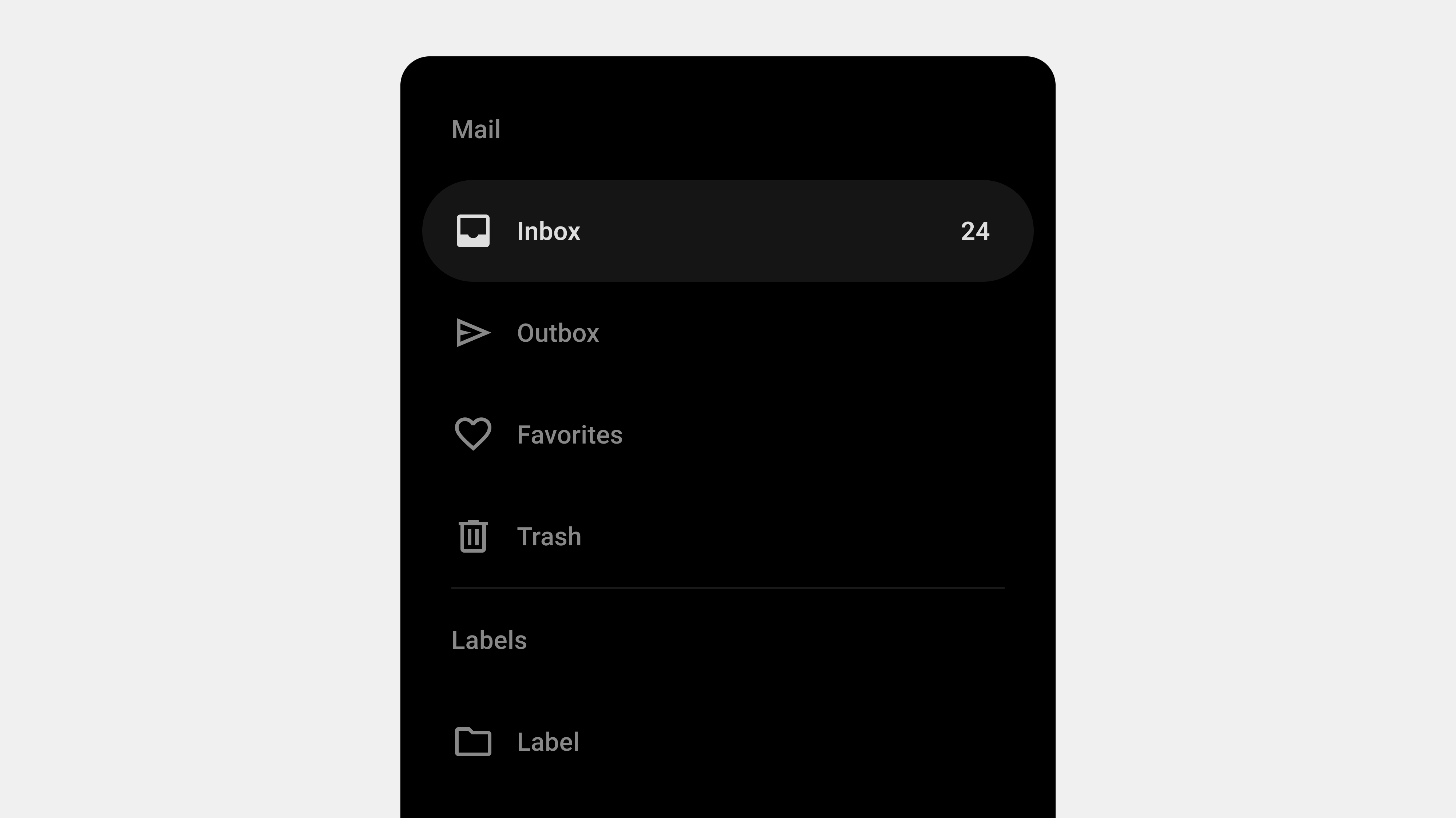
    Understanding Navigation Drawers: Definition and Role

    Navigation drawers, also known as side menus or hamburger menus, are one of the most widely used UI patterns in digital design. They provide a streamlined and efficient way to organize navigation, especially for applications with numerous features or complex hierarchies. While they are often seen as secondary to the primary navigation, their design and functionality can significantly impact the overall user experience. This article delves into the definition and role of navigation drawers, providing a comprehensive understanding of their importance in modern UI/UX design.


    1. What Is a Navigation Drawer?

    A navigation drawer is a collapsible side panel that allows users to access secondary or supplementary navigation elements. It typically remains hidden by default and can be opened via a toggle button, swipe gesture, or similar interaction.

    Key Characteristics

    • Hidden by Default: It stays out of sight, providing a clean interface until needed.
    • Expandable: Opens with a smooth transition to reveal navigation options.
    • Hierarchical Navigation: Supports multiple levels of navigation in a compact form.
    • Context-Aware: Can be personalized or contextualized based on user behavior.

    Common Use Cases

    • Mobile apps where screen space is limited.
    • Web applications with complex functionality.
    • Multi-platform tools that require consistent navigation patterns.

    2. The Role of Navigation Drawers in UX/UI Design

    Navigation drawers play a crucial role in enhancing usability, accessibility, and design efficiency. Let’s explore their key functions.

    A. Organizing Content and Features

    One of the primary roles of a navigation drawer is to organize content and features into a structured, easily navigable format.

    Benefits

    • Reduces clutter on the main screen by hiding secondary items.
    • Groups related features, making them easier to find.
    • Enables quick access to key sections without overwhelming the user.

    Example

    An e-commerce app might use a navigation drawer to house sections like “Shop by Category,” “Order History,” and “Account Settings,” while keeping the main interface focused on product discovery.


    B. Improving Space Efficiency

    Navigation drawers are particularly valuable in mobile and responsive designs, where screen space is at a premium.

    Benefits

    • Maximizes space for primary content by hiding the navigation panel.
    • Ensures users can focus on tasks without distraction.
    • Adapts seamlessly to different screen sizes and orientations.

    Example

    In a productivity app like Google Drive, the drawer stays hidden until the user needs to switch folders or access settings.


    C. Supporting Hierarchical Navigation

    For applications with multiple layers of content, navigation drawers simplify hierarchical navigation.

    Benefits

    • Allows users to drill down into submenus without losing context.
    • Keeps the navigation structure clear and logical.
    • Accommodates large datasets or extensive features.

    Example

    A learning platform like Coursera might use a drawer to navigate between courses, modules, and lessons.


    D. Enhancing Personalization

    Navigation drawers can be tailored to individual users, offering shortcuts or content based on their preferences and behavior.

    Benefits

    • Boosts engagement by showing personalized options.
    • Speeds up navigation for frequently accessed features.
    • Encourages user retention through customized experiences.

    Example

    A streaming app like Netflix uses the drawer to highlight the user’s profile, watchlist, and recommendations.


    E. Ensuring Consistency Across Platforms

    Navigation drawers provide a consistent navigation experience across mobile, web, and desktop applications.

    Benefits

    • Reduces learning curves for users switching between platforms.
    • Standardizes the UI design for better brand consistency.
    • Simplifies maintenance and updates for development teams.

    Example

    Slack’s navigation drawer maintains a consistent structure whether accessed on mobile or desktop, ensuring familiarity for users.


    3. Advantages of Navigation Drawers

    A. Scalability

    Navigation drawers can handle a wide range of content without becoming cluttered.

    B. Flexibility

    They adapt to different contexts, user needs, and platform constraints.

    C. Minimal Disruption

    The hidden design minimizes disruption to the main content, allowing users to focus on their tasks.

    D. Improved Aesthetics

    By hiding secondary navigation elements, drawers contribute to a cleaner, more modern interface.


    4. Challenges in Implementing Navigation Drawers

    While navigation drawers offer many benefits, they also present certain challenges.

    A. Discoverability

    Since drawers are hidden by default, some users may overlook their presence.

    Solution

    • Use onboarding or visual hints to introduce the drawer.
    • Make the toggle icon prominent and universally recognizable (e.g., the hamburger icon).

    B. Overcrowding

    Adding too many items to the drawer can overwhelm users and reduce usability.

    Solution

    • Prioritize key items and move less important ones to submenus.
    • Regularly audit and streamline the navigation structure.

    C. Accessibility Issues

    Improper implementation can exclude users with disabilities.

    Solution

    • Follow accessibility standards like WCAG.
    • Use ARIA roles and keyboard navigation support.

    5. Best Practices for Navigation Drawers

    A. Keep It Simple

    • Limit the number of menu items to avoid clutter.
    • Use clear and concise labels for navigation links.

    B. Highlight Key Features

    • Place frequently used features at the top of the drawer.
    • Use separators or headings to group related items.

    C. Optimize for Gestures

    • Enable swipe gestures for opening and closing the drawer on mobile devices.
    • Ensure gestures don’t interfere with other interactions.

    D. Test Responsiveness

    • Adapt the drawer design for various screen sizes.
    • Use persistent drawers for larger screens where appropriate.

    6. Examples of Effective Navigation Drawer Designs

    A. Gmail

    • Features: Displays user account info, primary folders, and additional labels.
    • Why It Works: Combines personalization with hierarchical navigation.

    B. Spotify

    • Features: Provides quick access to playlists, search, and user library.
    • Why It Works: Keeps the focus on music discovery while organizing secondary features.

    C. Trello

    • Features: Allows users to switch between boards and manage account settings.
    • Why It Works: Maintains a clean interface by hiding less frequently used options.

    7. Future Trends in Navigation Drawers

    A. AI-Powered Personalization

    Future drawers will use AI to dynamically adjust content based on user behavior and preferences.

    B. Voice Integration

    As voice interfaces grow, navigation drawers may incorporate voice commands for opening and navigating menus.

    C. Gesture-Based Interactions

    Gestures will become more intuitive and integrated with other touch interactions.


    Conclusion

    Navigation drawers are more than just a design trend—they are a functional, space-efficient solution for organizing complex menus and enhancing user experiences. By understanding their definition and role, designers and developers can harness their potential to create intuitive, user-friendly interfaces. While challenges like discoverability and accessibility require careful attention, the benefits of navigation drawers make them an indispensable tool in modern UI/UX design.


  • 내비게이션 드로어 – 2. 정의

    내비게이션 드로어 – 2. 정의

    내비게이션 드로어(Navigation Drawer)의 정의와 역할

    내비게이션 드로어(Navigation Drawer)는 화면의 한쪽에서 슬라이드로 나타나는 UI 컴포넌트로, 애플리케이션이나 웹사이트 내 주요 탐색 항목을 제공한다. 최근 모바일 중심의 사용자 경험(UX) 설계에서 널리 사용되며, 공간 절약과 탐색 효율성을 높이는 데 기여한다. 이번 글에서는 내비게이션 드로어의 정의와 역할을 심도 있게 탐구하고, 이를 설계 및 구현할 때 고려해야 할 요소를 살펴본다.


    내비게이션 드로어의 정의

    1. 내비게이션 드로어란 무엇인가?

    내비게이션 드로어는 화면의 좌측 또는 우측에서 슬라이드 방식으로 나타나는 메뉴 UI다. 일반적으로 아이콘 클릭, 제스처(스와이프) 등의 사용자 입력에 의해 활성화되며, 주요 메뉴, 설정, 사용자 프로필, 알림 등 다양한 기능을 포함할 수 있다.

    2. 내비게이션 드로어의 구성 요소

    • 햄버거 메뉴 아이콘: 드로어를 열기 위한 트리거 역할을 함.
    • 슬라이드 패널: 드로어 자체로, 탐색 메뉴와 부가적인 정보를 표시.
    • 메뉴 항목: 주요 페이지 링크, 설정, 프로필 등 사용자의 행동을 유도하는 항목들.
    • 닫기 인터페이스: 드로어를 닫는 버튼 또는 제스처 영역.

    내비게이션 드로어의 역할

    1. 공간 절약

    드로어는 화면에 항상 고정된 내비게이션 바와 달리, 필요한 경우에만 나타나기 때문에 화면 공간을 절약할 수 있다.

    • 효율적 레이아웃: 작은 화면(모바일)에서도 콘텐츠 중심의 UI를 유지.
    • 복잡한 정보 구조 처리: 많은 메뉴 항목을 숨겨 사용자 인터페이스를 간결하게 유지.

    2. 다단계 메뉴 제공

    드로어는 계층적 정보 구조를 표현하기에 적합하다.

    • 하위 메뉴: 여러 단계를 포함한 복잡한 메뉴 구조를 깔끔하게 정리 가능.
    • 카테고리화: 관련 메뉴를 그룹화하여 사용자가 쉽게 탐색하도록 유도.

    3. 사용자 행동 유도

    드로어는 단순한 메뉴 제공을 넘어, 사용자 행동을 유도하는 역할을 한다.

    • CTA(Call to Action): 특정 행동(예: 설정 변경, 프로필 확인)을 유도하는 버튼 포함.
    • 개인화 메뉴: 사용자 데이터(예: 최근 검색, 즐겨찾기)에 기반한 맞춤형 탐색 제공.

    4. 브랜드 아이덴티티 표현

    드로어는 서비스의 브랜드 아이덴티티를 시각적으로 강화하는 역할도 한다.

    • 브랜드 로고 및 컬러 사용: 브랜드의 정체성을 반영한 시각적 요소 배치.
    • 일관성 유지: 애플리케이션 또는 웹사이트 전반에서 동일한 디자인 언어 적용.

    내비게이션 드로어 설계 시 고려사항

    1. 정보 계층 구조

    • 우선순위 설정: 사용자 행동 데이터를 기반으로 가장 중요한 메뉴 항목을 상단에 배치.
    • 하위 메뉴 표시: 드롭다운 또는 확장 가능한 메뉴로 계층 구조를 명확히 표현.
    • 사용자 피드백 반영: 자주 사용되는 항목과 그렇지 않은 항목을 지속적으로 최적화.

    2. 시각적 디자인

    • 명확한 구분: 드로어와 메인 콘텐츠를 시각적으로 분리하여 혼란을 방지.
    • 일관된 스타일: 브랜드 색상, 아이콘 스타일, 텍스트 폰트를 통일.
    • 가독성: 텍스트 크기와 색상 대비를 조정하여 사용자 경험을 개선.

    3. 반응형 설계

    • 모바일 최적화: 터치 친화적인 인터페이스로 설계.
    • 데스크탑 적응: 화면 크기에 따라 드로어를 고정형(핀)으로 표시하거나, 슬라이드 방식으로 표시.

    4. 접근성(A11Y)

    • 스크린 리더 지원: 드로어 열림 및 닫힘 상태를 스크린 리더가 명확히 읽을 수 있도록 ARIA 속성 사용.
    • 키보드 탐색: 키보드만으로도 모든 메뉴를 탐색할 수 있도록 설정.
    • 색상 대비: 색맹 및 시각 장애 사용자를 위한 충분한 대비 제공.

    5. 성능 최적화

    • 애니메이션 성능: 드로어 열림/닫힘 애니메이션이 부드럽게 작동하도록 GPU 가속 활용.
    • 리소스 로드 최적화: 드로어가 열릴 때만 필요한 리소스를 로드하여 초기 로딩 속도 개선.

    성공적인 내비게이션 드로어 활용 사례

    1. 구글 드라이브

    • 특징: 좌측 드로어에 계정 정보, 폴더 구조, 즐겨찾기 항목 포함.
    • 장점: 단순하면서도 강력한 탐색 경험 제공.

    2. 페이스북

    • 특징: 모바일에서는 햄버거 메뉴로 드로어를 제공.
    • 장점: 핵심 기능은 하단 바, 부가 기능은 드로어에 배치하여 효율적인 탐색 제공.

    3. 아마존

    • 특징: 방대한 카테고리를 드로어로 정리.
    • 장점: 검색 필터와 결합해 효율적인 상품 탐색 제공.

    내비게이션 드로어의 한계와 개선 방향

    1. 가시성 부족

    드로어는 기본적으로 숨겨져 있어 사용자가 메뉴를 찾기 어려울 수 있다.

    • 개선 방향: 중요 항목은 내비게이션 바에 배치하고, 부가 항목만 드로어에 포함.

    2. 복잡성 증가

    과도하게 많은 항목을 포함하면 사용자가 혼란을 느낄 수 있다.

    • 개선 방향: 메뉴 수를 제한하고, 검색 기능 추가.

    3. 접근성 문제

    드로어가 스크린 리더나 키보드 탐색을 지원하지 않으면 특정 사용자에게 불편을 줄 수 있다.

    • 개선 방향: 접근성 표준(WCAG)을 준수하고, 사용자 테스트를 통해 문제점을 식별.

    결론

    내비게이션 드로어는 공간 절약, 정보 구조화, 사용자 행동 유도 등 다양한 역할을 수행하는 강력한 UI 컴포넌트다. 이를 성공적으로 설계하기 위해서는 사용자 중심의 정보 구조, 일관된 디자인, 접근성 강화, 성능 최적화가 필수적이다. 잘 설계된 드로어는 사용자 경험을 크게 향상시키며, 복잡한 정보 구조를 간단하고 효율적으로 제공할 수 있다.