[태그:] Product Owner

  • Buttons – Product owner 2

    Buttons – Product owner 2

    Crafting Effective Button Wireframes: 5 Key Considerations for Designers, Publishers, and Developers

    Buttons are at the heart of digital interfaces, serving as the primary elements of interaction. When creating wireframes or storyboards for buttons, ensuring clarity and alignment among designers, publishers, and developers is crucial. A well-documented button wireframe not only streamlines the implementation process but also reduces miscommunication and errors. In this post, we’ll outline the five most critical considerations when creating button wireframes.


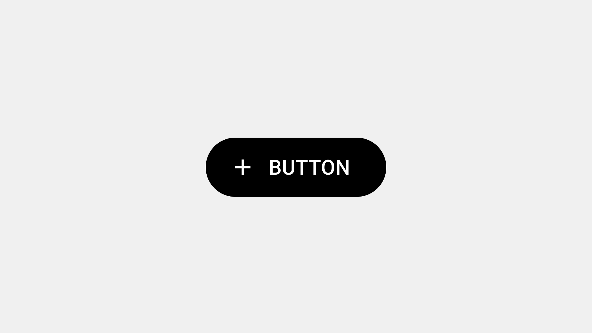
    1. Define the Button’s Purpose and Hierarchy

    Why It Matters:

    The purpose of a button directly impacts its design, placement, and functionality. Establishing a clear hierarchy ensures that users can easily distinguish between primary, secondary, and tertiary actions, guiding their attention and interaction.

    Key Considerations:

    • Primary Buttons: Highlight the most critical actions, such as “Submit” or “Buy Now.” Use bold colors and prominent placement.
    • Secondary Buttons: Support additional actions, such as “Cancel” or “Back.” Use subtler styling like outlines or muted colors.
    • Tertiary Buttons: For minor or contextual actions, such as “Learn More.” Often styled as text links.

    Documentation Tips:

    • Clearly label buttons in the wireframe based on their hierarchy (e.g., Primary, Secondary).
    • Include annotations explaining the button’s purpose and its role in the user flow.

    2. Specify Button States and Interactions

    Why It Matters:

    Buttons must provide visual feedback to inform users about their status and interactivity. Defining these states in the wireframe ensures consistency across the design and development stages.

    Common Button States:

    1. Default: The resting state when no interaction occurs.
    2. Hover: Changes when the cursor is over the button (web).
    3. Pressed/Active: Indicates the button has been clicked or tapped.
    4. Disabled: Grayed out when the button is inactive or unavailable.
    5. Loading: Shows progress for actions that take time.

    Documentation Tips:

    • Illustrate all button states in the wireframe, with visual examples or mockups.
    • Annotate interactions such as hover effects, animations, or transitions.
    • For mobile, specify tactile feedback like vibrations for taps.

    3. Ensure Accessibility Standards

    Why It Matters:

    Accessible buttons cater to all users, including those with disabilities. Ensuring accessibility in the wireframe phase prevents costly revisions during development.

    Key Considerations:

    • Size: Buttons should have a minimum touch target size of 48x48dp for mobile interfaces.
    • Contrast: Meet WCAG guidelines with sufficient contrast between text and background.
    • Keyboard Navigation: Buttons should be operable with a keyboard and include clear focus states.
    • Screen Reader Support: Include ARIA labels or text equivalents for non-text buttons.

    Documentation Tips:

    • Include specific accessibility requirements in the wireframe annotations.
    • Provide examples of how focus and hover states will appear for keyboard users.
    • Annotate ARIA roles and labels for screen readers.

    4. Document Placement and Alignment

    Why It Matters:

    Button placement significantly affects usability. Proper alignment and spacing contribute to a visually cohesive design and prevent user confusion.

    Key Considerations:

    • Align buttons consistently across the interface (e.g., primary actions on the bottom-right).
    • Maintain sufficient spacing between buttons to avoid accidental clicks or taps.
    • Follow platform-specific guidelines for button placement (e.g., floating action buttons on mobile).

    Documentation Tips:

    • Use grid systems in the wireframe to illustrate button alignment and spacing.
    • Include annotations specifying alignment rules, such as “Center align this button within its container.”
    • Highlight platform-specific adjustments (e.g., mobile vs. desktop layouts).

    5. Detail Functional Requirements and Edge Cases

    Why It Matters:

    Buttons often interact with complex system logic, such as disabling states or triggering backend processes. Documenting these functional requirements ensures developers implement the button behavior correctly.

    Key Considerations:

    • Functional Logic: Define when a button is enabled, disabled, or in a loading state.
    • Error Handling: Specify what happens when an action fails (e.g., error messages).
    • Edge Cases: Include scenarios like network interruptions or invalid inputs.
    • Performance Feedback: Explain how users will know an action is processing (e.g., spinners, loaders).

    Documentation Tips:

    • Use flowcharts or diagrams in the wireframe to detail button behavior across user journeys.
    • Annotate specific conditions for enabling or disabling buttons.
    • Include examples of success and error messages that appear after button actions.

    Additional Best Practices for Button Wireframes

    1. Use Consistent Naming Conventions: Label buttons clearly in the wireframe (e.g., “Primary_Button_Submit”).
    2. Provide Visual and Text Annotations: Combine visual examples with text annotations to avoid ambiguity.
    3. Collaborate Early: Involve designers, publishers, and developers early in the wireframe process to address potential challenges.
    4. Test with Prototypes: Before finalizing wireframes, create clickable prototypes to validate button behavior with stakeholders and users.

    Conclusion

    Creating effective button wireframes requires careful attention to purpose, states, accessibility, placement, and functional logic. As a Product Owner, your role is to ensure these details are clearly documented to streamline collaboration and implementation. By addressing these five considerations, you can minimize miscommunication and deliver buttons that meet both user and business goals.


  • Buttons – Product owner 1

    Buttons – Product owner 1

    Designing Buttons with User Expectations in Mind: A Guide for Product Owners

    Buttons are critical touchpoints in any digital product, serving as the gateway between user intentions and system actions. From a Product Owner’s perspective, ensuring buttons meet user expectations is crucial for achieving business objectives, optimizing usability, and fostering trust. This article outlines what users expect from buttons, how to align design with these expectations, and actionable steps Product Owners can take to deliver a superior user experience.


    What Do Users Expect from Buttons?

    Users approach buttons with clear expectations, influenced by their past digital experiences and intuitive understanding of interaction design. Meeting these expectations is key to ensuring satisfaction and usability.

    1. Clarity of Purpose

    Users expect buttons to explicitly convey their function. Ambiguity can lead to confusion or errors.

    • A button labeled “Buy Now” should lead directly to a checkout process.
    • Avoid vague labels like “Click Here”, which do not explain the action’s outcome.

    2. Ease of Interaction

    Users want buttons to be effortless to locate, recognize, and use.

    • Buttons should be large enough for easy tapping or clicking.
    • Adequate spacing prevents accidental interactions, especially on mobile devices.

    3. Visual Cues for Interactivity

    Buttons must look and feel interactive to users.

    • Interactive elements should have distinct visual styles (e.g., shadows, borders, hover effects).
    • Disabled buttons should clearly indicate they are non-functional.

    4. Immediate Feedback

    Users expect buttons to confirm their interactions through visual or functional feedback.

    • Examples include color changes, animations, or success messages.
    • Feedback reassures users their action has been acknowledged.

    5. Alignment with Context

    Buttons should fit seamlessly into the interface and match the user’s current task.

    • Primary buttons should stand out for critical actions.
    • Secondary actions should have a subtler design to avoid visual competition.

    6. Consistency Across the System

    Users expect consistent button behavior throughout the product.

    • For instance, all primary buttons should share the same color and size.
    • States like hover, active, and disabled should follow uniform patterns.

    How to Meet User Expectations with Button Design

    Product Owners play a critical role in ensuring button design aligns with user needs. By working closely with designers and developers, you can create buttons that are functional, user-friendly, and aligned with business goals.


    1. Define Button Hierarchy

    Clear visual hierarchy helps users distinguish between primary and secondary actions. As a Product Owner:

    • Prioritize primary actions for business-critical goals (e.g., “Sign Up” or “Add to Cart”).
    • Use secondary and tertiary buttons for less important or optional actions.
    • Collaborate with designers to visually differentiate these buttons.

    Example: In a payment page, the “Pay Now” button should dominate visually, while the “Cancel” button should be less prominent.


    2. Craft Clear and Actionable Labels

    Button labels are a user’s guide to interaction. To ensure clarity:

    • Use concise, action-oriented text that reflects the intended outcome (e.g., “Download Report”).
    • Avoid generic terms or jargon that may confuse users.
    • Test labels with real users to validate their understanding.

    Example: A button reading “Get Free Trial” is more compelling than one labeled “Submit”.


    3. Prioritize Accessibility

    Buttons must be designed inclusively to accommodate all users. Product Owners should:

    • Advocate for WCAG-compliant contrast ratios and accessible font sizes.
    • Ensure buttons are keyboard and screen reader compatible with proper ARIA labels.
    • Collaborate with QA teams to validate accessibility in real-world scenarios.

    Example: For visually impaired users, ensure a “Submit Form” button is announced correctly by screen readers.


    4. Implement Feedback Mechanisms

    Feedback is essential to building trust and guiding users. Effective buttons provide:

    • Visual feedback (e.g., color changes, animations) on hover, active, and disabled states.
    • Progress indicators for long-running actions, such as a spinner or progress bar.
    • Confirmation messages for successful tasks or error messages for failed ones.

    Example: A “Submit” button that changes to “Submitting…” and then to “Submitted” reassures users that the process is progressing.


    5. Optimize for Mobile Usability

    Mobile interfaces pose unique challenges for button design. As a Product Owner:

    • Ensure buttons meet touch-friendly size requirements (minimum 48x48dp).
    • Place primary actions at the bottom of the screen for easy thumb reach.
    • Space buttons adequately to prevent accidental taps.

    Example: In a mobile banking app, place the “Transfer” button at the bottom-right corner for thumb-friendly access.


    6. Reflect User Mental Models

    Buttons should align with users’ intuitive expectations. This involves:

    • Placing buttons where users naturally expect them (e.g., “Next” on the bottom-right of forms).
    • Following established design conventions (e.g., a trash can icon for delete).

    Tip: Validate assumptions about user mental models through usability testing.


    7. Plan for Error Handling and Edge Cases

    Anticipate scenarios where user inputs or system conditions may fail. Effective button design includes:

    • Disabled states for unavailable actions (e.g., incomplete form fields).
    • Clear error messages to guide users on corrective actions.
    • Confirmation prompts for irreversible actions, such as account deletion.

    Example: A “Delete Account” button should always include a secondary confirmation dialog.


    Key Actions for Product Owners

    To ensure buttons meet user expectations and business goals, Product Owners should:

    1. Define Priorities: Clearly identify which actions are critical to user and business objectives.
    2. Collaborate Effectively: Work closely with designers and developers to align on button hierarchy, style, and functionality.
    3. Enforce Standards: Advocate for consistent button behavior and styling across the product.
    4. Champion Accessibility: Prioritize inclusivity by ensuring buttons are accessible to all users.
    5. Test and Iterate: Use usability testing to validate button designs and make data-driven improvements.

    Conclusion

    Buttons are more than visual elements—they are the foundation of interaction within any product. As a Product Owner, ensuring buttons align with user expectations requires clear priorities, collaboration, and a user-first mindset. By delivering well-designed buttons, you can improve usability, achieve business goals, and foster trust with your users.


  • 긍정=넓다. 부정=좁다.

    긍정=넓다. 부정=좁다.

    긍정적 감성을 일으키다가 부정적 감성을 일으키도록 하는 것이 가능할까? 몇 가지 방법이 있는데 그중 하나는 소리를 이용하는 것이다. 기계설비의 눈에 보이는 외양은 긍정적인 감성이나 즐거움을 줄 수 있다. 기계설비의 작동하는 소리가 그 상태를 알려 주는 경우가 아니라면 평상시 작동에서는 가벼운 배경 음악을 깔 수 있다. 그러나 어떤 문제가 발생한 다면 곧바로 음악이 꺼지고 알람이 울려야만 한다. 부저, 종소리 등이 부정적인 감성과 불안을 불러일으켜, 그 소리만으로도 긍정적인 감성을 부정적인 감성으로 바꿀 수 있다 지나친 집중의 위험성은 사고(事故)를 연구하는 사람들에게는 이미 잘 알려진 사실이다. 그러므로 사람들이 강도높은 스트레스 속에서 맡은 일을 잘 수행하게 하기 위해서는 특별한 디자인과 훈련이 요구된다. 높은 불안감이 야기되는 극도의 집중과 터널 시각, 때문에 이러한 시스템 은 기본적으로 창의적인 생각의 필요성을 최소화하도록 디자인되어야 한다. 사실 문제는 도를 지나치지 않는데 있다. 불안감을 지나치게 조성하면터널 시각(tunnel vision)’이라는 현상이 나타나서, 너무 집중한 나머지 다른 뻔히 보이는 대안을 찾아내는 데 도리어 실패할 수 있다. 극도의 불안감, 즉 극도의 부정적 감성을 가진 사람들은 탈출에만 집중하게 된다. 그들은 무조건 문을 바깥으로 민다. 그런데도 열리지 않을 때 그들은 더욱 세게 미는 것이다. 너무 많은 이들이 사고가 났을 때 그런 행동의 결과로 목숨을 잃었다. 이제 소방 관련 법규는 ‘공황설비(panic hardware)’ 를 필요로 한다. 그래서 공연장의 문은 밖으로 열려야 하고, 밀면 항상 열려야 한다.

    감성 디자인, 도널드 노먼


    감성 디자인은 사용자의 감정을 고려해 제품, 환경, 서비스의 경험을 설계하는 학문입니다. 특히 감정의 전환, 즉 긍정적 감정에서 부정적 감정으로의 변화는 특정한 목적을 위해 중요한 요소로 작용할 수 있습니다. 사용자 경험을 향상시키는 데 있어 긍정적인 감정을 유지하는 것이 중요하지만, 때때로 부정적인 감정을 불러일으키는 것이 더 효과적인 경우도 존재합니다. 이러한 감정의 전환은 주로 경고, 위험 인식, 안전 확보 등의 상황에서 사용됩니다.

    본 글에서는 긍정적 감성을 부정적 감성으로 전환하는 방법 중 소리를 이용한 방법과 이 과정에서 발생하는 인지적 반응을 중심으로 살펴보고자 합니다. 이를 통해 감정적 디자인이 사용자 경험에 미치는 영향을 구체적으로 이해해보겠습니다.


    소리를 통한 감정의 전환

    소리는 감정 디자인에서 강력한 도구로 작용합니다. 청각적 자극은 시각적인 요소와는 달리 즉각적이며 강렬한 감정을 유발할 수 있습니다. 예를 들어, 기계 설비가 평상시에 작동하는 동안 배경음악을 통해 사용자에게 긍정적인 감정을 유도할 수 있습니다. 이런 환경에서는 사용자가 평온하고 안정적인 상태를 유지할 수 있으며, 업무 효율성을 높이는 데도 도움이 됩니다.

    하지만 특정 상황에서 부정적 감정을 유도하는 것이 필요할 때가 있습니다. 문제가 발생했을 때 배경음악이 갑자기 꺼지고, 부저나 경고음이 울리면 사용자에게 긴장과 불안을 유발하게 됩니다. 이때 부정적인 감정은 문제의 심각성을 인지시키고, 사용자가 즉각적인 대응을 하도록 만드는 중요한 역할을 합니다.

    소리의 두 가지 역할:

    1. 정상 상태에서의 긍정적인 감정 유도: 편안한 음악이나 배경 소음은 사용자가 느끼는 스트레스를 줄이고, 업무에 집중할 수 있는 환경을 조성합니다.
    2. 비정상 상태에서의 부정적인 감정 유도: 경고음은 즉각적인 반응을 이끌어내기 위해 사용되며, 사용자가 위험 상황을 인지하고 빠르게 대처할 수 있도록 돕습니다.

    이와 같은 감정의 전환은 단순한 시각적 경고보다 효과적일 수 있으며, 특히 여러 감각을 동시에 자극하여 경각심을 높이는 방식은 사용자에게 더 강한 반응을 유도할 수 있습니다.


    부정적 감정이 필요한 이유

    부정적인 감정은 주로 위험 상황에서 사용자에게 경각심을 불러일으키고, 빠른 대응을 유도하는 데 필수적입니다. 특히 안전이 중요한 분야에서는 부정적인 감정을 유도하여 사용자가 신속하게 행동하도록 만드는 것이 매우 중요합니다.

    예를 들어, 공장의 기계 설비가 고장났을 때 또는 소방 상황에서 긍정적인 감정을 유지하는 것은 적절하지 않습니다. 이 경우, 부정적인 감정을 통해 사용자가 현재 상황을 인지하고 빠르게 조치를 취하게 만드는 것이 중요합니다.

    지나친 집중의 위험성: 터널 시각(Tunnel Vision)

    부정적인 감정은 때때로 사용자가 극도의 집중 상태에 빠지게 만듭니다. 이는 위기 상황에서 중요할 수 있지만, 지나친 집중은 ‘터널 시각’이라는 부작용을 불러일으킬 수 있습니다. 터널 시각은 사용자가 너무 한 가지 문제에만 집중하여 다른 중요한 정보를 놓치게 되는 현상을 의미합니다.

    터널 시각은 위험 상황에서 치명적일 수 있습니다. 예를 들어, 긴급 상황에서 출입구를 열어야 하는데 문이 열리지 않을 경우, 사람들이 지나치게 문을 미는 것에만 집중하여 다른 탈출 방법을 고려하지 않는 상황이 발생할 수 있습니다. 이로 인해 많은 사람들이 불필요한 희생을 겪어왔으며, 이 문제를 해결하기 위해 ‘공황설비(panic hardware)’가 도입되었습니다. 공연장이나 공공 장소의 문이 밀면 항상 열리도록 설계된 이유도 이러한 부작용을 방지하기 위함입니다.


    극도의 불안과 창의성의 관계

    높은 불안감이 유발되는 상황에서는 창의적인 사고가 억제될 수 있습니다. 이는 인간의 본능적인 반응으로, 위기 상황에서는 생존이 최우선이 되기 때문에 새로운 접근 방식을 생각해낼 여유가 없기 때문입니다. 예를 들어, 긴급 상황에서 사람들은 대개 탈출에만 집중하게 되며, 이는 기존에 알고 있는 방법에 지나치게 의존하는 결과를 낳습니다.

    감정과 창의적 사고

    아이젠의 연구에 따르면, 사람들이 편안하고 긍정적인 감정을 느낄 때 사고의 폭이 넓어지고 창의적으로 된다고 합니다. 반면, 높은 불안감 속에서는 사고의 폭이 좁아져 새로운 접근 방식을 생각해내는 것이 어려워집니다. 즉, 위험 상황에서 창의적인 해결책을 기대하기는 어렵다는 의미입니다. 이는 위기 상황에서는 사용자가 본능적으로 반응할 수 있도록 단순하고 직관적인 시스템이 필요하다는 점을 시사합니다.


    디자인에서 감정의 전환 적용하기

    감정의 전환은 단순히 감정만을 다루는 것이 아니라, 사용자의 행동을 유도하는 중요한 디자인 전략입니다. 긍정적인 감정을 통해 사용자가 제품이나 환경에서 편안함을 느끼게 하고, 부정적인 감정을 통해 중요한 결정을 빠르게 내리도록 유도하는 것이 핵심입니다.

    소리를 이용한 디자인 예시:

    자동차 경고 시스템: 차량이 정상적으로 작동할 때는 조용하거나 편안한 소리가 들리지만, 문제가 발생하면 경고음이 울리며 운전자에게 위험을 경고합니다. 이때 경고음은 긴급성을 나타내며, 운전자가 즉각적으로 조치를 취하도록 유도합니다.

    의료기기 경고음: 의료 기기의 경고음은 환자의 상태가 위급할 때 의료진에게 빠르게 알려주는 역할을 합니다. 이 경고음은 단순히 소리로 끝나지 않고, 시각적인 요소와 함께 사용되어 사용자가 즉각적으로 반응하도록 돕습니다.


    감성 디자인의 미래

    감정 전환을 효과적으로 활용한 디자인은 사용자 경험을 향상시키는 데 큰 역할을 합니다. 특히 안전과 관련된 분야에서는 부정적인 감정을 적절히 유도하여 위험을 회피할 수 있도록 돕는 것이 중요합니다. 다만, 지나친 부정적 감정 유발은 사용자에게 불필요한 스트레스를 가중시킬 수 있으므로 적절한 균형이 필요합니다.

    미래의 감성 디자인은 단순히 기능적 요소에 국한되지 않고, 사용자의 감정을 고려한 맞춤형 경험을 제공하는 방향으로 나아갈 것입니다. 기술의 발전에 따라 감정 인식 시스템이 더욱 정교해지면, 실시간으로 사용자의 감정 상태를 파악하여 이에 맞는 경험을 제공하는 것도 가능해질 것입니다. 이는 사용자가 더 나은 의사결정을 할 수 있도록 돕고, 궁극적으로는 더 안전하고 효율적인 환경을 제공하는 데 기여할 것입니다.


    결론

    긍정적인 감성을 부정적인 감성으로 전환하는 것은 사용자 경험에서 매우 중요한 요소입니다. 특히 위험 상황에서 적절한 경고와 대처가 필요할 때, 감정 전환을 통해 사용자가 빠르고 정확하게 반응하도록 만드는 것이 중요합니다. 소리를 이용한 감정 전환은 효과적인 방법 중 하나로, 경고음과 배경음악을 적절히 활용하여 사용자의 감정을 제어할 수 있습니다. 디자인에서 감정을 다루는 것은 단순한 미학 이상의 중요한 역할을 하며, 이를 통해 더 나은 사용자 경험을 제공할 수 있습니다.

  • 감정이 사용성에 미치는 영향: 감성 디자인의 중요성

    감정이 사용성에 미치는 영향: 감성 디자인의 중요성

    인간이 현재 처한 상황이 좋은지 나쁜지, 안전한지 위험한지를 판단하는 데 도움을 주는 것이 바로 감정이다.

    긍정적인 감정은 학습, 호기심 그리고 창의적 사고의 중요한 요소다. 사람들은 걱정으로 인해 불안해할 때 그 문제와 직접적으로 관련된 부분에만 집중하면서 사고의 폭을 좁히는 경향이 있다. 이는 위험한 상황에서 벗어나는 데는 좋은 전략이지만, 문제 해결에서 새로운 창의적 접근 방법을 생각해 내는 데는 좋은 전략이라 할 수 없다. 아이젠의 결론을 보면, 사람들은 편안하고 행복한 상태일 때 사고의 진행이 넓어지고 창의적으로 되며 상상력이 풍부해진다.

    예쁜 물건은 사람들의 기분을 좋게 하고, 그 결과 더욱 창조적인 생각을 할 수 있게 한다. 제품이 사용하기 쉬워지는 이유는 무엇 때문일까? 대답은 간단하다. 사람들이 직면한 문제의 해결책을 찾기 쉽도록하기 때문이다. 일반적으로 제품을 사용하다가 첫 시도로 원하는 결과를 얻지 못했을 때 가장 자연스러운 반응은 좀 더 노력을 기울여 다시 시도하는 것이다. 그러나 컴퓨터와 관련된 오늘날의 제품들은 같은 작동을 여러 번 하는 것보다 다른 대안을 찾는 것이 더 낫다. 같은 작동을 여러 번 하는 경향은 불안하거나 긴장한 사람들에게서 주로 나타나는데, 부정적인 감정 상태가 문제의 세부적인 것에 초점을 맞추게 하는 것이다. 해결 책을 찾지 못할 경우 사람들은 더욱 불안해하고 긴장하며, 이 성가신 문제의 세부적인 것에 더욱 집중하게 된다.

    반대로 긍정적인 감정 상태에 있는 사람들은 다른 새로운 접근방법을 찾으려 하고 대부분 만족스러운 결과를 얻게 된다. 감정 시스템은 몸의 근육을 제어할 뿐만 아니라 화학적 신경전달물질을 통하여 뇌를 작동시킨다. 우리는 근육 활동을 통하여 반응한다. 그러나 근육 활동은 우리가 만나는 사물 혹은 상대방에 대한 신호로 행해지기도 하는데 이는’의사소통’ 이라는 감정의 또 다른 강력한 역할이다.

    감성 디자인, 도널드 노먼

    인간의 감정은 일상에서 매우 중요한 역할을 하며, 우리가 경험하는 모든 상황과 밀접하게 연결되어 있습니다. 감정은 우리가 처한 상황이 안전한지, 위험한지, 좋은지, 나쁜지 판단하는 데 결정적인 도움을 줍니다. 특히 감정은 사용자가 제품이나 서비스를 경험하는 방식에 크게 영향을 미치며, 이는 디자인 과정에서도 반드시 고려해야 할 중요한 요소입니다. 이 글에서는 감성 디자인이 사용자 경험에 어떻게 영향을 미치는지, 그리고 긍정적인 감정이 사용성과 창의성을 촉진하는 방법에 대해 살펴보겠습니다.


    감정과 사용성의 관계

    감정은 단순한 심리적 상태 이상으로, 우리가 세상을 어떻게 인식하고 반응하는지 결정하는 중요한 요소입니다. 아이젠(Aisen)의 연구에 따르면, 사람들은 긍정적인 감정 상태일 때 더 넓은 사고를 하며 창의적인 아이디어를 떠올리기 쉬워집니다. 반면에, 불안이나 스트레스와 같은 부정적인 감정 상태에서는 문제의 세부 사항에 집중하게 되며, 사고의 폭이 좁아져 창의적인 해결책을 찾는 데 어려움을 겪게 됩니다.

    이러한 점은 사용성에 중요한 의미를 가집니다. 사용자가 제품을 사용할 때 긍정적인 감정을 느낀다면, 그들은 더 창의적이고 유연하게 문제를 해결할 수 있습니다. 그러나 사용자가 불편함이나 좌절감을 느낀다면, 그들은 주어진 문제에 더욱 집착하게 되어 더 나은 해결책을 찾지 못할 가능성이 커집니다. 이는 결국 사용 경험에 부정적인 영향을 미치게 됩니다.


    감정이 사고와 문제 해결에 미치는 영향

    긍정적인 감정은 사용자가 제품을 탐색할 때 사고의 폭을 넓히는 역할을 합니다. 예를 들어, 사용자가 편안하고 행복한 상태에서 제품을 사용하면 다양한 방법으로 문제를 해결하려고 시도하고, 더 많은 가능성을 탐구하려는 경향을 보입니다. 반면에, 부정적인 감정 상태에 있는 사용자는 문제의 세부 사항에 지나치게 집중하면서 해결책을 찾는 데 어려움을 겪게 됩니다.

    예쁜 물건이나 사용하기 쉬운 제품은 사람들의 감정을 긍정적으로 변화시킵니다. 시각적으로 아름답거나 직관적인 디자인은 사용자에게 즉각적인 긍정적 반응을 일으키며, 이는 문제 해결 과정에서도 큰 도움이 됩니다. 사용자들은 이러한 제품을 사용할 때 기분이 좋아지며, 이로 인해 더 창의적이고 유연한 사고를 할 수 있게 됩니다. 반대로 복잡하거나 사용하기 어려운 제품은 사용자를 좌절시키고, 문제 해결 능력을 제한하게 됩니다.


    감성 디자인의 필요성

    감성 디자인이란 제품이나 서비스가 사용자에게 긍정적인 감정을 불러일으킬 수 있도록 설계하는 것을 의미합니다. 이는 단순히 기능적이거나 효율적인 제품을 만드는 것을 넘어, 사용자가 제품을 사용할 때 느끼는 감정까지 고려하는 디자인을 추구합니다. 감성 디자인의 궁극적인 목표는 사용자가 제품을 사용하는 동안 긍정적인 경험을 하도록 하여, 제품과의 상호작용이 더 즐겁고 만족스러운 경험이 되도록 하는 것입니다.

    감성 디자인의 필요성은 특히 디지털 제품에서 두드러집니다. 예를 들어, 복잡한 사용자 인터페이스(UI)를 가진 소프트웨어나 애플리케이션은 사용자가 사용 중에 혼란을 느끼게 할 수 있으며, 이는 결국 부정적인 감정을 불러일으킵니다. 이와 같은 상황에서는 사용자가 문제를 해결하기보다는 동일한 방법을 반복적으로 시도하면서 좌절감을 느끼게 됩니다. 그러나 감성 디자인이 적용된 제품은 사용자가 문제를 해결하는 과정에서 긍정적인 감정을 유지하게 도와주며, 더 나은 사용자 경험을 제공합니다.


    감정과 행동의 상호작용

    감정은 우리의 신체 활동과도 밀접하게 연결되어 있습니다. 감정 시스템은 뇌에서 신경전달물질을 분비해 신체의 근육을 제어하고, 이를 통해 우리는 상황에 반응하게 됩니다. 예를 들어, 긴장하거나 불안할 때 몸이 경직되는 것처럼, 감정은 우리의 신체적 반응을 유발합니다. 하지만 이러한 신체적 반응은 단순한 움직임에 그치지 않고, 우리가 상호작용하는 대상이나 사람에게 감정적 신호를 전달하는 역할을 하기도 합니다.

    이러한 상호작용은 제품 디자인에서도 중요한 역할을 합니다. 제품을 사용할 때 사용자가 느끼는 감정은 그들의 행동에 직접적인 영향을 미칩니다. 긍정적인 감정을 느낄 때, 우리는 그 제품에 대해 더 호감을 갖고, 문제를 해결하는 과정에서 더 유연한 태도를 취하게 됩니다. 반대로 부정적인 감정을 느낄 때는 제품에 대한 반응이 경직되고, 반복적인 행동을 하거나 더 나은 대안을 찾지 못하게 됩니다.


    감성 디자인이 사용성에 미치는 긍정적 효과

    감성 디자인은 사용성에 매우 긍정적인 영향을 미칩니다. 사용자 인터페이스(UI)와 사용자 경험(UX) 디자인에서는 특히 중요한 요소로, 사용자의 감정 상태를 고려한 디자인은 더 나은 사용성을 제공할 수 있습니다. 예를 들어, 직관적이고 시각적으로 매력적인 인터페이스는 사용자가 제품을 쉽게 이해하고 사용할 수 있도록 도와줍니다. 사용자가 제품을 처음 사용했을 때 긍정적인 경험을 한다면, 그들은 앞으로도 그 제품을 계속 사용할 가능성이 높아집니다.

    또한, 감성 디자인은 사용자가 제품에 대해 더 높은 신뢰감을 가지도록 도와줍니다. 사용자가 편안하고 즐겁게 제품을 사용할 수 있을 때, 그들은 그 제품을 더욱 신뢰하게 되고, 이는 브랜드 충성도로 이어질 수 있습니다. 결국, 감성 디자인은 사용성과 사용자 만족도를 동시에 높이는 중요한 전략으로 자리 잡을 수 있습니다.


    마무리

    감정은 사용자가 제품이나 서비스를 경험하는 방식에 깊은 영향을 미치며, 감성 디자인은 이를 최적화하는 중요한 방법입니다. 긍정적인 감정은 사용자의 창의적 사고와 문제 해결 능력을 촉진하며, 사용자가 제품을 더욱 편안하게 탐색하고 즐길 수 있도록 도와줍니다. 반면에, 부정적인 감정은 사용성을 제한하고, 사용자가 문제에 집착하며 더 나은 대안을 찾지 못하게 만듭니다.

    따라서 제품이나 서비스의 디자인 과정에서 사용자의 감정 상태를 고려한 감성 디자인은 필수적입니다. 이를 통해 사용자는 더 나은 경험을 하게 되며, 제품에 대한 신뢰와 만족도를 높일 수 있습니다. 결국 감성 디자인은 제품의 성공에 있어 중요한 열쇠가 될 수 있습니다.

  • 정보 아키텍처: UI/UX 최적화의 숨은 영웅

    정보 아키텍처: UI/UX 최적화의 숨은 영웅

    오늘은 사용자 경험 최적화에 있어 종종 간과되지만 절대적으로 중요한 요소, 바로 ‘정보 아키텍처(Information Architecture, IA)’에 대해 이야기해보려 합니다. 정보 아키텍처는 UI/UX 설계의 근간이자, 사용자 경험의 핵심 뼈대입니다. 자, 이제 이 숨은 영웅의 세계로 뛰어들어봅시다!

    정보 아키텍처란 무엇인가?

    정보 아키텍처는 정보를 구조화하고 조직화하는 방식을 말합니다. 쉽게 말해, 사용자가 필요한 정보를 쉽게 찾고 이해할 수 있도록 정보를 배치하고 연결하는 것입니다. 이는 마치 도시 계획과 같습니다. 잘 설계된 도시에서는 길을 잃지 않고 목적지에 도달할 수 있듯이, 잘 설계된 정보 아키텍처는 사용자가 디지털 공간에서 길을 잃지 않고 원하는 정보에 도달할 수 있게 해줍니다.

    정보 아키텍처의 중요성

    1. 사용자 만족도 향상
      • 사용자가 원하는 정보를 쉽게 찾을 수 있게 함으로써 만족도를 높입니다.
      • 복잡한 정보를 체계적으로 정리하여 사용자의 인지 부하를 줄입니다.
    2. 효율성 증대
      • 잘 구조화된 정보는 사용자가 더 빠르게 작업을 완료할 수 있게 합니다.
      • 검색 시간을 줄이고 의사 결정 과정을 간소화합니다.
    3. 일관성 유지
      • 전체 시스템에 걸쳐 일관된 구조를 제공하여 학습 곡선을 낮춥니다.
      • 새로운 기능이나 콘텐츠를 추가할 때도 일관된 구조를 유지할 수 있습니다.
    4. 확장성 확보
      • 미래의 성장과 변화에 대비한 유연한 구조를 제공합니다.
      • 새로운 카테고리나 기능을 쉽게 통합할 수 있는 기반을 마련합니다.
    5. 브랜드 신뢰도 향상
      • 잘 정리된 정보는 전문성과 신뢰성을 전달합니다.
      • 사용자가 정보를 쉽게 찾고 이해할 수 있을 때, 브랜드에 대한 신뢰도가 높아집니다.

    정보 아키텍처 최적화 전략

    1. 사용자 중심 접근
      • 사용자 리서치를 통해 실제 사용자의 니즈와 행동 패턴을 파악하세요.
      • 카드 소팅(Card Sorting) 기법을 활용하여 사용자의 멘탈 모델을 이해하세요.
    2. 계층 구조 최적화
      • 정보를 논리적이고 직관적인 계층 구조로 조직화하세요.
      • 브레드크럼(Breadcrumb) 네비게이션을 활용하여 사용자의 현재 위치를 명확히 하세요.
    3. 레이블링 시스템 개선
      • 명확하고 일관된 레이블을 사용하여 사용자의 혼란을 줄이세요.
      • 전문 용어보다는 사용자가 이해하기 쉬운 일상 언어를 사용하세요.
    4. 검색 기능 강화
      • 강력한 검색 기능을 제공하여 사용자가 원하는 정보를 빠르게 찾을 수 있게 하세요.
      • 자동 완성, 관련 검색어 추천 등의 기능을 추가하여 검색 경험을 개선하세요.
    5. 콘텐츠 모델링
      • 콘텐츠 타입과 속성을 명확히 정의하여 일관된 정보 구조를 만드세요.
      • 콘텐츠 간의 관계를 정의하여 연관 정보를 쉽게 탐색할 수 있게 하세요.
    6. 네비게이션 시스템 최적화
      • 글로벌 네비게이션, 로컬 네비게이션, 유틸리티 네비게이션을 명확히 구분하세요.
      • 사용자의 현재 위치와 가능한 다음 단계를 항상 명확히 표시하세요.
    7. 시각적 계층 구조 활용
      • 타이포그래피, 색상, 여백 등을 활용하여 정보의 중요도와 관계를 시각적으로 표현하세요.
      • 게슈탈트 원리를 활용하여 관련 정보를 그룹화하세요.

    정보 아키텍처의 미래: AI와의 융합

    인공지능(AI)의 발전은 정보 아키텍처에 새로운 가능성을 열어주고 있습니다.

    • 동적 정보 구조: 사용자의 행동 패턴과 선호도에 따라 실시간으로 정보 구조를 조정할 수 있습니다.
    • 개인화된 네비게이션: AI가 각 사용자의 목적과 컨텍스트를 이해하고, 그에 맞는 최적의 경로를 제시할 수 있습니다.
    • 지능형 검색: 자연어 처리 기술을 활용하여 사용자의 의도를 정확히 파악하고, 가장 관련성 높은 결과를 제공할 수 있습니다.

    결론: 보이지 않는 곳에서 빛나는 영웅

    정보 아키텍처는 UI/UX 설계에서 종종 간과되지만, 실제로는 가장 중요한 요소 중 하나입니다. 잘 설계된 정보 아키텍처는 마치 공기와 같아서, 있을 때는 느끼지 못하지만 없으면 곧바로 그 부재를 실감하게 됩니다.여러분의 다음 프로젝트에서는 정보 아키텍처에 더 많은 관심을 기울여보세요. 사용자들이 여러분의 제품을 사용하면서 “와, 이건 정말 사용하기 쉽네!”라고 말한다면, 그건 바로 여러분이 정보 아키텍처를 제대로 설계했다는 증거입니다.기억하세요. 훌륭한 UI/UX는 눈에 보이는 아름다움만이 아닙니다. 그 아름다움을 떠받치는 견고하고 체계적인 정보의 골격, 그것이 바로 정보 아키텍처의 힘입니다. 이제 여러분은 이 숨은 영웅의 힘을 활용할 준비가 되었습니다. 자, 이제 사용자들에게 진정으로 의미 있는 경험을 선사할 시간입니다!