[태그:] scalability

  • 확장성 (Scalability): 미래를 대비하는 디자인 시스템의 핵심 역량

    확장성 (Scalability): 미래를 대비하는 디자인 시스템의 핵심 역량

    확장성이란 무엇이며, 왜 중요할까요?

    확장성(Scalability)은 디자인 시스템, UI/UX 디자인, 소프트웨어 개발 등 다양한 분야에서 중요한 개념입니다. 시스템이나 제품이 성장하고 변화함에 따라 유연하게 대응하고 성능 저하 없이 기능을 추가하거나 변경할 수 있는 능력을 의미합니다.

    디자인 시스템 관점에서 확장성은 다음과 같은 의미를 갖습니다.

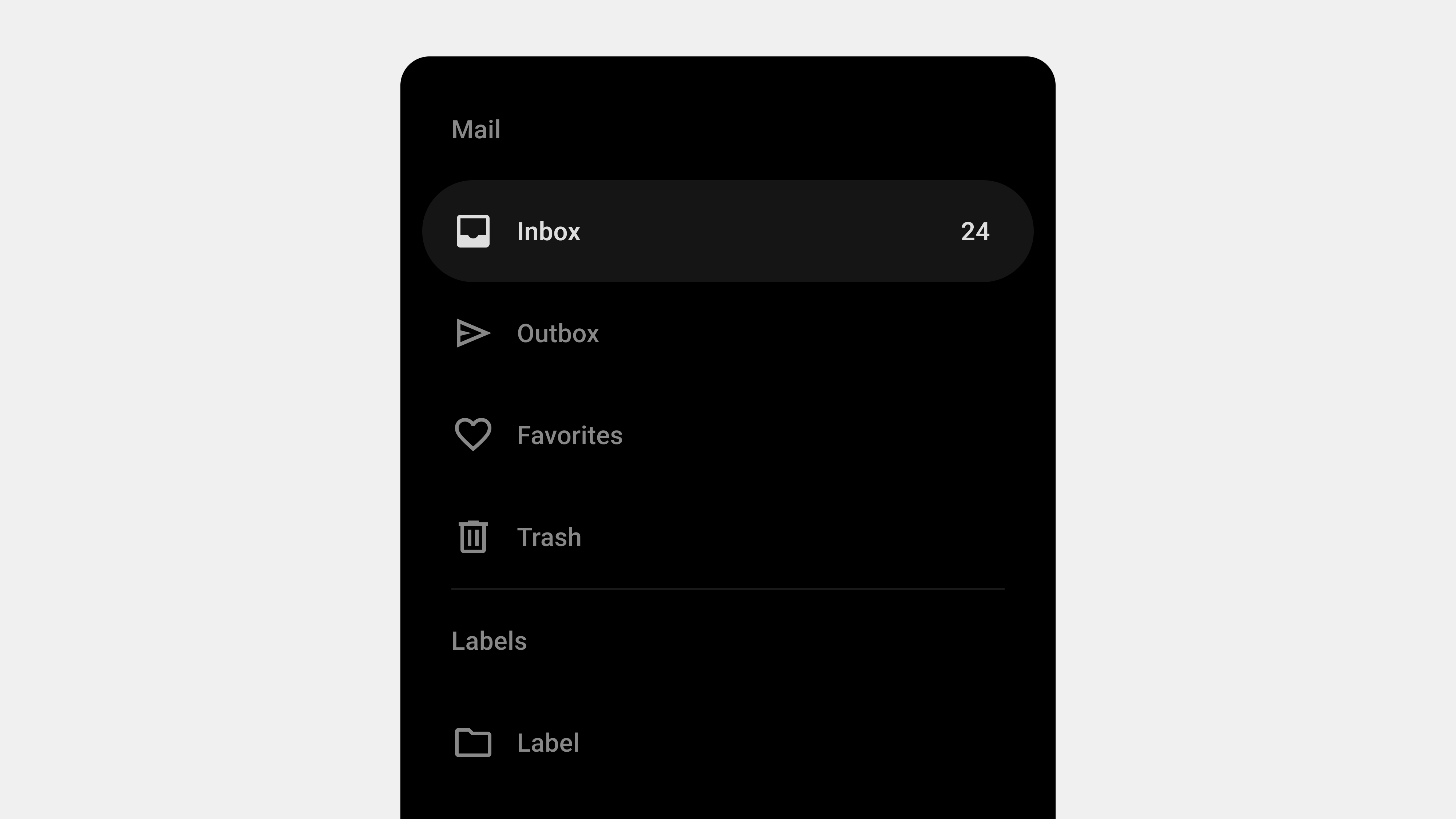
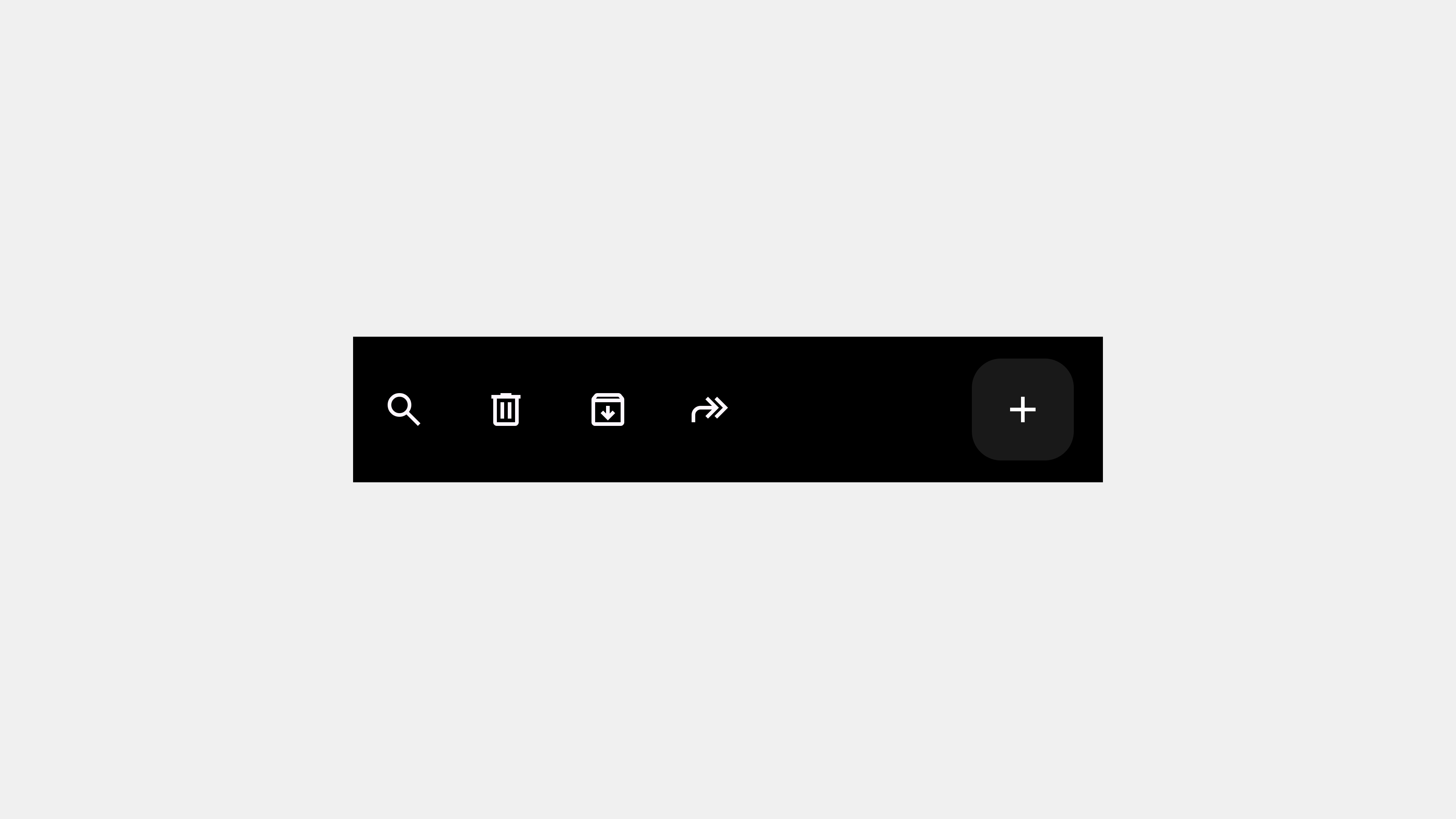
    • 새로운 기능 추가: 새로운 기능이나 컴포넌트를 디자인 시스템에 쉽게 추가할 수 있어야 합니다.
    • 디자인 변경: 디자인 트렌드 변화나 브랜드 리뉴얼 등에 따라 디자인 시스템을 쉽게 변경할 수 있어야 합니다.
    • 다양한 플랫폼 지원: 웹, 앱, 스마트워치 등 다양한 플랫폼에 일관된 디자인 시스템을 적용할 수 있어야 합니다.
    • 팀 규모 확장: 팀 규모가 커지더라도 디자인 시스템을 효율적으로 관리하고 사용할 수 있어야 합니다.
    • 기술 변화 대응: 새로운 기술(예: 새로운 프레임워크, 라이브러리)이 등장하더라도 디자인 시스템을 유연하게 적용할 수 있어야 합니다.

    확장성이 부족한 디자인 시스템은 제품의 성장을 저해하고, 유지보수 비용을 증가시키며, 결국에는 디자인 시스템 자체가 무용지물이 될 수 있습니다. 따라서 디자인 시스템을 구축할 때부터 확장성을 고려하는 것이 매우 중요합니다.

    확장성은 다음과 같은 이점을 제공합니다.

    • 미래 대비: 제품의 성장과 변화에 유연하게 대응할 수 있습니다.
    • 효율성 향상: 디자인 및 개발 시간을 단축하고, 반복 작업을 줄여 생산성을 높입니다.
    • 일관성 유지: 디자인 시스템의 일관성을 유지하면서도 새로운 기능과 디자인을 추가할 수 있습니다.
    • 유지보수 용이성: 디자인 시스템을 쉽게 업데이트하고 관리할 수 있습니다.
    • 비용 절감: 장기적으로 디자인 및 개발 비용을 절감할 수 있습니다.

    확장성을 고려한 디자인 시스템 구축 방법

    1. 모듈화 (Modularization)

    디자인 시스템을 독립적인 모듈(컴포넌트, 패턴, 스타일 등)로 구성하여 재사용성과 유지보수성을 높입니다. 각 모듈은 독립적으로 변경하고 관리할 수 있어야 합니다.

    2. 유연한 구조 (Flexible Structure)

    디자인 시스템의 구조는 새로운 요소(컴포넌트, 패턴, 스타일 등)를 쉽게 추가하고 제거할 수 있도록 유연하게 설계해야 합니다.

    3. 명확한 네이밍 컨벤션 (Naming Convention)

    컴포넌트, 패턴, 변수, 파일 등에 일관되고 명확한 네이밍 컨벤션을 적용하여 가독성과 유지보수성을 높입니다. (예: BEM, Atomic Design)

    4. 디자인 토큰 (Design Tokens)

    색상, 타이포그래피, 간격 등 디자인 속성을 디자인 토큰으로 정의하여 일관성을 유지하고, 변경 사항을 쉽게 적용할 수 있도록 합니다.

    5. 버전 관리 (Versioning)

    디자인 시스템의 변경 이력을 추적하고 관리할 수 있도록 버전 관리 시스템(예: Git)을 사용합니다.

    6. 문서화 (Documentation)

    디자인 시스템의 모든 구성 요소(컴포넌트, 패턴, 스타일, 디자인 원칙 등)를 명확하게 문서화하여 팀원들이 쉽게 이해하고 사용할 수 있도록 합니다.

    7. 자동화 (Automation)

    반복적인 작업을 자동화하여 효율성을 높입니다. (예: 디자인 토큰 생성, 컴포넌트 라이브러리 빌드, 스타일 가이드 생성)

    8. 개방성 (Openness)

    디자인 시스템을 팀 내부뿐만 아니라 외부(커뮤니티, 오픈 소스)에도 공개하여 피드백을 받고 함께 발전시켜 나갈 수 있습니다.

    9. 테스트 (Testing)

    디자인 시스템의 구성 요소(컴포넌트, 패턴 등)를 테스트하여 품질을 보장하고, 변경 사항이 기존 기능에 영향을 미치지 않는지 확인합니다.

    테스트를 자동화 해두면 좋습니다.

    10. 거버넌스 (Governance)

    디자인 시스템을 운영하고, 새로운 요소의 반영 여부를 결정하는 프로세스를 구축해야합니다.

    확장 가능한 디자인 시스템의 예시: Atomic Design

    Atomic Design은 디자인 시스템을 가장 작은 단위인 원자(Atoms)에서 시작하여 분자(Molecules), 유기체(Organisms), 템플릿(Templates), 페이지(Pages)로 구성하는 방법론입니다.

    • Atoms (원자): 더 이상 쪼갤 수 없는 가장 작은 UI 요소 (예: 버튼, 레이블, 아이콘)
    • Molecules (분자): 여러 개의 원자가 결합된 UI 요소 (예: 검색창, 폼 필드)
    • Organisms (유기체): 여러 개의 분자와 원자가 결합된 UI 요소 (예: 헤더, 카드)
    • Templates (템플릿): 여러 개의 유기체가 결합된 페이지 레이아웃 (예: 메인 페이지 템플릿, 상세 페이지 템플릿)
    • Pages (페이지): 템플릿에 실제 콘텐츠가 채워진 최종 결과물

    Atomic Design은 디자인 시스템의 확장성과 재사용성을 높이는 데 효과적인 방법론입니다.

    결론: 지속 가능한 성장을 위한 필수 조건

    확장성은 디자인 시스템의 지속 가능한 성장을 위한 필수 조건입니다. 모듈화, 유연한 구조, 명확한 네이밍 컨벤션, 디자인 토큰, 버전 관리, 문서화, 자동화, 개방성, 테스트 등을 통해 확장성을 확보하고, 제품의 성장과 변화에 유연하게 대응할 수 있는 디자인 시스템을 구축해야 합니다.

    요약:

    1. 확장성은 시스템/제품이 성장/변화에 유연하게 대응하고 성능 저하 없이 기능 추가/변경 가능한 능력이며, 미래 대비, 효율성/일관성/유지보수성/비용 절감에 기여한다.
    2. 모듈화, 유연한 구조, 명확한 네이밍 컨벤션, 디자인 토큰, 버전 관리, 문서화, 자동화, 개방성, 테스트, 거버넌스를 통해 확장성을 고려한다.
    3. Atomic Design은 원자, 분자, 유기체, 템플릿, 페이지로 구성하여 확장성과 재사용성을 높이는 방법론이다.

    #확장성, #Scalability, #디자인시스템, #UI디자인, #UX디자인, #모듈화, #디자인토큰, #AtomicDesign, #버전관리, #문서화

  • Navigation Drawer – 6. Wireframes

    Navigation Drawer – 6. Wireframes

    Designing Navigation Drawer Wireframes: 5 Key Considerations

    Navigation drawers are critical for organizing and structuring digital platforms, particularly in mobile and web applications. When creating wireframes or storyboards for a navigation drawer, careful planning is essential to ensure usability, accessibility, and scalability. This article outlines the five most important factors to consider when designing navigation drawer wireframes, tailored for designers, publishers, developers, and QA professionals.


    1. Information Architecture and Hierarchy

    Why It Matters

    A well-organized navigation drawer helps users quickly locate the features or content they need. Poor information architecture can confuse users, increasing cognitive load and navigation time.

    Key Considerations

    • Group Related Items: Organize menu items into logical categories.
    • Prioritize Key Features: Place the most important or frequently used items at the top.
    • Use Progressive Disclosure: Hide secondary or less critical items in collapsible submenus.

    How to Implement in Wireframes

    • Clearly label categories and subcategories.
    • Use visual separators or headers to distinguish groups.
    • Indicate expandable menus with icons or arrows.

    Example

    An e-commerce app’s drawer might have:

    • Primary Items: “Home,” “Categories,” “Cart.”
    • Secondary Items: “Order History,” “Help.”
    • Collapsible Sections: “Clothing,” “Electronics” under “Categories.”

    For the Team

    • Designers: Focus on visual clarity for the hierarchy.
    • Developers: Ensure nested menus function as intended.
    • QA: Test usability for all menu levels.

    2. Responsiveness and Adaptability

    Why It Matters

    Navigation drawers must adapt seamlessly to different devices, screen sizes, and orientations. A responsive design ensures consistent functionality and usability across platforms.

    Key Considerations

    • Mobile Optimization: Use full-screen drawers or bottom drawers for smaller screens.
    • Desktop Adaptation: Opt for persistent or collapsible sidebars for larger screens.
    • Orientation Changes: Ensure the layout adjusts smoothly between portrait and landscape modes.

    How to Implement in Wireframes

    • Create wireframes for multiple breakpoints (e.g., mobile, tablet, desktop).
    • Indicate how the drawer opens (e.g., swipe, toggle button).
    • Show different states: collapsed, expanded, and persistent.

    Example

    For a news app:

    • Mobile: Temporary drawer with swipe-to-open functionality.
    • Tablet: Persistent drawer showing icons and labels.
    • Desktop: Full-width persistent sidebar with detailed categories.

    For the Team

    • Designers: Create responsive prototypes for usability testing.
    • Publishers: Optimize styles for CSS breakpoints.
    • QA: Test functionality across devices and orientations.

    3. Accessibility Compliance

    Why It Matters

    Accessibility ensures that all users, including those with disabilities, can interact with the navigation drawer effectively. This is not only ethically essential but also legally required in many regions.

    Key Considerations

    • Keyboard Navigation: Ensure the drawer can be opened, closed, and navigated using a keyboard.
    • Screen Reader Support: Use semantic HTML and ARIA roles to describe elements.
    • Focus Indicators: Highlight interactive elements for visually impaired users.

    How to Implement in Wireframes

    • Annotate elements with accessibility labels and roles.
    • Highlight focus states and keyboard shortcuts in the design.
    • Include notes for developers on ARIA role implementation.

    Example

    In a financial app:

    • The toggle button has an ARIA label like “Open Menu.”
    • Focus automatically shifts to the first menu item when the drawer opens.
    • A “Close Drawer” button is always accessible.

    For the Team

    • Designers: Use tools like Stark for contrast and readability checks.
    • Developers: Implement and test ARIA roles.
    • QA: Test screen reader and keyboard navigation compatibility.

    4. Feedback and Interaction Design

    Why It Matters

    Users need clear visual and interactive cues to understand the state and functionality of the navigation drawer. Without proper feedback, users may struggle to interact effectively.

    Key Considerations

    • Opening and Closing Feedback: Use smooth animations to show transitions.
    • Active State Indicators: Highlight the current menu item to orient users.
    • Error States: Provide feedback for scenarios like broken links or failed dynamic loading.

    How to Implement in Wireframes

    • Indicate animation directions (e.g., slide-in, fade).
    • Mark active and hover states for menu items.
    • Include error messages or loading indicators for dynamic content.

    Example

    In a food delivery app:

    • The drawer slides in from the left with a semi-transparent overlay.
    • The active menu item (“Current Orders”) is highlighted with a bold underline.
    • Dynamic sections show a loading spinner when fetching new content.

    For the Team

    • Designers: Annotate wireframes with animation details.
    • Developers: Implement animations using CSS or JavaScript.
    • QA: Test all interaction states, including error handling.

    5. Scalability and Future Growth

    Why It Matters

    Navigation systems often grow as new features are added. Planning for scalability ensures that the navigation drawer remains functional and user-friendly over time.

    Key Considerations

    • Modular Design: Use a flexible structure that can accommodate additional items.
    • Dynamic Content: Prepare for personalization or role-based menus.
    • Fallback Options: Ensure the drawer remains usable if features are temporarily unavailable.

    How to Implement in Wireframes

    • Leave space for future menu items or categories.
    • Use placeholders or notes for dynamic content.
    • Show how the drawer adapts to different user roles or permissions.

    Example

    In an enterprise app:

    • Admin users see options like “User Management” and “Reports.”
    • Regular users only see “Dashboard” and “Profile.”
    • Dynamic sections like “Recent Files” update based on user activity.

    For the Team

    • Designers: Plan for modular layouts and reusable components.
    • Developers: Use scalable data structures for dynamic menus.
    • QA: Test with different user roles and menu configurations.

    Conclusion

    Designing wireframes for navigation drawers is a collaborative process that requires input from designers, publishers, developers, and QA professionals. By focusing on information architecture, responsiveness, accessibility, interaction feedback, and scalability, teams can create navigation drawers that are intuitive, user-friendly, and adaptable to future needs. Proper planning and thorough testing ensure a seamless experience for all users, regardless of device or ability.


  • Navigation Bar – Designer

    Navigation Bar – Designer

    Top 5 Considerations for User-Centric Navigation Bar Design

    A navigation bar is a crucial component of any digital interface, guiding users to essential information and features. Designing a navigation bar with a user-centered approach is vital for enhancing usability, engagement, and satisfaction. This article outlines the five most important considerations for creating a navigation bar that prioritizes user experience and ensures seamless interaction.


    1. Prioritize Simplicity and Clarity

    Why It Matters

    Simplicity and clarity are the foundation of effective navigation bar design. Users should immediately understand the purpose of each menu item and how to use the navigation bar. A cluttered or overly complex navigation system can frustrate users and lead to abandonment.

    Key Guidelines

    • Use Familiar Labels: Stick to terms that users commonly understand (e.g., “Home,” “Contact”).
    • Limit Options: Focus on the most essential menu items to avoid overwhelming users.
    • Logical Grouping: Organize related items into categories for better discoverability.

    Example

    An e-commerce site might use labels like “Shop,” “Categories,” “Cart,” and “Profile” while grouping less critical features (e.g., “Help” or “FAQ”) into dropdowns or secondary menus.

    Design Tip

    Conduct user research to understand common terminology and structure menu items accordingly.


    2. Ensure Accessibility for All Users

    Why It Matters

    Inclusive design is a key principle of user-centered UI/UX. A navigation bar should be accessible to everyone, including users with disabilities. Overlooking accessibility can alienate a significant portion of your audience and impact usability.

    Key Guidelines

    • Keyboard Navigation: Ensure all menu items are accessible via the keyboard.
    • Screen Reader Compatibility: Provide clear ARIA labels and roles for assistive technologies.
    • Color Contrast: Use high-contrast colors to improve readability for users with visual impairments.

    Example

    A government website might include features like tab-based navigation, clear focus indicators, and descriptive alt text for menu icons.

    Design Tip

    Test the navigation bar using accessibility tools to identify and fix potential barriers.


    3. Optimize for Responsiveness and Cross-Device Compatibility

    Why It Matters

    With users accessing digital platforms on a wide range of devices, responsive design is non-negotiable. Navigation bars must adapt seamlessly to different screen sizes and input methods while maintaining usability.

    Key Guidelines

    • Mobile-Friendly Design: Use bottom navigation or hamburger menus for small screens.
    • Touch Targets: Ensure buttons and links are large enough for touch interaction.
    • Consistent Experience: Align navigation design across desktop, tablet, and mobile devices.

    Example

    A mobile banking app might feature a bottom navigation bar with primary actions like “Accounts,” “Transactions,” and “Settings,” ensuring easy thumb reach.

    Design Tip

    Create prototypes for multiple screen sizes and test usability across devices.


    4. Provide Feedback and Visual Cues

    Why It Matters

    Users need immediate feedback to understand their actions and current location within the interface. Visual cues improve navigation intuitiveness and reduce cognitive load.

    Key Guidelines

    • Active States: Highlight the current page or section in the navigation bar.
    • Hover Effects: Use animations or color changes to indicate clickable items.
    • Error Feedback: Guide users when navigation fails (e.g., broken links or unavailable pages).

    Example

    An educational platform might use bold text or an underline for active sections like “Courses” or “Dashboard” to help users identify their current location.

    Design Tip

    Incorporate subtle animations and consistent styles to enhance interaction cues without overwhelming users.


    5. Design for Scalability and Future Growth

    Why It Matters

    As digital platforms grow, navigation systems often need to accommodate additional features and content. Designing for scalability ensures the navigation bar remains functional and user-friendly over time.

    Key Guidelines

    • Expandable Menus: Include dropdowns or collapsible sections for secondary items.
    • Dynamic Content: Leverage personalization to highlight relevant options based on user behavior.
    • Avoid Overloading: Maintain a clean layout by balancing core and secondary options.

    Example

    A SaaS product might feature a top-level navigation bar for core features like “Dashboard,” “Projects,” and “Reports,” with dropdowns for advanced settings or admin tools.

    Design Tip

    Regularly audit the navigation bar to remove outdated items and incorporate new features without compromising usability.


    Conclusion

    Designing a user-centered navigation bar requires a balance of simplicity, accessibility, responsiveness, feedback, and scalability. By prioritizing these considerations, designers can create navigation systems that cater to diverse user needs and enhance the overall user experience. A well-designed navigation bar is not just functional—it’s a strategic tool for improving engagement and satisfaction.


  • Navigation Bars – Product Owner 2

    Navigation Bars – Product Owner 2

    Top 5 Considerations When Creating Wireframes for Navigation Bars

    Navigation bars are the backbone of any digital interface, and their wireframes serve as the blueprint for successful implementation. A well-thought-out wireframe ensures seamless collaboration among designers, publishers, developers, and QA teams, laying the foundation for an intuitive and user-friendly navigation system. This article explores the five most critical considerations to focus on when drafting wireframes or storyboards for navigation bars.


    1. Define Clear User Flows

    Why It Matters

    User flow is the backbone of any navigation system. A clear and logical user journey ensures that users can easily access the information or features they seek without unnecessary confusion or friction.

    Key Points for Wireframing

    • Understand User Intent: Map out the primary and secondary user goals.
    • Logical Hierarchy: Arrange items based on user priority and frequency of access.
    • Entry and Exit Points: Clearly define how users enter and leave specific sections.

    Example

    For an e-commerce site:

    • Primary Flows: “Browse Categories,” “Search Products,” “View Cart.”
    • Secondary Flows: “Track Orders,” “Manage Account,” “Customer Support.”

    Collaboration Tips

    • Designers: Focus on creating intuitive paths with minimal cognitive load.
    • Developers: Highlight key navigation triggers and interactions.
    • QA: Test whether the navigation flow matches the wireframe logic.

    2. Prioritize Responsive Design

    Why It Matters

    Navigation bars must adapt seamlessly to different devices and screen sizes. A wireframe that accounts for responsiveness ensures a consistent user experience across platforms.

    Key Points for Wireframing

    • Device-Specific Layouts: Design separate layouts for desktop, tablet, and mobile.
    • Touch-Friendly Interactions: Ensure buttons and links are large enough for touch screens.
    • Responsive Breakpoints: Define how the navigation will adapt at various screen sizes.

    Example

    • Desktop: Horizontal top navigation with dropdowns.
    • Mobile: Bottom navigation with a collapsible hamburger menu.
    • Tablet: A hybrid approach with expanded or hidden menus depending on screen orientation.

    Collaboration Tips

    • Designers: Create separate wireframes for each breakpoint.
    • Publishers: Ensure proper CSS implementation for responsiveness.
    • Developers: Test adaptive behavior in real-time.
    • QA: Verify usability across all devices and resolutions.

    3. Ensure Accessibility Compliance

    Why It Matters

    Accessibility is not just a legal requirement; it’s an ethical responsibility. Navigation bars should cater to all users, including those with disabilities. Wireframes should explicitly include accessibility considerations to ensure they are not overlooked during development.

    Key Points for Wireframing

    • Keyboard Navigation: Indicate tab orders and keyboard shortcuts.
    • Screen Reader Compatibility: Add labels and ARIA roles to key elements.
    • Contrast Ratios: Ensure sufficient contrast between text and background colors.

    Example

    For a navigation bar:

    • Tab Order: “Home > About Us > Services > Contact.”
    • Visual Focus Indicators: Highlight menu items as users tab through options.

    Collaboration Tips

    • Designers: Use accessibility tools to simulate low-vision or colorblind experiences.
    • Developers: Implement semantic HTML with ARIA roles.
    • QA: Test with screen readers and keyboard-only navigation.

    4. Define Visual and Interaction Cues

    Why It Matters

    Visual and interaction cues provide feedback to users, making navigation intuitive and engaging. A wireframe that includes these details reduces guesswork for designers and developers during the implementation phase.

    Key Points for Wireframing

    • Active States: Show how the navigation bar will indicate the current page or section.
    • Hover and Focus Effects: Define visual changes for interactive elements.
    • Transitions and Animations: Illustrate dynamic behaviors like dropdown menus or sliding panels.

    Example

    • Active State: Bold text or underlined style for the active menu item.
    • Hover Effect: Change in background color or icon animation.
    • Dropdown Transition: Smooth sliding effect when expanding menus.

    Collaboration Tips

    • Designers: Use annotations in the wireframe to describe interaction effects.
    • Developers: Implement CSS animations and transitions as specified.
    • QA: Verify that visual and interaction cues behave as expected.

    5. Balance Scalability and Simplicity

    Why It Matters

    Navigation systems often evolve as platforms grow. Wireframes must accommodate future scalability without overloading the initial design. Balancing simplicity and scalability ensures both current usability and long-term flexibility.

    Key Points for Wireframing

    • Expandable Menus: Include dropdowns or side panels for additional options.
    • Content Prioritization: Highlight the most critical items while hiding secondary ones.
    • Dynamic Updates: Account for features like personalized or contextual menus.

    Example

    • Primary Navigation: “Home,” “Shop,” “Categories,” “Cart.”
    • Secondary Navigation: Nested dropdown for “Categories” (e.g., “Clothing,” “Accessories”).

    Collaboration Tips

    • Designers: Plan for modular components that are easy to update.
    • Developers: Build scalable systems with reusable code.
    • QA: Test navigation performance under different use cases and scenarios.

    Conclusion

    Creating wireframes for navigation bars is a collaborative effort that requires careful planning and attention to user needs. By focusing on clear user flows, responsiveness, accessibility, interaction cues, and scalability, teams can design navigation systems that deliver exceptional user experiences. Wireframes are not just static documents—they are living blueprints that guide the entire development process, from design to deployment.